![[Tutorial] small talk](https://img5.xaiju.com/storage/6/kt/cz/d38796-019e8306-3707-7492-a05f-9ad1b81e9d4b.gif)
![[Tutorial] small talk](https://img5.xaiju.com/storage/4/za/dh/d38796-019e8306-3708-75bb-8c76-9e322c8a1cc9.png)
![[Tutorial] small talk](https://img5.xaiju.com/storage/5/ih/bv/d38796-019e8306-370a-7bc2-a207-5bb38e34e557.gif)
![[Tutorial] small talk](https://img5.xaiju.com/storage/3/lm/pj/d38796-019e8306-370d-7b51-8ff6-9bed355dc581.gif)
![[Tutorial] small talk](https://img5.xaiju.com/storage/6/dl/tr/d38796-019e8306-370e-7e50-bebf-ee7f48c50eb3.jpg)

주변분들 작업물을 피드백 해드리면서 많이 나오는 말들에 대한 잡설입니다.
// It's a small talk about the words that come out a lot while giving feedback to people around me.
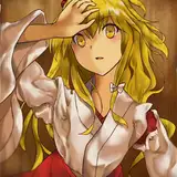
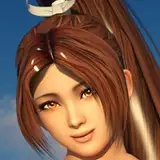
디테일은 퀄리티인가?
제가 주로 사용하는 방식인 빛을 듬뿍 퍼바르는 것으로 분위기를 표현하는 방식은 작품의 원래 형태가 [너무 엄청 디테일하지 않게] 표현되었을때 제일 효과적입니다
특히 거대한 스케일감을 표현 할 때는 디테일을 죽이는 편이 좋습니다.
또한 디테일을 많이 판 배경이나 캐릭터의 경우 이런 식으로 표현하면 오히려 이런 이펙트가 디테일을 가려서 퀄리티가 기대보다 좋지 않게 나올수 있습니다.
즉 케바케인 사항이지요
// Detail = Quality?
The way i usually use it, the way i express the atmosphere by applying a lot of light, is most effective when the original form is [not too much detail] of the painting is expressed
especially when expressing a huge sense of scale, it's better to reduce the details.
also, in the case of a background or character that a lot of details, if you express it in this way, these effects cover the details, so the quality can come out worse than expected.
so, it's case by case
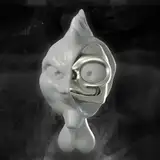
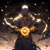
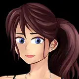
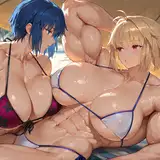
효과적인 배경 표현과 공기 원근법
배경을 표현할때 오브젝트를 예쁘게 그려넣어도 중구난방해 보이거나 밀도의 조절이 힘들고 원 , 중, 근경에 대한 구분이 모호한 점, 배경의 요소들이 일치되어 보이지 않는 점 등이 개인 과외나 피드백을 주고받을때 비기너 분들이 가장 많이 힘들어하셨던 부분입니다.
이 경우엔 공기색을 그라데이션 등을 이용해 넓게 원, 중, 근경의 층마다 펴 바르는 것으로 어느정도 공간감과 통일감을 살려줄 수 있습니다.
저도 많이 사용하는 방식이네요
위 그림의 변화를 보면 알 수 있습니다.
// Effective background representation and air perspective
when exchanging personal feedback, the most difficult part for beginners was that even if they drew objects beautifully when expressing the background, the distinction between the far, middle, and close sight was ambiguous, and the elements of the background were not unified.
in this case, the air color can be spread widely on each layer of the far, middle, and close sight using a gradation tool to create a sense of space and unity. I use this method a lot, too
you can see from the changes in the picture above.
이런 방식을 사용했을때 디테일을 획기적으로 절감할 수 있기 때문에 풀 일러스트를 제작하면서도 어느정도 생산성을 확보할 수 있습니다.
그래도 정석은 세세한 디테일을 어떻게 표현하느냐가 중요하니까 기초는 디테일을 살리는것부터 시작하는 것이 좋지만요
이 글이 조금은 도움이 되면 좋겠네요
// with this approach, you can dramatically reduce details, so you can get some productivity while creating a full illustration.
of course, as time goes by, the spend more and more time trying to maintain a larger scale, not too much detail.
still, it's important how you express detail, so this is not necessarily the right answer.
I hope this is helpful


