download the attached .mov file to watch the process video of january's monster of the month painting!
for this piece i went with a somewhat more painterly style and method than i usually do nowadays. i work in procreate and my three go-to brushes are 6B pencil (in the sketching category) for linearts and details; 2B compressed (charcoals category) for gradients and textured shading; and gloaming (drawing category) for highlights and sculpting shapes. but this time i used the 'gloaming' brush for almost everything, including the sketch, colouring, and polishing. for some of the texturing and the finest little details i switched to the 6B pencil but i didn't use my beloved charcoal brushes at all. rather than adding sweeping gradients everything was painted in individual strokes, and the textured nature of the gloaming brush beautifully mimics traditional media.
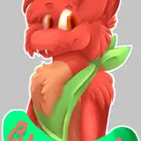
i doodled the pose really tiny in a different document, which is why the video starts with a rough doodle rather than a completely blank canvas. i gradually refined this sketch, figuring out the details and erasing parts of previous layers to clean it all up. as described in the design commentary, the focus of this design is on the shapes, colours, and the contrast between the charcoal "scaling" and the internal ember glow. the sketch is drawn with angular, 'chunky' lines for the outline of the charcoal parts, but with only a few guidelines for the scaly pattern, since i would be able to refine those shapes later on.
normally, i draw a more or less refined lineart and do much of the colouring underneath the sketch and lineart layers, only moving to draw on top of them towards the later stages of the process when it's time to polish and refine. but for this piece i wanted to use the same method as i had for the concept art, where much of the colouring is in fact done on top of the lineart. in other words i didn't need any precise linework for most of this piece. i spent plenty of time establishing guidelines for the major shapes, but only did a proper lineart for detailed areas like the character's faces, hands, and the close-ups. (on that note, everything that relate to the close-ups are on different layers from the rest of the piece, so that i could hide them while working on the background and move them about if the composition required it.)
i locked the transparency of my sketch & lineart layers, changed the colour to a dark blue-green, and switched the layer setting to 'multiply.' to firmly establish the contrast between the dark and glowing areas i blocked in the charcoal parts on two other layers (also set to 'multiply'), the second of which add a hint of scaly texture.
i then moved on to the colouring and at this point i'm still working below the sketch & lineart, to establish a solid base. i used a neutral, earthy hue for the monster, but immediately started adding a brighter orange to the glowing 'core' and darker blue tones to the charcoal scaling, creating more contrast in both hue and value. the brush strokes of the ember areas look almost 'smudgy,' because i wanted the glow to have some texture, as opposed to being all smooth and even. meanwhile, for the charcoal parts, the brush strokes are laid on in a 'chunky' and 'scaly' way that gradually 'sculpts' the irregular shapes. sometimes i painted the orange onto new, semi-transparent layers set to 'overlay' or 'add' or 'screen,' to make them shinier. the darker patches, on the other hand, were sometimes painted onto a new semi-transparent layer set to 'multiply.' as you can see the contrast between the ember glow and the charcoal gets progressively more pronounced, at the same time as the monster's body becomes more three-dimensional and textured.
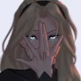
i also slapped on the beginnings of a background just to have a sense of what it would look like, and started colouring the human too. their skin is rendered in a super painterly way, with shadows and highlights added to the base hue in textured brush strokes.
i stayed underneath the lineart layer for a bit longer, working on different parts of the painting at the same time and gradually refining the shapes and contrasts. by temporarily switching to a tiny brush and drawing fine lines that run along or against the 'scaling' i created some texture and definition of individual charcoal chunks, while broader and bigger brush strokes created a more scaly impression overall (particularly on the tail).
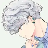
then i finally switched to working on top of the lineart layers, which allowed me to refine the shapes even more, by adding both darker and lighter hues around the edges. for example, i zoomed in to work on his ribcage by using pale warm yellow for the inside while also refining the flared out ribs with dark blue. adding the pale blue brush strokes for the lightest charcoal 'scales' made a huge difference and illustrates why i needed to work on top of the lineart. the same goes for filling in some of the cracks and gaps between the charcoal scales with bright orange. i definitely wouldn't say that this piece has no lineart, because many of the shapes are still framed by lines. but the linework blends into the colouring more than my usual style, and some areas rely on a more painterly look to tell the shapes apart and create form. i'm especially proud of how the human is rendered -- their back and butt is one of my favourite areas of this piece.
besides painting more scales with big brush strokes i cleaned up the shapes and outlines, notably along the human's back and hair. i zoomed in to refine the character' faces and hands, added little details here and there, and erased parts of the lineart and sketch that were peeking through. i kept the background fairly simple because i didn't want it to steal attention away from the characters, but added the shiny sparks that come off the monster's body as a special effect.
the more i worked on this piece, the more i was wary of overworking it. i could have kept at it for an eternity, adding details and tweaking the colours, and rendering the shapes ad infinitum. i have a history of being so much of a perfectionist that i overwork paintings that would have looked more lively and fluid if i stopped sooner. a piece of art doesn't automatically get better if you spend more time on it -- sometimes adding too much detail and polish can make it look stiff and messy.
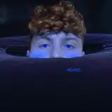
thankfully i've gotten better at recognising when i need to stop. after painting the liquid fire that drips out of the monster's tail mouth i felt like i was pretty much done with the main scene, so i moved on to colour the close-ups in much the same way. again, there's lines but they blend into the colouring -- note, for example, how the rendering of the human's teeth relies more on the contrast between the dark inside of their mouth and the white of the enamel. (i don't know why i keep referring to them as a human, though -- their pointed ears and sharp teeth would suggest otherwise. i guess i subconsciously think of this monster as some kind of ember demon, with the background being a fiery hellscape and his lover being another demon who looks much more like a regular human...?)
finally, i applied some effects to make the painting easier to read -- to tell what's what. there's a lot of contrasting textures, shapes, and colours going on, and a fair bit of overlapping bodyparts. i applied a blue overlay to the monster's right arm and the root of his tail, making their left arm and right thigh easier to distinguish. the inside of his mouth was blending into the reddish background, but thanks to the blue 'halo' it's more clearly delineated, and the light outline framing his silhouette makes the characters stand out more against the background.
in general, there's quite a lot going on in this piece. the ember design itself is pretty intense, with such bright colours and sharp contrasts, and there's something happening on almost every centimeter of the canvas. compared to many of my other paintings it looks a little "busy," but i don't mean that in a bad way. i'm just making an observation, because my art tends to have a calmer (?) and more scaled-back vibe. as always, stepping a bit outside my comfort zone was simultaneously challenging and fun, but most importantly i'm really happy with the end result!
if you have any questions about this process, go ahead and ask below!
// art + characters © me.