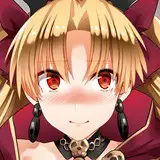
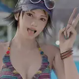
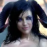
i present to you, the process video for the august monster of the month painting, themed on a modern neon aesthetic -- download the .mov file below.
my MOTM paintings are usually very nsfw, and nsfw usually requires some degree of undress. however, the clothes and accessories play a big part in this design so i didn't want to undress him too much, or even at all. i decided that i would focus on the aesthetics of the theme and simply do a sfw painting this month, especially since i had such a great opportunity to paint a really interesting background.
see, as soon as the neon design prompt won, i knew i wanted to fill the canvas with neon signs. i was torn between depicting a street view or placing neon signs in a more unexpected setting (like in a forest), but put off the decision until i had some more meat on the conceptual bone. as i developed the design and it took on an egyptian vibe, i had the idea of incorporating hieroglyphs into the neon signs. not gonna lie, i was SO excited about it. i haven't seen it done before and i'm lucky in that i didn't have to simply pick random hieroglyphs or make it up. i have studied enough egyptology to have a basic understanding of middle egyptian and hieroglyphs, so i dug up my course literature and picked actual sentences and words.
since the background would be so important for this piece, that's where i started. i wanted to cover it with a number of signs, so i opted for a street view aesthetic, where it would make more sense to cram in a bunch of signs in a relatively small space. that said i didn't care about the perspective being correct or the buildings making much sense. a street view that's cluttered with neon signs lends itself really well to an abstract and imprecise approach, where the general impression is more important than the details. first of all i created a rough view of buildings and places to put my shiny signs. i worked in monochrome, knowing i would add colourful overlays later on, in accordance with the colours of the signs.
i sketched the hieroglyphs in a different document, so i could take my sweet time getting them right. i'm pretentious enough to have a ~favourite quote from a middle egyptian author~ (Merikara's advice to carpe that fucking diem), so i definitely wanted to incorporate it. but for the others i flipped through my books and papers, looking for words and quotes that seemed appropriately whimsical or artsy. neon street signs usually draw attention to a business or event, while decorative neon signs for indoor use tend to have inspirational or ~random~ words on them. despite depicting a street view i opted for the latter vibe simply because it's more fun -- not to mention that there's no middle egyptian words for modern stuff like "cinema" or "cocktails". i suppose i could have used "merriment" and "beer" and other equivalents, but i felt more inclined to choose artsy phrases. i've attached an image above that shows the meaning of all the signs (except for the one in the top right, because i forgot to take note of the translation and i can't remember it to save my life?!).
once i had both the words and phrases and a basic street view, i started arranging the hieroglyphs and distributing them across the spaces i had designated for my neon signs. in hindsight, there's a few little things i would have done differently. i should have added lines between the rows of signs of the longest quote, to make it look more authentic and orderly. since i focused on distributing the signs in an aesthetically pleasing way some words are cut off right in the middle, with bothers me a bit, and i could have fixed that by just arranging things a bit differently. lastly i should have placed the signs a bit more along the edges of the canvas instead of focusing them in the middle, where they will ultimately be partly covered by the character. but ah well, you live and you learn.
once i had the composition figured out, it was time to create the neon sign effect. i haven't done anything like it before, but by now i'm fairly familiar with various layer settings so i had a good idea of how to achieve the desired effect. first of all i refined the hieroglyphs with a base colour, drawing them in a way that mimics how many neon signs are designed, with some space left between individual light tubes. next i duplicated that layer, added a gaussian blur effect, and set it to 'overlay' or 'add.' i duplicated this shiny layer until the hieroglyphs looked glowy enough. then i created a new layer and used a smaller brush to go over the hieroglyphs again, this time with an almost white colour. i set that layer to 'add' and lowered the transparency, if needed, to achieve the 'core' of white light at the center of each neon tube.
i created the frames of the signs in the same way, and refined the surrounding parts of the background as needed. i tried to go with a few different looks and shapes, so that no two signs would look exactly the same, and added a few elements that didn't have a frame, so that the overall impression would be a bit more organic and interesting. as mentioned above i added some colourful overlays to the entire background, as well as few darker patches along the sides and corners, to make it look less flat and create the impression of a nighttime street lit by neon signs. again, the background is kind of the star of this piece, and it honestly was so much fun to paint.
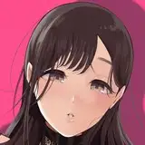
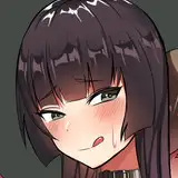
and then! it was time to add the character. i doodled a few pose ideas on a different canvas and copypasted the final sketch on top of the background. as usual i refined it little by little, until i was ready to do the lineart. i wanted to draw him in a kind of comic book style, for several reasons: 1) it felt appropriate for the modern vibe; 2) the background was already "busy" enough, with a lot of detail and eye-catching special effects. using a simpler style for the character would keep the image from looking messy, and ensure that the character stands out from the background; and 3) i straight up love the combination of a painterly background with a simpler style for the character. it reminds me of animated movies with beautifully painted backgrounds and characters drawn in a more flat but elegant and striking 2D style. maybe it's because they're both wearing leather jackets but i also kept thinking about this sketch of march, which in turn makes me think of the art styles of french and belgian artists like moebius and hergé (the creator of tintin).
i kept the lineart pretty bold and visible and the colouring is relatively flat, with just a few gradients (to the hair and tail), some stylised shadows (using thin parallel lines), and a few highlights (especially on the leather jacket, since it's a shiny material). i paid extra attention to rendering shape and form with relatively few lines (i'm most proud of his shoes) and as for his shiny neon jewellery i created the effect in the same way as the neon signs. to finish it off i added some layer effects to the character, effectively adjusting his overall colour scheme. i wanted him to stand out from the background, but not too much - he still needed to fit in with the lighting.
towards the very end of it i exported the pdf from procreate to photoshop, so i could add a few effects that i can most easily and quickly do in that program. so the very last few steps of the process aren't shown in the video, since it's created from the procreate timelapse, but it's easy enough to explain: at first i just wanted to add a vague scan line and 3D effect to the background. for the scan lines i create a new layer and fill it in with white. go to filter --> filter gallery --> choose 'halftone pattern' and set the pattern type to 'line'; experiment with what size and contrast looks best on your image and press 'OK' --> set the layer to 'multiply' and adjust the transparency to maybe 10%. i put this layer on top of the background but under the character layers, so the scan lines apply to the backdrop but not to our cyborg friend. for the 3D effect i duplicate the background layer --> right click on the layer and open 'blending options' --> uncheck 'G(reen)' and 'B(lue)', click 'OK' --> nudge the layer a few pixels to the right/left and maybe a little up/down as well --> adjust the transparency if needed.
i also added a very faint noise effect to the whole image, since it gives it a subtle texture reminiscent of printed comic pages. i didn't intend to do anything more with it, but then realised it looked a bit dark on my desktop so i ended up increasing the brightness and contrast, and added an 'auto tone' effect to make the colours a bit more bright and pastelly. at that point i decided it was Done, and here we are! i hope you enjoy the video and if you have any questions about the process, feel free to comment below.
// art + character © me.