here's the process video for june's monster of the month painting, feat. a human and their alien lover! you can download the .mov file below. (sorry again that a thin slice of the top and bottom edges are cut off for parts of the video - does anyone have any idea why procreate and/or imovie is doing that to my exported time-lapse videos?!)
the design commentary explains how a lot of my design choices were rooted in making the silhouette of this alien look like something from out of this world. i wanted to choose a pose that highlighted rather than obscured their unusual outline, so i couldn't contort or foreshorten their body too much. i initially tried sketching a few more dynamic poses, where they looked like they were swimming or floating in a more horizontal or flowy position. but in the end i fell for what is arguably a more 'boring' pose, where they're simply hovering 'upright' with their lover in their arms.
weirdly enough, i have concluded that the reason i chose this pose is that it gives them a more unearthly and uncanny vibe, with the way they're so stiff and vertical, tentacles gently swaying. they look kind of statuesque and robotic, and i can't help but think of those super eerie squid that are sometimes caught by the underwater cameras of oil rigs (content warning because it's unsettling nightmare fuel but ... here's a video). at first glance you might assume this alien moves much like a regular octopus, all smooth and fluid, and that might well be the case when they need to move fast. but what if, as an unnerving contrast, their 'resting position' or 'casual mode' is actually similar to one of those creepy af squids? shoulders straight and upright, as if rigidly hanging from a clothes hanger, body eerily stiff and unmoving, floating along in a way that looks really unnatural and uncanny. i'm thinking of imagery like the hovering ghost of a hanged person, or a robot that's not programmed to move any part of their body unless it's necessary or serves a purpose... for this reason i didn't want their tentacles to look too animated, either. i tried some more curly and 'organic' ways to position them, but kept returning to the less lively, gently swaying look. i don't know if my reasoning makes sense, because normally you don't want a pose to look stiff -- but then again, i didn't want this alien to look 'normal,' so...
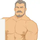
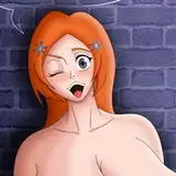
speaking of tentacles, i wanted to show their prehensile dicks curling around their lover's hips and slipping into them, so having them wrap their legs around the alien's waist seemed like a perfect and obvious solution. this allowed me to draw their hands on the human's thigh and waist in a fond gesture, too, neck slightly bent to (presumably) gaze upon their expression of pleasure. such little gestures of affection mean even more if we run with the idea that our alien is generally non-expressive and non-animated in their body language and movement patterns.
i used several layers to refine the sketch, most notably one for the alien, one for the human's body, and one for the human's head. being able to flick layers on and off and adjust the opacity made it easier to figure out the overlapping body parts and move things around as needed. i once again spent a particularly long time refining the sketch, since that's the most difficult part about drawing and posing monsters with relatively complex designs. i try to figure out as much detail as possible before moving on to the lineart, so i know exactly where all the lines need to go.. since the composition is so zoomed out the lineart is relatively simple, without too much detail or texture, so as to not be too cluttered. i would simply have to add those details while colouring instead.
the concept sketch was quite precise in terms of the alien's colour palette and markings, so blocking in the base colours was easy enough. i wasn't sure what i wanted to do with the background yet -- i liked the idea of a completely black field of colour, but it kind of swallowed the dark ends of the tentacles and obscured the silhouette. a red background might have looked cool, but it was almost painfully bright when i tried it out. i decided to figure it out later, and instead kept working on rendering the characters.
i used my usual mixture of charcoal and graphite brushes, selecting big and small areas to add textured gradients and occasionally resorting to the 'gloaming' brush to add some sheen. i ended up using the graphite brush to add a lot of texture and detail, creating shadows and highlights by drawing many small lines next to each other. at first i worked only on layers below the lineart, but after a while i created new layers above it too, so i could clean things up and draw the red details on top of the dark lines, making them pop a bit more.
towards the end i applied some special effects to brighten up the colours and make the drawing look more vivid. the red accent colours create a really neat impression, especially the striking contrast between the inside of their tentacles vs. the outside. i tried making their 'halo' red as well, contrary to its green colour on the concept sketch, but with the angle of their neck it obscured their outline too much--so i decided to make it plain white instead, which really 'frames' their crest.
i also ended up making the background look like the static white noise of a TV screen--it somehow felt fitting for a sci-fi monster that has taken on a rather eerie vibe in my brain. that also led to the notion of adding a glitchy effect to the drawing in general, but unfortunately this last step is not shown in the video. you see, i painted his piece in procreate, which automatically records video of my canvas -- but i wasn't sure of how to do the glitch effect in procreate, and every tutorial i could find was for photoshop. i had to export the file as a PSD and finish it up in photoshop, so unfortunately i don't have video of that last step. it's a shame i can't show you exactly how i did it, but i'm happy to link you to the tutorial i consulted - it's right here. i didn't follow every exact step of it, but if you want to learn to create a similar effect, it's super helpful! the point of the glitchy effect, in any case, is its inherent association with technology and modernity, lending the drawing a more futuristic and sci-fi aesthetic.
if you have any questions about how i made this painting, go ahead and comment below <3
// art + characters © me.