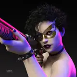
here's the process video for my recent drawing of luca and rin, you can access it by downloading the .mov file below.
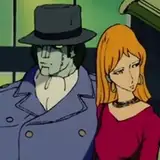
i keep working my way through old pose idea sketches that i want to turn into finished drawings. for this piece i went all the way back to december and the pose you can see in the upper left corner of this sketchdump. as is often the case i didn't 'assign' a pairing to that doodle at the time of sketching it, and there's so many characters i'm eager to draw right now, but this time i settled on luca and rin.
as you can see in the video, i use techniques and methods that should be pretty familiar by now. i start with a rough sketch that i gradually refine, and use an older painting of them as reference for their features and colours, drawing the lineart and laying down the base colours. i start with medium hues and gradually apply both darker and lighter gradients, basically 'sculpting' the forms of their bodies by adding smaller and smaller gradients and details. some of the gradients softly fade into each other, while others have sharp edges; some of the different hues pose a stark and defined contrast to each other, while others gently blend together. i tried something different for the background, adding a bold red splotch that gives the piece a completely different look than if the backdrop had been more tone-in-tone with the rest of the palette. using contrasts in value also makes the pose easier to read, so i make some areas a little darker and others a bit brighter. while i had used a charcoal brush for much of the colouring (and various 'artistic' brushes for the background) i switch to a small graphite brush to add details and polish the drawing. as per usual i had lots of fun experimenting with adding 'special effects' to both specific parts of the painting and to the whole canvas, some of them subtle and others drastically changing the look of the whole thing.
since i've already detailed my process in many other commentaries, i figured that instead of lingering on any of the steps briefly outlined above, i'd talk more about the choices i made to portray the vibe of this specific couple. the mood of a pairing and the 'genre' of their story sometimes (though not always) has a very pronounced influence on how i draw them, and i feel like luca and rin are a great example of that approach.
they're one of my all-time favourite couples and i adore how their story is quite dark and gritty in a sexy way, juxtaposing their unquestioning love for each other (and A+++ sex scenes) with the fact that they're both quite villainous, at least from a human perspective. they have that unsettling, scary, greedy vibe that you see in many folktales about man-eating monsters, warning people from venturing too far into the nighttime woods, where something dark and dangerous and very hungry might hunt them down like prey. in luca and rin's case they are literally vampiric, so they live off of blood and flesh and regular mortals do have many reasons to fear them. in short, their genre is folklory horror, and they are the things that go bump in the night.
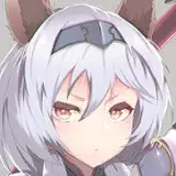
out of all our werewolves, luca probably has the most "dark and dangerous" design, reflecting his nature and his role in our stories. just compare him to qaragan or cian or andreas and the very different first impressions they give off. the shape of luca's head (notably his muzzle and ears) is inspired by a dobermann, a breed of dog that has a formidable and intimidating look. his shapes are relatively sharp, including his snout, ears, 'eyebrows,' and the 'spiky' way i draw his fur, especially his neck fluff and tail (again, compare this fur texture to the other werewolves mentioned above, who i usually draw with more rounded and 'friendly' shapes, making them look much more approachable).
i love showing off his teeth in an unsettling grin, too, and drawing his eyes all white and moon-like (i sometimes give him a small, piercing pupil, but his iris is always pale like moonstone). the rest of his colour palette is black, grey, and silver, which ties him to both the darkness of the night and the silvery light of the moon. on that note i usually give him a cold blue undertone, which i think gives him more of a horror story aesthetic (as opposed to warmer undertones, which tend to look more warm and comforting).
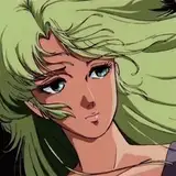
as for rin, he is canonically very pale (especially after luca turns him into a vampire) but there's different ways to draw pale skin. in rin's case, i usually go for an eerie type of paleness, as if his skin is lit by moonlight or have an ethereal, almost fae-like shine to it, in a way that doesn't necessarily look very natural or even 'alive.' it's supposed to be a beautiful but unsettling and otherwordly type of paleness, if that makes any kind of sense.
in terms of their sexual dynamic, rin has a very masterful personality in everyday life and takes absolutely zero shit from anyone--but in the bedroom he loves being submissive to luca, who in turn is very dominant, so they are a perfect fit. i like drawing luca hunched and hulking over rin, looming large, formidable and powerful, perhaps manhandling him a bit. at the same time rin's pleasured smile and relaxed body makes it obvious that he's enjoying himself, and that he has zero fear of his fearsome partner.
as you can tell by the many times i've mentioned the moon so far, the way i portray their combined aesthetic draws a lot on the role of luna and her silvery light in many a horror story, combined with the scary darkness of the rest of the night. any forest, mountain, or meadow looks beautifully eerie in moonlight, and the moon is of course intimately connected with (were)wolves. visually, the 'moonlit night' aesthetic goes so well with luca's silvery fur, his white eyes, and rin's pale skin. conceptually, it has always been viewed as a dangerous and spooky time, so i often find myself drawing luca and rin in nighttime scenes, using blue-ish colour palettes (for the background as well) and a sort of dimmed, shimmery, white light.
admittedly, i tried something new with this particular painting, but in ways that still align with their aesthetic. instead of a cold, blue midnight forest or dark room, this background is abstract and symbolic, with the bright red resembling a splatter of the blood they feed on. as you can see luca's fur had a very blue undertone until the very end of the process, when i decided to give it a somewhat more green tone, because i thought it looked better against the red. as an end result the colour palette isn't as blue as usual, but i think the splotch of red makes an unsettling impression and gives a clear idea of the vibe of the pairing. they're not the good guys.
if you have any questions about this process or about the lines of thought outlined above, don't hesitate to comment below! <3
// art + luca © me; rin © kubi.