here's the process video for march's MOTM painting--download the attached .mov file below!
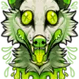
this all began with the idea that to properly show off the monster's saberteeth i wanted to portray him in profile, mouth partly open, with a stylised 'halo' behind his head to outline his profile and the shape of his fangs. from there i decided to have him bend in over his lover, because i'm very into the looming silhouette of an arched neck and back (further accentuated by the fluff of his mane). i think that posture carries with it a ... deliciously heavy kind of intimacy, if that makes sense?
once i had placed one of his hands on his partner's back, i decided to have him use the other to line his cock up with the ass eagerly being presented to him. since he has such a long tail i chose to use it to frame the lower half of the image and from out of nowhere i thought of adding a strange arch of waxy candles to the upper half, echoing the curve of his neck and completing the stylised framing. the different parts of the pose and composition kind of just fell into place, one after the other.
bit by bit i refined the sketch, until i could start working on the lineart. i kind of went ham with the linework here, because this kind of 'scruffy' design lends itself so well to rather intricate linearts. there was plenty of details to add, to begin with, what with all the teeth growing on him. but i also kept adding little lines and 'scratches' to illustrate the rough and leathery texture, the coarseness of his mane and tail tuft, and the beef of his body. i'd actually describe this lineart as 'messy' but in a good way, where the amount of detail adds to the rough vibe of the design. i topped it off by adding some simple shading, after which i set all my sketch and lineart layers to 'multiply' and coloured them a dark green (for reasons that will soon become apparent).
in the middle of adding the base colours i realised that the human's torso was a bit too long, so i adjusted his proportions, and then began colouring both characters. i started adding gradients to their bodies, using mostly my beloved charcoal-y brushes (and with my concept sketch as reference). the hues of the monster's leathery skin generally blend into one another rather smoothly and there's a lot of subtly shifting tones and undertones, but i made sure that there were enough contrasts in value and hue to make the pose easy to read.
however, i also wanted to add some neat lighting. i mentioned how old silent horror films and spooky victorian novels were at the back of my mind when i designed this lad. for that reason i just kept thinking of old school movie posters and book covers that use dramatic green or yellow lighting to add an otherwordly, creepy, or strange air to it. green lighting is of course a horror classic--just imagine a mad scientist in a cluttered laboratory, lit from below by luminescent green liquids in chemical containers and tubes; or an eerie green glow covering a graveyard or spooky swamp like a mysterious fog; or even the green lights that are all over the SAW movies. since my sabertoothed monster already had a mossy mane and undertones of olive to some areas of his skin, a bright green glow would go well with his colour scheme.
plus, it would be a fun challenge and change of pace to incorporate such a bright, lemony, almost neon green. we all have colours and palettes we favour over others, but lately i have been thinking more and more about experimenting with hues and colour combinations that i rarely use. it's easy to stick to what you know without even realising it, but i'm thinking back on every time i've tried something different from what i normally do and in the majority of those cases it's such a fun process and the results turn out so neat and refreshing. but that was a bit of a tangent--back to this particular piece.
i first made the background really green and added a brighter glow from below. i started adding green gradients to the human, and though i wanted the monster to look relatively dark and dull against the more vibrant backdrop he was much too grey at first. i increased the vibrance and saturation a bit... and then realised i should probably finish adding and polishing the details before i got too distracted with the lighting. i went over all the teeth, refined some of the linework, and finished 'sculpting' his musculature by adding smaller gradients of lighter and darker hues.
after all of that was done, it was time to add green overlays to the monster's body too--or at least to parts of him, as you can see in the video. those hints of green served to anchor him in the rest of the picture but i kept his head and neck fairly dark, because i thought it made him look more 'looming' in the way it accentuated his silhouette. you'll also note that i added a subtle blue overlay to his arms and hands, to differentiate them a bit more from his stomach and hip area. there's likewise some very minor hints of purple here and there, just because it looked cool and it helped pull the colour palette together. but most importantly i airbrushed a green overlay onto the whole image, which made a huge difference, making it look more vibrant and... uh, well, more green. at this point i was happy with the balance between eerie lighting and the monster still having a sufficiently mummified colour scheme, so i decided to call it a day.
i hope you liked this process video and as always, feel free to ask questions below!
// art + characters © me.