here’s the process video of the december monster of the month painting! you can download the video file below - but first, please read the next three paragraphs!
1) this process video is clearly different from my usual process packs, which consist of individual pngs of various steps of my process + a gif. i’ve recently gained access to an easy way to record video of my canvas, and i figured that from now on it would be fun to sometimes do a process pack, sometimes a process video. i’m going to make a poll and ask y’all what you think, now that you can see what the process videos would look like!
2) i’m SO sorry for the shitty quality of this video...! this is the very first time i recorded my canvas and i thought i would be able to determine the quality as i was exporting the video, but as it turns out i have to do it when i create the canvas and there’s no way to change it after the fact. now that i know this i’ll make damn sure that all future process videos are better quality. this one is low-res and muddy but i hope you can still get something out of it!
3) turns out that you can’t upload videos directly to patreon - you have to use vimeo or an url. vimeo does not allow sexually explicit content, so i’m going to have to keep looking for a video hosting site where nsfw stuff is permitted. for now, you can download the video file below. i know it’s more cumbersome than being able to view it right here on patreon, but i’m going to work on a solution and any tips on sex-friendly video hosting sites is most welcome!
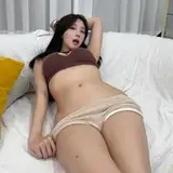
all that said, i can finally start talking about the painting itself. it actually marks another first as well; my first time making a piece of art in procreate, start to finish. i’ve been using it to do a ton of sketches, but i hadn’t properly coloured and finished a painting in this program until now. it was challenging because i’m so used to the photoshop brushes, tools, and shortcuts, but i’m gradually getting used to it and i’m sure i’ll streamline my process as time goes on.
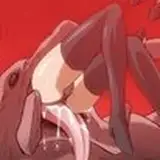
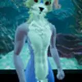
as always, it starts with coming up with a pose and doing a rough sketch. whenever i draw a winged monster i like showing of their wings but i also don’t want them to obscure their body too much. it took me a few attempts to figure out a good position, but i’m happy with how the final outcome also gives an explicit view of the, uh, mess they made.
the video shows how i refined the initial sketch ‘layer by layer,’ polishing it bit by bit until i was ready to do the lineart. you can see how i tried adding the thick braids seen on the concept sketch, but as mentioned in the design commentary i felt like it obscured the monster’s body too much. for the same reason, i ended up changing the position of their wing as well.
i lowered the transparency of the lineart, filled each character in with a basic flat colour, and started rendering their bodies. this was the most challenging part because i’m still not used to painting and colouring in procreate. it took me a while to figure out the most convenient way to use the freehand selection tool so i could use my lasso select + airbrush method. and yes, i know that you can import photoshop brushes into procreate 5, but i haven’t gotten around to it yet so i was working with a whole new set of brushes. i’m still experimenting and exploring to determine which procreate brushes work best for me, so there was a lot of trial and error going on.
mind you, i’m not trying to blame my tools, merely sharing my thoughts on getting used to a new art program. besides, there’s no blame to be placed - i’m super pleased and proud of how my first full procreate drawing turned out. but i’m getting ahead of myself.
the theory behind colouring the characters was the same as usual. there was some slight colour variation to the gryphon’s body - the overside of their legs and tail are slightly darker than the rest of their body, while their chest and the primary + secondary wing feathers are the most white. i started with a medium hue and used a charcoal-esque brush to add darker and lighter fields of colour as appropriate. sometimes i selected a specific area so i’d be able to conveniently colour it without painting outside the lines, such as selecting the primaries of the left wing so i could add the pale colour to it with a couple of big brush strokes instead of having to paint each individual feather.
when i realised that the colours were a bit too dark, i duplicated the layer, increased the brightness, adjusted the transparency, and merged it with the original layer. i kept adding paler colours and started adding details and texture, like the speckled feathering on their neck and arm, not to mention the spots on their tail and leg. at first i used the charcoal brush for the spots, but i thought they looked too smudgy, so i picked a much smaller brush (that mimics a graphite pen) and went over each spot with tiny brush strokes, simultaneously defining the shape and giving them fur texture.
i created more contrast between their body parts by adding some shadows and by making the pale areas even more pale, making the monster look less flat. i added shadows and highlights to their human lover as well and made his skintone warmer, again creating contrast between him and the gryphon monster. i added the speckles to their wings in much the same way as i had rendered the spots - it was a little tricky to avoid a ‘messy’ impression, what with the amount of spots and speckles, but i think i managed to achieve a nice balance.
once the basic colouring of the characters’ bodies was starting to feel finished, i began refining some of the lines and cleaning it all up a bit. i left the outlines much as before but went over the lineart where there was an overlap of bodyparts, because the somewhat thicker lines help create a distinction between them.
like often before, my favourite part is adding an overlay of a contrasting colour that adds a sense of depth and atmosphere. in this case i chose a cold blue that complemented the neutral colour scheme and made it look a bit more cold and wintery. both characters already had warm undertones but i realised it would look even better if i also added a yellow overlay to the ‘foreground.’ after that the only things that remained were to add the finishing touches (which in this case is an euphemism for a respectable amount of cum) and refining some details, like the human’s face.
art + characters © me.