download the attached .zip to access the process pack for july's MOTM painting--it contains 17 pngs and 1 gif.
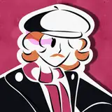
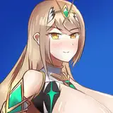
this painting began with the idea of a ghostly humanoid cradling the corvid monster's head in her arms, with the monster emerging from a pitch black background--hence the way her body seems cut in half in the first few process pictures, it was supposed to completely blend into the shadowy background. i wanted to show her crawling on the floor using all her arms in a pretty spidery way. it's not exactly a normal way of locomotion and seeing elbows jut out at that angle, along with the mental image of this long-bodied monster scurrying across the floor like a centipede, felt appropriately unsettling and creepy.
as already discussed in the design commentary i ended up going for a gothic victorian horror kind of look, which inspired the ghostly girlfriend's outfit but also the way this piece was drawn. i decided that this drawing would basically be 90% inks -- which would result in a method and style that's pretty different from my usual stuff nowadays, but i do have a history of occasionally wanting to draw something ink-centric.
i've included a step where i was simply experimenting with a few different brushes and finishing looks. at one point i considered drawing inspiration from medieval woodcuts, which could have resulted in a really neat stylised vibe. in the end, the artists that were in the back of my mind as i started inking were edward gorey, tove jansson, gustave doré, bernie wrightson, and a bit of mike mignola. i more or less wanted the piece to look like it could have been an illustration of a 19th century horror novel.
i chose a brush that imitates traditional ink in texture, and from the very start i worked towards creating a striking contrast between the dark corvid monster and the pale ghost lady. after ensuring that the inking style would work i finished the "lineart"--i'm putting in quotation marks because the lines would soon be 'swallowed up' by the rest of the inks anyway, and would mostly function as guidelines for the shading. my first plan was to add a very dark background that the corvid monster could melt out of. i soon realised how cut-off her body looked, however, so i decided to add her legs and a hint of her tail, after all.

i kept working on the inks and it was definitely the most time-consuming part of this whole process. i used relatively small brushes to create that textured look, kept the direction of the brush strokes constantly in mind, and used both black and white to create threedimensionality. i wasn't going for a realistic look at all and as you can see i inked her whole body in the same way, adding the same amount of detail and high contrast shading all over.
it looks like a jumbled mess at first (just look at step 09), but my plan was always to colour part of the inks with lighter greys rather than keeping it all pitch black, and also to add such dark greys underneath certain parts of it that the inks would blend into it more. both of these things would make it easier to digest, create a better balance of detail and texture, and give an impression of depth. i started with a plain layer of flat grey underneath the ink layer, and then added darker and lighter greys--just compare the huge difference between steps 10 and 11. at step 12 i made certain parts of the inks lighter, too.
next, i ... decided to completely change the background. i really liked the contrast of the ghost lady's white form against the shadowy backdrop, but i realised that the dark figure of our corvid monster against stark white looked even more striking. i gave the eerie lady some simple grey gradients to make her pop against the background, and would soon change her previously white halo to pitch black instead.
the inks had already taken care of much of the texture, but i spent some time adding more details to the corvid monster, using both white, black, and grey, and working both underneath and on top of the inks layer. she doesn't look quite as shaggy as on the concept sketch, because i found myself not wanting to 'obscure' her form too much with lots of tufts of hair along her limbs and such. but even then the small details make a big difference, she looks rough and leathery enough thanks to the texture of the inks, and my personal favourite part is the way her feathery neck turned out.
next i filled the gaps in the background with some more bits of foliage, and you'd think i was finished by then but there was one more thing i wanted to try. i very much liked the completely greyscale version but speaking of gothic victorian horror, what's more creepy than yellowed old photographs? i added a sepia tone to the picture, a hint of a dark vignette around the edges, a bit of blurryness to the corners, and after i had resized the image i also gave it a grainy noise effect. and bam--we're done.
// art + characters © me.