here we go, you can download the process pack for my phoenix monster of the month painting below; it contains 19 pngs and 1 gif!
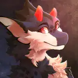
as always, it begins with a pose idea. i decided to draw a scene that was suggestive and erotic without being super explicit--the foreplay rather than the main act. don't get me wrong, i love to shamelessly draw graphically explicit stuff. but right now i'm also in a mood to explore poses and scenes that depict other facets of intimacy, rather than "just" slap-slap-slap dick/tongue/finger in hole, yknow? foreplay and aftercare is fun too (not to mention that intimacy and pleasure doesn't always have to be super sexual). so here we have our phoenix, grinding her thigh inbetween her human's legs, a mere taste of what's to come; she has great plans for him, but he has to be a good and patient boy before he gets his reward.
after carefully drawing the fairly detailed lineart, i added the basic flat colours to both the background and the characters. i did a colour palette for my own reference and added the basic big gradients to the phoenix, but before i spent too much time on the characters i wanted to more or less finish the background. in my munroe painting process pack i talk about painting the background first, in order to make sure that the colouring of the characters match the colouring of the background--i find it easier to do that if i start with the background rather than the other way around. i used various textured brushes to paint the wall frescos and stone throne, which, as mentioned in the design commentary, are directly based on the throne room of knossos. i basically finished the background at this early stage, though i'd make some edits and add some details later on. i coloured the characters using the same lasso select + airbrush technique that i've described in a fair few process packs by now. painting the human's skin involved some textured brushes, and towards the final stages of the process i used small brushes to polish up the lineart and add small details, making the whole thing look more refined and crisp.
there's a couple of reasons i opted to use different colouring styles for the characters and the background. for one, i like the look of it--it reminds me of 2D-animated movies, where the backgrounds are gorgeously painted while the characters are drawn and cel-shaded in a simpler fashion (which reminds me, i should absolutely draw some pictures that look like mock screencaps from old VHS movies...). but the difference in style between background and characters is also a way to tell the viewer which parts of the painting are "more important," as well as a way to balance out the amount of detail across the image. the characters are outlined by a thin-lined lineart, they're shaded with crisp gradient shadows, the texture is partially stylised (the brush strokes and 'raindrop' pattern on the phoenix), and the colouring is relatively bright and eye-catching, especially with the sharply defined highlights. the background, meanwhile, is done with either a rough lineart that barely shows up on the final painting (for the throne) or no lineart at all (the fresco and floor), and it's painted with brushes that give it texture rather than detail. it came out looking great (if i may say so myself) but serves as a backdrop for the characters rather than drawing attention away from them, if that makes sense. in the same vein, the details are concentrated on the characters rather than on the background; if the level of detail would have been the same across every inch of the picture, it would have looked way more messy and busy, and the eye wouldn't really have known where to settle.

one challenge related to the character-background relationship was that at one point (step 10) the colours of certain elements were rather close to one another, which made the image more difficult to read, since it was more tricky to tell where one part ended and another began. the phoenix herself is red-purple, a big chunk of the fresco is red, and the human's skin colour has warm red undertones. try squinting at step 10; the phoenix, human, and parts of the background blend into one another much more than in the final picture, while the throne and the beige-grey parts of the background were also difficult to tell apart. i used several tricks to fix this; i added a more yellow undertone to the human's skin, increased the brightness and contrast of the characters, and worked to create a clear difference in hue and value at certain points of overlap (for example the phoenix' beak vs the human's hair; their thighs; her hand on his butt; and so on). i also made the throne colder in temperature, and added a pale gradient to the left side of the background (right behind the characters, making them stand out against it more), while also adding shadows to the right side of it, making it darker.
the latter stages of this process also illustrate what a huge difference it can make to play around with value, brightness, contrast, and colour temperature settings; the image would have been much more dark and dull without the adjustments i made. just compare steps 15 and 16--not to mention steps 15 and 19. don't be afraid to experiment!
i'll be happy to answer any questions in the comments <3
// art + characters © me.