here's the process pack for this painting, feat. nian and tu shen. you can download the .zip below; it contains 24 pngs and 1 gif. the step-by-step images are pretty self-explanatory--i used a rather painterly method, and didn't utilise that many photoshop tricks this time around. the following discussion touches not only on the process, but also on some things that i was reflecting on while painting and while putting together this process pack.
the first few steps are the same as so many times before; a very rough pose idea, followed by a sketch, and then the lineart. the lines are pretty fine and relatively sketchy-looking at places. i have such mixed feelings towards doing linearts; i love it a lot more since i got my cintiq, and some days all i want to do is spend hours drawing clean, detailed linearts... but other times it's such a pain in the ass. in the case of the latter i like giving myself some leeway and leave the lines looking a bit rough at places, putting most of my effort into the most important parts of the picture. the rough lines can either be polished during the colouring process or left as they are; they'll usually blend into the colouring anyway, so they won't look out of place. in fact, mixing rough and refined lines might make the picture look more alive and interesting; if every single line is super precise, it can look a bit rigid and stiff.
the colouring is a bit more painterly and sketchy than in many of my recent pieces. i only used the lasso select + gradient thing at the very beginning, to establish some of the basic colours and how they change across nian's body. the rest of it is coloured in a more 'classically painterly' way, using mostly a square brush and an irregular brush, both with rugged edges and a bit of texture to them. i didn't always bother to 'paint within the lines' (see the scales on nian's left leg and tail, for example), which serves to draw attention to the areas that are coloured in a more careful manner; their faces and genitals.

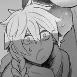
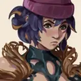
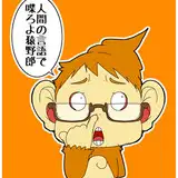
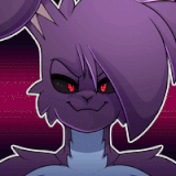
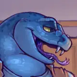
nian's colour scheme has honestly caused me a lot of headaches since his creation (along with his design in general). as already mentioned elsewhere, it's only recently that i've managed to settle on a design, after drawing and re-drawing a bunch of concepts of him. he's an amphibious creature so i wanted him to have a colour scheme that worked well both underwater and on land; his story takes place in China, so i looked to chinese art for inspiration; and another reason i was gravitating towards green was because i haven't used green in a lot of other designs, so i wanted to challenge myself. my first concept of him was rather ... garish, though, in lack of a better word. his main colour was a very bright green, with bright gold and red details. he looked like a cloisonné statue--and while i think cloisonné looks super neat, it didn't really work for his character design. i toned his colours down a bit, but still wasn't happy with them. i eventually re-designed him, using more muted greens combined with rather earthy hues of red and orange. i was... okay with that colour combination, but it still didn't feel quite right--plus i remembered that according to the myth, nian is afraid of the colour red, so it didn't make much sense for red to feature in his own colour scheme. i finally hit on the right colours with his recent re-design; the greens are fairly muted and natural-looking on most of his body, but he's got scales along his back, arms, legs, and tail that shimmer in a more vibrant green. it reads as rather toned down on the whole, with the shiny emerald scales providing a pop of vivid colour in a way that resembles the opalescence of magpie feathers.
aside from the concept sketches, this was the first "full" picture in which i put his new colour scheme into practise. tu shen is all white, accentuated by blushy hues of pink, and i absolutely love their combined colour scheme. as always, i didn't care much for the simple background to look realistic, i usually just go with a colour that goes well with the characters; in this case, that means they're fucking on some pink grass. :D
i eventually coloured parts of the lineart with hues that better blend into the surrounding colours, making the lines more subtle. i also painted on top of the lineart a bunch, cleaning it up and emphasizing certain outlines. for the scales on nian's arms and legs i kept the relatively sketchy-looking lines more or less intact, though. i didn't want to detail every single scale, as it might have looked too over-worked compared to the rest of the picture; i figured it best to keep the rough-ish look. i feel like i want to experiment with different ways to colour his scales, though, so maybe i'll return to that topic in some future process pack?
one tricky thing about nian's colouring (and the colouring of certain other characters) is that sometimes i get so busy getting the patterns/markings right that i sort of forget to ... shade the whole thing. with characters who are more or less monochromatic it's easier to add shadows in a way that looks good; when a character has a more complex colouring that involves more colours/distinct patterns, i feel like adding shadows sometimes obscures their colours and patterns and their bodies in general... so i admit that sometimes i sort of skip that step, which results in relatively flat-looking pictures. i generally don't mind, as long as i still like the style/colouring/#aesthetic, but even so it's something i've realised i want to work on. my colouring methods usually entail adding more or less texture in a way that adds more or less form to things, i tend to shade musculature rather carefully, and i'm keen on adding highlights, but i also tend to neglect core shadows and cast shadows--and often i don't even decide where the main source of light is situated, i just kind of wing it. in the case of this painting, parts of it is shaded while other parts look pretty flat, and the light is all over the place. the colouring is focused more on differences in hue than differences in value, in a way that still creates an impression of form--but i wonder what it would have looked like with more proper shading. don't get me wrong, i love the way it came out, this is just me reflecting on a thing i'd love to work on because it would be fun and help me improve!
this is also another example of me trying out a new-ish pose--i don't think i've drawn this particular sex position before? it's a good example of showing off both the character's faces, the penetrative action, and the general pose without the bodies being too obscured/the pose being difficult to read. i personally think that the trickiest part about this pose is figuring out where to place the top's hands and how to pose their topmost leg. depending on the angle it can involve some tricky foreshortening, but i gotta say, in this particular case i'm very happy with how the foreshortened muscles/shapes of nian's right leg turned out! (i'm not as happy with his right hand--i usually really love drawing hands, but sometimes it's like i forget everything i know about drawing fingers. oh well!)
as always, comment below if you have any questions or comments! <3
// art + nian © me; tu shen © kubi.