here's the process pack for this month's monster of the month painting, download it below!
i included quite a few sketch and lineart steps in this process pack; since this lineart is quite detailed, i spent more time sketching and doing the lineart than usual. i wanted to have all the details figured out and in place before i started linearting, so i spent quite a bit of time refining the sketch, from the first rough anatomy outlines (step 02) to thinner and thinner lines and smaller and smaller details. this way, i don't have to stop in the middle of the lineart to figure anything out, i just follow the lines of the most refined sketch, and before i know it i'm all done. doing several layers of increasingly refined sketches takes a bit more time than doing just one or two sketches, sure, but i prefer that to having to re-draw parts of the lineart if i discover that it doesn't work out.
sometimes my linearts are fairly simple and clean, and i end up adding painted details both beneath and on top of the lineart layer as i work. i tend to add texture details as i go, and then, towards the later stages of my default process, i create a few layers above the lineart layer for things such as cleaning up the lines, refining various parts of the painting, and adding finishing details. i did that with this painting too, but in this case i included a lot of small details in the lineart itself, which gives it a somewhat different vibe. it looks a bit more "busy" and "messy" than certain other linearts of mine, but i don't mean that in a bad way; it's just a different aesthetic that i felt was appropriate to the theme of summer and flourishing abundance.
i also went kind of easy on texture details when colouring this piece, using more or less smooth gradients for the shifting colours, highlights, and shadows. i figured that when the lineart is already so detailed, adding too much texture to the bodies of the characters could've easily made the picture look very messy and jumbled, so i allowed the lineart to do most of the work in conveying the textures; the fluffy softness of their fur, the flakey lightness of the flowers, witu's voluminous hair, and so on.
speaking of the lineart, as you can see when comparing steps 15 and 17, i experimented with colouring parts of the lineart in a lighter hue. this can look really cool and striking, and may add a neat stylized flair to a drawing... but i found that it didn't really work for this piece, since it obscured some of the details of especially the mane fluff, so i reverted back to a darker lineart.

at step 16 you can see how i increased the vibrance slightly (image -> adjustments -> vibrance) to make the colours more warm, summer-y, and sunshine-y. but i also added a 'faded' effect to the parts of the painting that are further away, sort of 'pushing them into the background' to create more of a sense of depth. i felt that it made the picture easier to read; again, there's a lot of details, textures, and colours happening here, and i was concerned that it would be difficult to tell what's what. i created the fading effect on a separate layer at step 16, but then i hid that layer out of view while working on the piece, adding details on the original layers and in the 'original' colours. when i was happy with it i just made the 'faded effect' layer visible again, on top of everything else. at step 21 i also pulled their faces into the foreground a bit by adding a warmer hue and upping the contrast. these are all little ways to both distinguish parts of the painting from one another, _and_ tell the viewer where to focus. more vibrant and detailed areas with a higher contrast demands attention, while faded areas with lower contrast signals that they are not the most important parts of the painting.
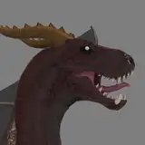
i didn't deviate much from my original concept sketches of these characters. i think that with the past four monster of the months i've drawn i ended up changing some parts of the designs in the process from concept art to finished painting, but in this case there's only two minor things i can think of. all the flowers are red instead of red and white, just because i liked the way it look when there was an abundance of red. it would have looked neat with some white flowers too, so there wasn't really any right or wrong there. i also made the big boy's antlers dark brown all over instead of overgrown with moss; it would have looked great and i tried adding some green, but tbh it made his antlers blend into his green mane too much, making it difficult to tell what's what. i decided to keep them dark brown instead, for increased readability of the picture. (i mentioned how his appearance changes a bit with the seasons, though, so it's entirely possible his antlers are overgrown with various things at different times of the year.)
in hindsight i wish i would have spent more time on the background--it would have looked fantastic to situate this scene in a lush clearing in the woods, against a backdrop of rich greens and the characters being flooded with warm sunlight. i need to draw more proper backgrounds, really. but hey, guess that's just another reason to draw these two again, right?
// art + big boy © me; witu © kubi.