voilà, the process pack for this painting of renza and iskandar! the .zip, which you can find attached below, contains 18 (!) pngs and 1 gif.
for this piece i used much the same lasso select + gradient tool technique as described here, so i'm not going to repeat what i already discussed in that post. instead, let's talk about the unforeseen challenges i found myself facing as i coloured this image.
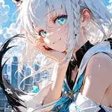
firstly, i love the colour scheme of this pairing; they're all warmth and sunshine, with iskandar's gold scales and renza's blond hair + tan skin. in practice, however, working with such matchy-matchy hues is tricky in that they might blend together into a single mass of yellow-ochre-tan, making it difficult to tell where one character ends and the other begins. like i've mentioned before, i like making my pictures easy to read, where you're immediately able to tell what's what. i feel like i didn't entirely succeed with it, in this case; i tried using different hues of yellow/gold/tan for the characters, giving renza's skin a somewhat warmer undertone than iskandar's scales, but there's still parts of it (such as renza's thigh and iskandar's thumb) where the colours are very similar. the picture still works just fine, because of the bold lineart and the differences in value, but in the future i'm going to work on how to subtly differentiate their colours a bit more - and on how to better portray the difference in texture between skin and scales.
the other main challenge was - how the heck to colour golden scales without making it look too yellow, too gaudy, too bright, or too ... artificial? i didn't want him to look like a tacky brass statue or like he was beaming like a beacon; he shouldn't be too shiny but not too matte, either; and i wanted him to look organic, not metallic, but i still wanted him to look golden rather than merely yellow. as you can see i desaturated the colours of his scales at step 15, because i felt like through steps 12-14 he had started looking too shiny in the gaudy statue way. i ended up making the shadows on his scales purple/blue-ish rather than reddish and tried not to go overboard with the highlights. but i'm still not entirely sure i achieved the look i wanted, so that's something i'm going to work on as well. it might look better to add more detail to his scaling, as opposed to the smooth, "polished"-looking texture of this picture... AH WELL. LIVE AND LEARN.
// art + iskandar © me; renza © kubi.