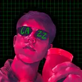
A little spoiler here. I want to make this illustration into an acrylic stand, but I'm always torn between minor changes in effect. I'm not sure which one is better. Could you help me decide which one you prefer?1 or 2?
Bryanna Stander
2024-04-15 22:54:22 +0000 UTCKUMAICE CREAM
2024-04-14 08:55:52 +0000 UTCKUMAICE CREAM
2024-04-14 08:54:41 +0000 UTCKUMAICE CREAM
2024-04-14 08:54:01 +0000 UTCKUMAICE CREAM
2024-04-14 08:53:07 +0000 UTCLoba Negra
2024-04-14 00:13:48 +0000 UTCJerrinev
2024-04-13 23:17:26 +0000 UTCSgurd Olson
2024-04-13 22:28:47 +0000 UTCdiaz adventures
2024-04-13 19:09:35 +0000 UTCDaydreaminTiger
2024-04-13 16:32:46 +0000 UTCdogexmachina
2024-04-13 16:07:48 +0000 UTCTiffany Nguyen
2024-04-13 15:12:57 +0000 UTCbest_ratchet
2024-04-13 15:08:04 +0000 UTCDante Sol
2024-04-13 14:38:02 +0000 UTCDerek Potter
2024-04-13 14:13:50 +0000 UTCCharlie
2024-04-13 14:00:34 +0000 UTCSanmei
2024-04-13 13:46:25 +0000 UTCDeusAxeMachina
2024-04-13 12:42:52 +0000 UTCvoyager-ngc5195
2024-04-13 11:54:42 +0000 UTCBaboulinet
2024-04-13 11:47:56 +0000 UTCBaby Sweet
2024-04-13 11:37:09 +0000 UTCAnthony Melnyk
2024-04-13 11:23:18 +0000 UTCZhana
2024-04-13 10:39:41 +0000 UTCYangmao
2024-04-13 10:24:49 +0000 UTC