General status update + some sketches.
Added 2018-01-11 19:37:15 +0000 UTCHey guys! I might start making posts here more often from now on. about what's going on, what am I doing, and why the hell it is not drawing more comic pages. Generally, whenever Im not drawing stuff to post, pretty much all Im doing is trying to improve some aspect of what Im making. Perhaps knowing more details would be interesting to some of you, and I myself could always use some advice or simply a second opinion (more like third tbh, but still).
My general position about the comic is that I dont want to make more pages until I know Ill be able to do them well enough. I understand its sort of silly to care so much about quality in something like this, but its important for me, so Ill keep trying to do it as well as I can.
Anyway, right now Im working on a problem where, as I see it, my drawings sometimes dont convey well enough what they should - the situation, the mood, the context - or fail to convey any altogether. The reason lies mostly with poses/faces not being natural and expressive enough, and sometimes with camera angles being boring and bland, or not showing enough details. To improve on that, I plan to spend some time drawing stuff with emphasis on expressing some kind of idea - for example, the few latest arts with Shy were a very, very simple example of that. Here is another one Ive been trying to do:
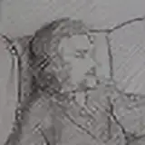
I tried various poses and angles to see what would look best, and I ended up with the following two:
The first one converys the idea well, I think; I generally like the poses and the expressions. However, the camera angle is boring and doesnt add anything, the bodies cant be seen very well, and there is a lot of not very needed background that takes space. The poses also are dont work very well with pone anatomy as Ive been drawing it. Compared to that, the second angle is more interesting on itself, shows the bodies much better, fits the anatomy, and cuts on unnecessary background, However, the poses themselves and much less natural or expressive, the face cant be seen very well either, and the situation makes a bit less sense with a background guy sitting directly across them. Overall, Im not sure which one of the two is better, or what I could do to make it better still. What do you think?
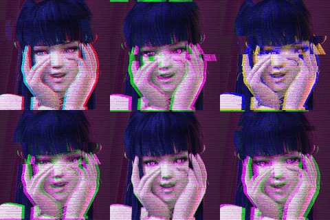
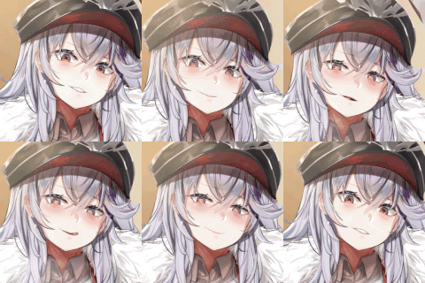
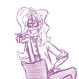
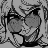
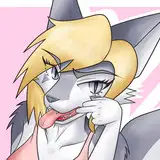
Oh, and also, have a bunch of other sketches from the last few days. I dont think those came out very well, so I probably wont be finishing most of them.
Comments
It's not silly to care about the quality. It is a little silly to think the quality you have is bad though, you're one of the bast pony artists I've seen! To answer your question, I like the style of the first variant more. I love seeing (Octavis?)'s expression and her trying to hide the other pony from the conductor walking past right next to her.
TetheredAngel
2018-01-14 20:34:03 +0000 UTC