Hello and happy new year! <3
I hope you've had a lovely end of the year and could start off 2025 feeling fresh :D
I got to visit my family, spend some time at home again and see some old friends, because we're all back in our hometown for once haha. And then the last couple of days I was back in the studio reeeally busy working on that 2024 wrap-up video because I wanted to get that out before the year ended :)
So, finally, I got around to catching up with the Patreon content now. I shot a neat tutorial for you that is coming soon. Postcards are in the works and will be sent out next week and today I finished working on the preset.
The preset for December is called "Yoyogi Faders", which I know, sounds like either a 90s boy band or a parody of the Power Rangers, BUT I just impulsively named the preset while working on it and then the name sort of stuck with me hahah :,D
Yoyogi is a district in Tokyo and this preset works with faded looks, which I believe is why I initially came up with the name.
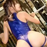
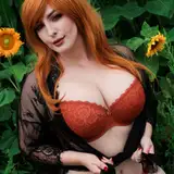
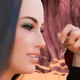
Anyway, as usual I've put together a bunch of previews for you. This look is one based off of a trend I've been seeing among Japanese photographers. It came to my attention that among Japanese photographers (at least the ones I follow) it is quite popular to edit with a cool and slightly airy or faded look, which is something I don't see as much in the west. Here in Europe or across the pond on the American continent, it seems to me that a more contrasty and warm leaning look is common, which by the way is also my preference, as you know :D
I decided to create a look based off of the airy blue-hued look I commonly see from Japanese photographers and this preset is the result.
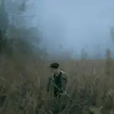
The preset will bring out some more details of your RAW file by decreasing the overall contrast and boosting the shadows. Additionally I've added a significant fade to both the blacks and the whites which creates this airy look, which can also often make a photograph look more vintage. Especially the Baseball-photo that I've added to the previews reminds me of an old photo you'd see on a postcard that has faded over the years.
The colours with this preset aren't drastically altered apart from an overall hue that covers the image. The highlights get that cool blue tone while the shadows are kept warm.
When it comes to my recommended application, I must say, this one appears to be a decent allrounder. I've applied this to sunny photos, photos in the shade, rainy photos and even a night photo and it always produced an acceptable edit at worst and a great edit at best.
I can especially see this preset working well for design projects in which a set of photographs need to be unified in their look.
Also this one was very easy to apply. Many of the photos in the preview are literally one-click-edits without any changes after applying the preset. For the few that do have some adjustments made, it was sufficient to only change the exposure slider to refine the brightness of the image.
I hope you enjoy this one! If you have any questions, you can simply ask ahead in either the comments or via a direct message here on Patreon :)
Wishing you a lovely week! <3
Teo
T
2026-01-02 17:45:06 +0000 UTCR L
2025-12-24 21:56:54 +0000 UTCT
2025-02-12 09:47:15 +0000 UTCNova Kowalski
2025-02-12 01:23:43 +0000 UTCT
2025-01-15 07:44:43 +0000 UTCAyisha Jadyn Calderon
2025-01-15 06:42:05 +0000 UTC