![Cards of Gluttony Dev Log #20 [26/11/2024]](https://img5.xaiju.com/storage/3/lh/cs/d38796-019e8388-446c-79fe-bb48-8417b764ae67.png)
![Cards of Gluttony Dev Log #20 [26/11/2024]](https://img5.xaiju.com/storage/5/cl/gp/d38796-019e8388-446d-7b25-b1d8-375c10767fe3.png)
![Cards of Gluttony Dev Log #20 [26/11/2024]](https://img5.xaiju.com/storage/12/lh/ra/d38796-019e8388-446e-763a-ba9b-0dcbfc4cb294.png)
![Cards of Gluttony Dev Log #20 [26/11/2024]](https://img5.xaiju.com/storage/3/fi/im/d38796-019e8388-4473-7c04-a58d-5b51f68fe91c.png)
![Cards of Gluttony Dev Log #20 [26/11/2024]](https://img5.xaiju.com/storage/9/aj/kh/d38796-019e8388-4473-7ec6-9c21-49c79a5757e8.png)
![Cards of Gluttony Dev Log #20 [26/11/2024]](https://img5.xaiju.com/storage/1/ye/az/d38796-019e8388-4476-75fa-8f92-9436bb7e9043.png)
![Cards of Gluttony Dev Log #20 [26/11/2024]](https://img5.xaiju.com/storage/4/nt/ma/d38796-019e8388-447a-765e-8a03-c9447523f809.png)
![Cards of Gluttony Dev Log #20 [26/11/2024]](https://img5.xaiju.com/storage/12/pr/ju/d38796-019e8388-447a-7add-99aa-a1d24f8371b1.png)
![Cards of Gluttony Dev Log #20 [26/11/2024]](https://img5.xaiju.com/storage/4/hh/lo/d38796-019e8388-447c-73fc-9a60-d413f9761789.png)
![Cards of Gluttony Dev Log #20 [26/11/2024]](https://img5.xaiju.com/storage/11/bg/ft/d38796-019e8388-447d-73be-9fcd-7c5ec7fa553c.png)
![Cards of Gluttony Dev Log #20 [26/11/2024]](https://img5.xaiju.com/storage/12/lr/uy/d38796-019e8388-4481-7e0e-a3a7-75b25fc2df0e.png)

Hey everyone! This one's coming with a slight delay, but shh, let's still say it's the 26th of November for consistency's sake.
The past two weeks or so have been a bit busy for me as I've just moved into a new apartment! This hasn't impacted development on the game much, as I have still been able to get my usual scheduled hours in, but it'll be interesting to see how it affects things going forward, now that I have a stable, focused space to work from.
That's the small life update tidbit for you at the beginning of this post, and from here on out, it's just development news galore... let's get started!
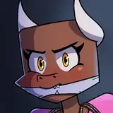
Continuing on from the previous month, I've been dwelling in the art cave popping out new sprites for some of the new fashion you'll see in the upcoming update!
... I could show you everything I added, one by one, but why do that when I can show off a few outfit combinations instead and give you an idea of how much variety there is?
 (The answer is: medium. A reasonable amount of variety. But it sure is far more variety than the current options of: either T-shirt or a Button-up shirt.)
What's new in these screenshots? A new top featuring an unbuttoned shirt (including several plaid variants!), cargo pants, a flatcap, as well as a few new color options for existing items I haven't shown previously.
The plaid shirt actually ended up being one of the most complex art assets I've had to make in a while, since I needed the various lines and checkers to be separate so that I could easily color them independently as I wanted for the color variants.

(It was worth it though, look at all these colors!)
Originally I planned on having quite a sizable section here that went on a deep dive about how I decided to implement the color variations... but I actually ended up having a breakthrough of sorts, and the way I'm dealing with them right now may be reworked in the future so... let's move away from fashion for now, and take a look at graphic design instead!
In the previous development log, I talked a little about how the UI of the game is starting to evolve, more specifically: with my newfound knowledge and experience, all of the new UI added in the recent update has been more responsive, animated and lively. I mentioned that this new style of UI design will likely be slowly carried over into all of the existing UI elements, and this month I started taking the first steps.
I say that, but I didn't touch animations at all! Actually, the first thing I did was update the UI with a few new buttons:

(Not quite the most interesting change, visually.)
It's about time I added a proper icon for the (?) - "help" and X - "close" buttons. Up until now, they were simply text buttons. It's more obvious on the (?) than the X, what with the parentheses and all, but in terms of UI design, the X ended up being quite a pain actual, due to various positioning and symmetry issues.
Neat! In the end it only took me about 20 minutes total to draw these and slot them into the game properly to replace the old buttons. Why didn't I do this sooner?

(This one has a bit more of an interesting story behind it.)
Actually, It's time I started moving away from these clunky text buttons as well. There are many of these sprinkled throughout the game, and not just the "Exit" one. There are also some that say "Done", "Finish", or "Leave", but they're all functionally the same.
Aside from looking pretty unwieldly, there is one very significant issue that made it clear to me these needed to be removed at some point: localization. Thanks to a few volunteers, multiple language support for CoG is looking more and more like something that is actually going to happen... which also means it brought up a slew of new issues I hadn't even considered during the early days of development.
These buttons are an example of one such problem... the issue is the fact that the word "Exit" may not be as small and compact in other languages. There have been several issues with translated UI cutting off, overlapping with each other, being too long, looking awkward, and so on.
This change not only fixes the problem, but it also reduces a bit of the localization workload by just... not using any words at all! A bit of caution will be necessary here though, to make sure that the UI doesn't become an illegible, enigmatic mess of wordless icons that barely communicate their function at first glance.
With the gardening and foraging minigames added in the previous update, a ton of crafting recipes got updated to use the new materials. As a result, some recipes have grown to include quite a few requirements, which was starting to feel a little cramped in the little UI window you get while crafting. So let's fix that!
There's nothing particularly heinous about the crafting UI as it is currently though, and right now isn't exactly the best time to be redesigning entire old interfaces from the ground up... so what we're looking for is small tweaks that we can do to the existing UI.
The thing is, pretty much every single crafting recipe in the game requires the various Zests sprinkled throughout gameplay. It's how the game incentivizes the player to do various activities, which also helps associate different card types with certain actions. But that also means that, almost always, the first 1-3 rows of the crafting recipe are occupied by the Zests alone.
... and there's our problem! Now to design a solution.

(The updated crafting menu!)
It's nothing too drastic, really. As you can see, the crafting UI now neatly compresses all of the Zests into their own little row. This got rid of the scrollbar on the recipe for several of the cards, and should hopefully make it more legible by clearly singling out the more grindable, general-purpose Zests.
(The crafting menu at Ricky's has also been updated to use this new UI!)
Additionally, you may have also noticed the two new tabs in the screenshot above! Cards are now grouped into "Standard" and "Signature" cards. The "Signature" tab is where you'll find all the cards that require the reward you get for beating the owner of the card.
This way, the cards will be neatly organized and separated, and you will no longer have to scroll through a bunch of regular cards just to find the one you can craft with the shiny new material you just got!
This month, allow me to show, I'll continue with a teaser from the same scene that I showed previously:

"It'll only be a minute, but... seeing as you're here, you might as well make yourself comfortable." - Ikem
(Pretend the background sketch isn't there! I haven't had much time to work on art assets other than clothing so far!)
I do quite enjoy giving all the various characters silly little outfit variations. I'm not quite sure what I want to do about Ikem's "main" outfit, which currently only appears only once in the game... in the intro.

(Ikem's "default" clothing.)
This outfit was designed a bit early into the writing of the game, back when Ikem's tailoring hobby was more than just a hobby... he was an entire fashion designer! But looking back at it now, it looks to be a bit too much, considering 90% of the time you see him in-game, it's just in his workout clothes.
In the end, I took a strange pivot and made him a translator instead. However, considering the way things are going, I might end up just completely ret-conning that and going back to making him a fashion icon instead.
That's enough reminiscing about how I wrote the game, now it's time to talk about the gameplay side of things!
Here's an interesting topic that I haven't had much of a chance to talk about until now: nerfing! That is to say, updating already existing cards in the game to make them... worse.
As a human being that plays video games itself, I don't feel particularly great about nerfing things in the game. It always feels bad to have a tool you've familiarized yourself with and built a ton of strategies around to just... stop working one day.
However, now that the card game aspect of CoG has shifted and evolved far beyond my expectations, and many new mechanics and nuances have emerged, it's hard not to stumble into balance-breaking issues, ones that definitely need to be addressed.
Though, it's not like I haven't nerfed, or even strengthened cards until now. If you look through the patch notes, you'll see many of them listed one by one under "Changes - Cards"! I just figured it could be fun to actually bring this up and talk about it in one of the logs. Especially since I'm about to do what I feel is one of the most significant card nerfs so far.
And with that preamble... which card could I possibly be talking about then? It's.... the one and only:

Sympathy Weight
Every Wgt you gain (after Fit calculation), your Opponent also gains (3 turns).
The way Sympathy Weight ends up affecting a given match is just strange. It just bounces all the Wgt back? There is a bit more nuance to it, but a lot of the time, what it means is that the opponent ends up avoiding attacking for a turn... hell, that's what the AI does anyways. This doesn't feel particularly great for the feel and flow of a match.
Another issue is the fact that it inherently benefits the person with the bigger Wgt range - typically the player. One could technically activate Sympathy weight, and just quickly attempt to rush through, not having to worry about effects that cause self-inflicted Wgt, which were originally meant to be a downside... but are now just a net zero loss while still managing to inch the opponent closer towards defeat.
So how did I decide to dampen this effect?

Every time you gain any amount of Wgt, your Opponent gains +1 Wgt (3 turns).
The effect is now reduced to only inflict +1 Wgt at a time, rather than completely mirror the amount the user gained.
In theory, it shouldn't make that much of a difference in the game's current state, as many of the cards still typically only inflict 1 Wgt at a time... but as time goes on and more hard-hitting cards are introduced, it's possible that this will make Sympathy Weight less effective, which is exactly how a card from early on in the game should behave!
And since we're already on the topic of cards, allow me to segue into another one:

Protein Shake
At the end of your every turn: gain +2 Fit if a DEFENSIVE card was played, otherwise gain +1 Wgt (10 turns).
A great tool... in the right hands.
With a far more appropriate theme than last month's card, it's... a protein shake! Continuing the trend of longer statuses, I ended up settling on making this one last a whopping 10 whole turns.
I originally started with 6, for 3 activations, but then I realized that the longer this status stays on, the more opportunity there will be for the "downside" effect to happen.
I also originally had the downside effect at +2 Wgt, but ended up lowering it down to +1, due to feeling like it would make it too difficult to use this card properly, seeing as a single miss would set back the benefits too easily.
Once again I have nothing particularly interesting to say to close off this post, so as always, thank you for reading and for supporting the project!
Turmeric Watercress
2024-11-27 17:18:19 +0000 UTCOak Fells
2024-11-27 15:03:12 +0000 UTCSilverLionfang
2024-11-27 13:53:00 +0000 UTCM. Anthony Horne-Williams
2024-11-27 02:44:04 +0000 UTCOak Fells
2024-11-27 02:42:11 +0000 UTCM. Anthony Horne-Williams
2024-11-27 02:39:14 +0000 UTC