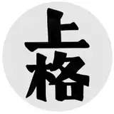
We've revamped the official Dreamkeepers logo!
A Sketch of the Month idea few months back was '1980s Dreamkeepers,' so I did a thumbnail as though they were an animation golden-era TV show. But they basically looked the same, as characters- however the '1980s' logo revamp looked enticing.

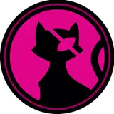
The original 'Dreamkeepers' logo we had from 2003-2004 or so. Part of the old logo was CG modeled from scratch, and part was a font that we curved and distorted. 'Old Logo' held up fine, but we felt like like it was time to grow.
The new logo is crafted entirely from scratch, with each letter hand drawn. We went through a few drafts to get exactly the right feel from our custom font.

 From sketches, we vectored every letter by hand so we can scale everything as needed in the future.

 Then the fun part!
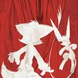
Once the logo reads properly as a simple black-stamp shape, it's on to the more fancy variants.
Painting the fancy strokes, textures, and effects. I decided to put a reflection of the Dreamworld map into the surface in this one, to give it a more fantasy-metallic feel.
 And there we go! The new Dreamkeepers logo is ready for action.
How is started vs how it's going:

 Especially with the Dreamkeepers TTRPG in the works, if there was a time to upgrade the look of the series, it was before those books launch.
We've come a long ways together, and we're trying our best to level up and make the series even sharper and more fun as we go. Onwards!
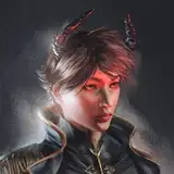
ALSO: If you want a physical copy of this illustration signed by me 'n Liz, it's going to be April's official Art Attack print!
(Reward mailed for Art Attack tier backers & up.)
TimeSeer
2025-04-24 18:36:55 +0000 UTC