![Sensual Bond [BBC & QoS]](https://img5.xaiju.com/storage/6/hb/nb/d38796-019e8419-3b49-74cf-9bde-08a162e67cb8.png)
![Sensual Bond [BBC & QoS]](https://img5.xaiju.com/storage/8/ko/hf/d38796-019e8419-3b4f-7017-91e8-8454b96315d7.png)
![Sensual Bond [BBC & QoS]](https://img5.xaiju.com/storage/5/ja/uw/d38796-019e8419-3b53-76b2-9f1f-8464f27c1e8f.png)
![Sensual Bond [BBC & QoS]](https://img5.xaiju.com/storage/2/ot/kd/d38796-019e8419-3b5b-717f-9170-6f2efd236390.png)
![Sensual Bond [BBC & QoS]](https://img5.xaiju.com/storage/3/jz/xy/d38796-019e8419-3b61-71db-b948-6d0cf973d790.png)
![Sensual Bond [BBC & QoS]](https://img5.xaiju.com/storage/9/uv/pd/d38796-019e8419-3b6a-7dd8-be29-3d3944fc7b26.png)
![Sensual Bond [BBC & QoS]](https://img5.xaiju.com/storage/9/gr/aa/d38796-019e8419-3b80-78a2-b4b3-b3ef1347c5da.png)
![Sensual Bond [BBC & QoS]](https://img5.xaiju.com/storage/3/wb/xp/d38796-019e8419-3b81-7bb7-8cad-e080e13863cb.png)
![Sensual Bond [BBC & QoS]](https://img5.xaiju.com/storage/7/xp/ls/d38796-019e8419-3b87-7154-8992-c028bab8de16.png)
![Sensual Bond [BBC & QoS]](https://img5.xaiju.com/storage/10/kl/ws/d38796-019e8419-3b8f-7ecc-ac1f-3b8d4baddd0c.png)
![Sensual Bond [BBC & QoS]](https://img5.xaiju.com/storage/1/nh/xm/d38796-019e8419-3b94-799e-95ca-e3cbfaab0afa.png)
![Sensual Bond [BBC & QoS]](https://img5.xaiju.com/storage/9/ph/bw/d38796-019e8419-3b98-75c6-b02d-7249d765365e.png)
![Sensual Bond [BBC & QoS]](https://img5.xaiju.com/storage/6/eq/rw/d38796-019e8419-3ba2-756b-b75d-2999a5401c7e.png)
![Sensual Bond [BBC & QoS]](https://img5.xaiju.com/storage/3/ig/kr/d38796-019e8419-3ba7-70b6-874d-f25c3ae20729.png)
![Sensual Bond [BBC & QoS]](https://img5.xaiju.com/storage/3/qa/xj/d38796-019e8419-3bb0-7e55-9834-6875b936eff6.jpg)

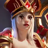
I received feedback that the illustration looked darker than it should, so I adjusted the lighting a bit. In this illustration, I decided to experiment with the size of the QoS tattoos. Usually, I draw them smaller, but this time I tried making them larger to see how it would affect the overall composition and visual impact. Let me know what you think about this variation!