Hey everyone ~~
April's print has gone out to Riso subscribers (and stickers are still on their way!) so everyone should be receiving their Maze's End print now (or soon)!! Woo! May's prints are around the corner, I'll be printing them when I get back from my ~~honeymooonnnn~~!

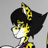
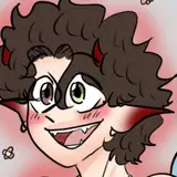
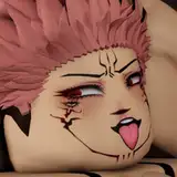
This piece was based on my Magic the Gathering card from the 20 Ways to Win deck, which came out in February! The plan is to soon make the Morophon card into a print, and later in the year do the Beholder as well. It's a fun challenge to make these pieces into Riso prints that work on their own without the text or borders of the card!

Translating this digitally drawn card into a Riso file took a lot of editing on the back end. I had to essentially break the entire file and build it up from scratch from the flats. It was also so tough looking at the digital version in RGB to compare, which has lots of vibrant blues in it, plus the digital file will always look more luminous because it's backlit from the screen. Comparing the two was frustrating, but my ultimate goal was not to do a perfect translation of the digital Magic card, but to make a Riso print that was sweet and could stand on it's own without the card as reference.
Here's what the color mock-up looked like when I built it with all the Riso colors:

Here's what the files turned out looking like in the photoshop document: lots of extra layers that aren't labeled (usually a gradient or I was trying a value that I wasn't sure about for final). right now I like to make 8 values to start instead of 4- that's 15%, 25, 35, 50, 65, 75, 85, 100% opacity layers. You can see below I name my layer according to the opacity. Also always making each layer set to multpily!

And here's the full breakdown! I'll add it in the uploads too in case this is too small to read.


This print is a bit darker than what I'm used to because I did want it to still keep the original feeling of entering a bright, lit up party from a dark entrance. The vibrancy of the yellows and fluorescent pinks against the dark border was fun to play with, while making sure the dark entrance didn't get too dark and lose a lot of the detailed lines that needed to stay blue. This is the cool thing about the two color machine I'm setting up now- I'll be able to make the line art a different color than the three I work in now. I do like the limited color palette but I am extremely excited about adding a brown or a burgundy as an option for line (in place of black in CMYK), rather than just usually blue for the darkest color.

This print went through several iterations- I think I did a total of 10 passes to get it right. Here are the six passes I did document. Sometimes a pass can have the wrong blue or I could have changed something slightly but gone back to the previous combination...I am less likely to document those but I think it's worth telling you that they happened. I have to try every variation in order to be happy, sometimes it gets excessive and it means long hours in the studio.
I liked the 5th color variation above, but I felt it was too dark in places. Looking at the differences between the first print and the last print is laughable, and now I'm feeling like 5 might have been the right print...but I know in person the print is much more vibrant and darker than in the photo, and ultimately I trust my eyes for the real-life Riso print, not the digital photo of it. I'm writing this from my honeymoon lol so I don't have the prints in front of me, but want to mention that sometimes seeing all the variations together like this weeks after printing can make me insane, but ultimately I trust that I made the right choice when I was in the moment printing.
Maybe I'll never get the colors 'right', and I'll never be fully confident when something is done- but that's the great magic of being an artist and making subjective work, isn't it? I have to have faith that this is the most interesting color variation and that I've chosen a color combination that really conveys the emotion in the characters and the subject matter. Having doubt is the way I grow and experiment, and push myself to learn more about my craft.

Here are some cool color separations for this print- these are going out to my support patrons in the higher tiers- thank you!!!
You'll notice in these prints I leave a little white space on the side- that's the area I'm putting through the machine first to keep the roller marks as light as possible! I knew I wanted a slightly squarer print than 8 1/2 x 11", so the print became 8 1/2 x 9 1/2" and off-centered for that roller-mark buffer space.

I had an amazing time drawing these little guys- still so in love with this little band~~

Also! Big news-- I'm moving!! And having a sale to cover costs!

I'm jumping on a space that's ben available for a few years in the same building as my current space, and getting a little discount on it! It'll be a significant jump in expenses per month but it's been a dream to have a space where I can invite people into my studio for events and workshops again, plus have a little retail area where I can have open studio time. My current studio has become box city with shipping supplies and paper production and it's not really ideal for the kind of community space I hoped I'd have in a studio space outside my home.
We'll see how it all pans out, but for now I'm going to do a little sale in my shop to cover some of my moving expenses. I recently bought a new two drum machine so this is also a little bit paying for that as well. Lots of big moves in a short amount of time- it's exciting and a little psychotic...my kind of flavors.
Instead of the regular moving sale, please use the Patron only 30% off code DREAMERS at checkout for a little extra % off! https://www.natalieandrewson.com/discount/DREAMERS