Hey everyone!
During this process, I found myself struggling to capture the visual "vibe" of the references that I used as inspiration and concept. Let me share with you how I dealt with this issue in today's character design illustration.
So, what does "vibe" mean in a visual context? Commonly used in conversational English, "vibe" conveys a particular feeling or atmosphere associated with a person, place, or thing. It stems from the word "vibration," with roots in physics. However, its usage has evolved to signify a more subjective, intuitive sense of the character or quality of something.
Visually, a "vibe" could be the total aesthetic or mood that a certain visual element or collection of elements conveys. This could include shapes, values, and colors. For example, dark tones, angular shapes, and stark contrasts might impart a "gothic" vibe. On the other hand, pastel colors, rounded shapes, and soft light might generate a "gentle" or "dreamy" vibe.
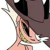
In today’s character designs, I created three girls who are enjoying a meal together. These characters are inspired by three different types of bears: the polar bear, grizzly bear, and black bear. To capture the essence of each reference, I had to visually define the concept of vibe, then structure its characteristics and adapt them according to my creative process. The goal was to enable the audience to recognize these collections of visual elements and associate each character with its original source of inspiration.
Based on personal experience, people tend to get caught by different visual elements like shapes, colors, and values. But for this specific kind of character design illustration, the composition is often shape first, then a mix between colors and values. Let’s explain each:
When it comes to character design, one of the first steps is creating thumbnail ideations. At this stage, we aren't focused on details. Instead, we make quick silhouette explorations that aim to capture shapes that echo the original reference.
For illustration purposes, we will cover things like silhouette and composition as well. Because we have three different characters, it's important that each has a distinctive shape design and this distinctive shape should also resemble the original bear. Keep in mind that people like to compare different sizes and forms and associate personality with each, so let’s make the work easy for them.
Reality, visually speaking, is complex. Often, we must simplify shapes. We can argue style is highly dependent on vibe since you must make a fair interpretation of what you see at its most fundamental level, not every detail but its big shape. For example, you might find logic that each bear has fur, therefore they share the same shape structure, but due to the conditions in which each bear is found, the big shapes are slightly different.
After we've defined the shapes, we consider values. This doesn't just pertain to lighting, which creates a vibe, but also aids in pattern recognition through the combination of black, grey, and white elements in the character design.
With the polar character being predominantly bright, the grizzly bearing grey tones, and the black character featuring dark tones, the contrast among the characters' outfits provides an interesting read. It allows the audience to compare and assign self identities.
As the third layer, color helps associate tonalities with the original reference reference. It's one of the most straightforward ways to recreate a relatable subject. However, if shapes and values aren't properly defined, each of the three characters wouldn't have sufficient visual information to build the vibe.
Conclusion
If you're aiming to capture the vibe of your references in a similar composition, keep it simple. Analyze your chosen references from this hierarchical standpoint and stylize these key characteristics into your designs. Pick an easy battle and ask a friend if they can spot the reference you've chosen in your take. Don't get frustrated if they are unable to see this; revisit your assumptions in terms of shape, values, and colors, and try again. This is a step-by-step process in which the goal is to develop an eagle eye for capturing these elements. Vibe is just one of them.
Remember, the interpretation of a vibe can be subjective and may vary from person to person, influenced by individual experiences, cultural background, and personal tastes.
Tomorrow, I'll be sharing the process video of these beauties, along with the file for those in the Mastering Maestro tier or above. In it, you will find great insights about how to implement this technique in detail. Don't miss it!
Welcome to the new patrons! If you have any questions, send me a DM or join our Discord community. I typically respond in less than 24h.
For more information, check out our Patreon FAQ: https://ramonn90.myportfolio.com/faq and Patreon Catalogue: https://ramonn90.myportfolio.com/work
Thanks for reading and thank you for your continued support!