


Hey guys!
I'm sure you already know this, but it's important to revisit from time to time what 'style' means. Style is basically how you simplify the world; you must constantly pay attention and reproduce with your hands what you see, for a duration long enough to find patterns and simplify through your unique interpretation. This often happens organically, without you even noticing, but it requires days of repetition. So how do we make that first step? Simply by choosing some nice references and drawing/painting them.
If you want to achieve a style similar to the pieces I've shared with you above, here are four points to avoid:
1. Avoid blatant references
When I say 'blatant references', I mean fabric shapes and silhouettes that are too simple. You need complex information to simplify - a challenge, because usually, with those simple references, the job is already done. Instead, use fabric draping references; in these references, you will find folds of clothing defined by high contrast values or complex silhouette shapes in relation to the background.
2. Avoid drawing detailed silhouettes
By 'silhouette', I mean the edge of the shape that separates the object (body shape) from the background, not what is inside the object itself. For example, every popular character franchise has a recognizable silhouette. Even when you turn the body silhouette into black, you would still be able to recognize them. Silhouette shape design is an essential part of stylization.
Once you've chosen your challenge/reference, don't copy the exact same number of folds in the reference silhouette; instead, merge many small folds into a single shape, often a larger one. Look at the picture from a distance and search for straight lines or curves where you can include a bunch of small silhouettes. Once this is done, you can play around by adding some small shapes to the silhouette to your liking, just to create some contrast.
3. Avoid drawing the shape inside the fabric
If you've seen any of my process videos, you will find that I mostly use my line art as a guide to distinguish between different objects and interesting shapes within those objects.
By 'objects', I mean that the lines separate eyes from skin, head from hair, cloth from skin, and so forth.
By 'interesting shapes', I'm referring to the information within those objects, such as the skin having different levels of volume like the nose or ears. I don't feel the need to define smooth surfaces with lines, like the separation between the chin and the neck - for men, it's fine, but for women, it's usually best to suggest these different volumes using soft strokes in the shadow layer. The same goes for fabric; lines are a good companion to sharp shadows or object shapes, but fabric often has soft edges, and I personally find it distracting when the shape is soft and there's a line on top without any purpose.
In this case, I define the folds with shadows, not line art. In tomorrow's process video, you will see that I create shadows in one layer using a multiply blending mode. In this layer, I use the "Limberto" and "柔角 250 1" brushes to create volume; this is how I define the shapes of the folds in the fabric.
4. Avoid many levels of value
The shadow would be brighter or darker depending on the surface of the fabric object. At first, it might be tempting to reproduce the exact same number of values your reference has in the different shapes, but this is a trap. You can create the same level of realism with the same shadow tone on the same layer using a multiply blending mode. I learned this technique from Clement Sauve, props to him, he was a great artist.
Once this is done, you can select the different objects (command/control + click on the layer), then go to the shadows layer and change the Hue/Saturation (command/control + U) based on the values of the reference. I often darken the shadow values of hair or black surfaces, and brighten them on skin and white surfaces.
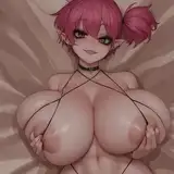
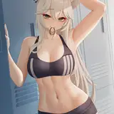
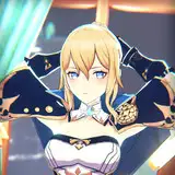
There are so many things you can do in the shadow layer, like making some small spots a bit darker right next to the brightest side of the object - this will enhance the volume outside of the object, as seen, for instance, in the breast of Vera, the girl in the lead with the pink jacket (the first one in this series).
You can also create light by selecting the shadow layer and inversing the selection (command/control + Shift + i), then creating a new layer and using the "柔角 250 1" brush to suggest one or two soft strokes where the light is brightest. Try to make the strokes soft and use the brush on a large scale - remember, these are small details to enhance the volume of the fabric. Again, Vera's breast is an excellent example of this technique. If you are struggling to grasp these suggestions, you'll be able to see them in depth in the process video available in the Mastering Maestro tier and above.
.
By avoiding these four points, you should be able to achieve a render style similar to what I did for this series. I'm sure you will discover interesting new ways to achieve similar goals, so please feel free to share those with us in the Discord community.
For more information, check out our Patreon FAQ: https://ramonn90.myportfolio.com/faq and Patreon Catalogue: https://ramonn90.myportfolio.com/work
Thanks for your support!
Ramon Nuñez
2023-06-10 11:18:19 +0000 UTCThat girl
2023-06-10 07:27:24 +0000 UTC


