Hi everyone!
QUICK UPDATE: You can buy my Overwatch stickers here if you'd like! Now onto the schedule content!
Today I'll be sharing with you how I created the above piece for Overwatch's holiday promotion! Warning: it involves a LOT of color tweaking that caused quite the headache, but worked out eventually. I'm pretty critical of myself in this tutorial. Don't mistake it for self-deprecation, it's all constructive criticism and most truly represents my thought process while working. So, without further ado, let's begin the process! :D

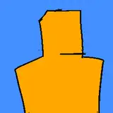
This is the first sketch I came up with. It's not bad, but I think I poorly translated the idea that was in my head onto the canvas. The forced perspective looks too squished and characters either look like they're floating or clipping through the floor. It's pretty funny actually. Funny, but not usable.

This is the final sketch I went with. Much better! All the characters are fully visible and the perspective makes sense even if it is flat. Fitting the holiday decor into the picture also adds to the festivities and gives it a more warm and homier feel.

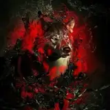
My first pass at colors. Argh, something went terribly wrong here. Clearly, I wanted to incorporate red and green into the image to represent the holidays, but nothing ends up standing out. I went with a darker background because I initially wanted the glow of the fire to be the primary light source, but it ended up muddying the colors even further.

This is looking better, but it's still not great. It looks really...heavy? And like...sad? The lighter background helps a lot, but the dark shapes attract too much attention and weigh the piece down. Let's keep trying.

Whew! It's like taking a breath of fresh air! Lightening the colors and nixing the dark shapes helped a lot. The piece starts to open up and the characters stand out rather than being buried by the background. The image also feels more lighthearted and welcoming, feelings that I heavily associated with the holidays.

The painting process begins. Nothing fancy here, I just merge all my layers and start drawing. I clean up all the lines first (to achieve a lineless style) and then carve out the shapes of characters from the color blobs.

Continuing to clean up and paint in details. Shadows and highlights are also added in to give form and life to the image. I changed the color of Zarya's (pink hair lady) pants to better balance out the image and to avoid overusing reds.

Voila! Final details and a yellow overlay layer are added to give the image additional warmth and even out the colors. The scene feels happy and cozy and my work is done.
This piece posed several challenges:
-I rarely draw 2+ characters in a single illustration so placement was tricky.
-Color balance proved most difficult and special attention was paid to changing colors and making sure nothing was too overpowering.
Overall, I learned a lot and had a lot of fun making this piece. 10/10 would do it again!
Hope this was helpful (entertaining at the very least) and I'll see you soon with more Overwatch art! ;D
Love,
Vicki
Vicki Tsai
2017-01-11 18:07:49 +0000 UTCMunrou
2017-01-11 15:39:56 +0000 UTCVicki Tsai
2017-01-10 00:10:21 +0000 UTCTim B.
2017-01-09 23:02:02 +0000 UTC