Hello lovely people,
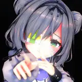
I am not entirely sure how I feel about this little one, but here's a newly finished small painting!

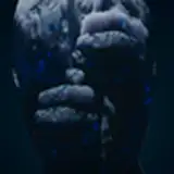
I used myself as a reference by collating a few photos of my own hands together (above), and then did a colour breakdown of a skin tone reference to get an idea of my base tones for the hands.

I am not as comfortable with darker skin tones as I would like to be, so this little guide was very helpful.
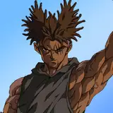
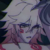
You may remember my first attempt at painting this concept from a few months back, that didn't end up working out :

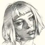
This first attempt made me realise that I didn't know where I was going with it, so I printed out the sketch in miniature on watercolour paper and did some very rough thumbnails :

- The top-left thumbnail was a rough go at the basic colour composition I was thinking of.
- The top-right thumbnail was intended at trying out having a red base before layering the dark background on top.
- The bottom-left thumbnail was a value study, to figure out what kind of lighting scheme I wanted, and was my favourite, and my rough guide for the rest of the process.
- The bottom-right thumbnail was to try out having the hands all be a very muted, almost flat colour, with the jewellery being the most vibrant elements and the eyes being the lightest value.
Sadly, the thumbnails on the right hand side of the page didn't really give me much info as the paper was horrendous to work with!
I ended up doing some more experimentation on my iPad in Procreate, which is the video you can watch at the top of this post.
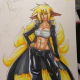
The value thumbnail did give me a good direction to start with, and after I made my skin tone reference, I jumped into the more finished image in my sketchbook :


(The scanner always makes the paper texture look so much more gnarly than real-life...)
This was very much a "trust the process" kinda experience, and I wanted to throw my sketchbook through the window a few times, but it ended up working out ok.
I chose more of a backlit style of lighting, which is honestly my favourite part of this piece.
I really enjoyed trying to achieve different skin tones, and I learned a lot.
I also really like the contrast between the skin and the gold jewellery, and the jewellery stands out about as much as I was hoping it would.
I think my main issue with this small piece is that it feels a little too...cartoonish in style, than what I was aiming for, maybe? Perhaps it's the lack of fine detail, or the brilliance of the gold? Or maybe the white of the eyes? I'm not sure...
Overall, given how small the piece is, and how much I struggled to paint it in my previous attempts, I am rather happy with how it turned out and learned a lot for something so simple.
I am hoping to make this the print for last November, the one item that was missing from your last packages for 2022, although I'm afraid won't be sending this this month, as I had said in my note to you.
Royal Mail, our shipping provider here in the UK, is having a real fun time screwing everyone over right now in lots of different ways, the latest one being halting all international shipments because of a cyber attack on their services.
So I am keeping an eye on it and will let you know as soon as services resume as usual and I am able to send you your next reward packages! Hopefully it will be once I am all moved into our new place :)
In the meantime, thank you so much for your kindness and understanding, and I hope 2023 is going well for each of you so far!
All the best,
Myriam