Hello lovely peeps,
I have spent most of the past few days working on the painting I will be using on my box of custom brushes, and I wanted to share my progress with you.
Thank you to all those of you who joined me during my stream the other week, and helped me make decisions about the design!
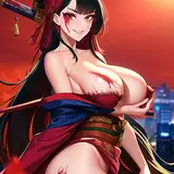
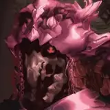
I ended up going for the first thumbnail I had mocked up, with the character who had the red reeds growing from them, but took one of your suggestions on board and had them removing their face, and facing to the right, towards the writing on the box.
Here are a few work in progress shots and my progress so far.

I really liked the linework on this outline and was really scared I would mess it up by painting.
The vines on the left look a little different to the rest because they were the first I drew and I was still in the process of deciding how I wanted them to look.


Here is where I have gotten so far.
It is nearing completion but I do want to add a little more detail to some of the branches before I call it done.
My paper must've been old or damaged so painting on it was an absolute nightmare as I had no control over the way my paint spread. It seeped into the paper in a way that tells me the sizing on the surface was almost non-existent and it was an uphill battle to try and make it work! It came out looking better than I hoped it would given the circumstances and I am glad I stuck with it.
I did a couple of mock-ups of the piece to see how it might look once on the packaging it is intended for, which you can see below ;

These mock-ups are very rough, so don't mind the variety of fonts and sizes!
The above image would be if the box was flat, with the white lines being where it would be folded over the sides.
Below is the image cropped to look as it would if you were only looking at the top cover of the box :


I'm not sure how zoomed in to the character's face I want the artwork to be.
Do you have a preference between the two above images?
As you probably noticed, I went for a composition that is more vertical than horizontal, even though I knew that something more horizontal would work better with the final format.
I did consider having the vines growing sideways but didn't like that when I sketched it out, so I stuck with the vertical growth.
I don't know how possible it will be for the company to do this, but I played around with the vines and had fun putting them on the fonts too.

I thought it tied the whole design together in a fun but consistent way.
What do you think?
I think I'll play around with these a little bit more and send some mock-ups to the company to see what they say.
Do let me know what you prefer between the two options above (face zoomed in or not) and whether you like the branches growing out of the fonts!
I will share the finished piece with you later this week and hopefully will have made the art for the back of the box too by then.
I hope you are all well,
All my love,
M
Thalia
2022-04-18 11:39:15 +0000 UTC