
Hi peeps,
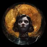
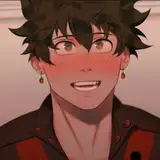
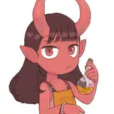
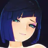
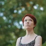
I'm spending today working on the Process Video for this month, and I decided to do a portrait study this time round.
An exercise I enjoy doing from time to time is to work from a direct reference, and add my own small surreal twist to it. This allows me to study an image while also trying to adapt its colour/lighting/values to a new element that doesn't exist in the reference.
This may sound like the thing I do whenever I paint a piece, since I always try to work with references when I can, but when I put together a more complex piece based on a precise concept of mine, I will usually create the reference to fit my idea, and adapt various small elements from my references to fit together as a cohesive painting in the end.
This study exercise is different in that I am not choosing the colours, lighting, composition, values, or any of the defining elements of the piece, since they are all contained in an external reference I didn't take myself.
Therefore, I have to abide to the rules set by my reference for any new details I may want to include.
In this case, I had to try and adapt the lighting and values of the piece to the ribbons in the throat, and try and make it look coherent and cohesive.
It's always challenging but I also always feel like I have learnt quite a bit and it helps me stay mentally flexible and malleable.
I did do something I had never done before for this one however.
I took the reference image into Photoshop and isolated some of the colours present in the image so I could have a sort of guide for my colour palette.
I then switched that template to black and white, to get a better understanding of the values, as well as how various colours translate to certain values.
I will probably to this again in the future, as it was incredibly useful to help me visualise how to build the piece and match my colours to my values.

Also, I used gouache in this one!
I don't know why, but I felt a sudden urge to whip my tubes out, as it had been a while and I missed it!
It was an added challenge to get used to the paints again and to work opaquely and with heavy brushstrokes, but it was so. much. fun.
I'm going to try not to leave them alone for so long this time. ;)
I used a piece of Strathmore Toned Blue Mixed Media paper, which was very enjoyable to paint on, especially with gouache.
The video is this piece will go up this week-end to $5+ patrons and this will also be the mini-print for September.
I hope you are well lovely people,
Take care and speak soon! <3