
Quick note about the video :
The video is not a tutorial.
I was planning on uploading this video to Youtube, but as I was getting more and more stressed about the painting, I turned the camera off after a while, as filming yourself painting is actually quite off putting sometimes.
So I decided to keep the footage Patreon exclusive. The video doesn't include the entirety of my process, but most of it. I hope you'll enjoy it anyway!

Hi everyone,
I haven't been able to do a Process PDF, or a step-by-step post in a while, and since this last painting was fairly experimental for me, I thought I'd show you what I did, along with the materials I used.
✦THE MATERIALS✦

I did most of the drawing for the sketch with my Red Colerase pencil, but when it came to the painting itself, I used both my Tuscan Red and Brown Colerase pencils (pictured above) to add some shading.
I also used the blending stump to soften the strokes.

I actually used a bigger range of brushes for this painting than I usually do.
I mostly used my trusty Flat Angled brushes, which I now have in about 4 sizes, as well as my soft round brushes for brushing on the shades of the skin.
But I also used that weird bristly brush at the top of the list to create some rough texture on the background wall, as well as the big square flat brush for large washes over big areas.
And I utilized my detail brushes for highlights.
My personal favourite at the moment is the Hard Pointed Round brush (the Royal and Langnickel one. They call it a Short Round on their website).
I rediscovered it when I was cleaning out my make-up kit from work, and, as I really enjoyed painting with it when I was doing prosthetics, I figured I might like it for traditional painting also. And I really, really do! It's a lot more precise than a soft round brush, and has a great range of strokes.


For this painting, I decided to try out my acrylic inks for the first time.
I have been getting frustrated with how much work getting darker values with my watercolours and gouache has been, so I decided to see if using acrylics would make a difference.
I have also been feeling like I've been overworking my paintings, and overworking with gouache or watercolours usually results in a muddy looking paintings.
So I wanted to try a medium that did not reactivate when overworked, to see if it would suit my current way of working better.
I have had a set of Liquitex Acrylic Inks for a few years now, as they are a good brand to use when airbrushing, but I had never used them to actually paint a piece with before.
I have a very limited range of them, so I might look into getting some more in the near future, as I really enjoyed them.

I also used a couple of my Sennelier Inks, which are not acrylic inks, rather Shellac based inks, so they do reactivate with water ever so slightly (but still not as easily as watercolours would).
I have had those for even longer than the Liquitex, and they are wonderful, although they do have a slight shine when they dry.
Which I tend to like, but isn't ideal for scanning or taking photos of the artwork.
I used both brands as it gave me a good range of colours.
Although I did have a red and brown in the Liquitex, the red was too pink, and the brown too ochre and transparent, so having a "bloodier" red like the Sennelier one, and a darker, colder brown like the Walnut Stain was very useful.
Both brands seemed to mix together well too.
I used a minimal amount of gouache towards the end of the piece, to add texture to the brick wall. Applying opaque gouache over acrylic inks was quite pleasant!, and it was easy to add highlights and tones that way.
I will have to experiment more with that technique.
As far as gouache colours, I mostly used some ochre and some white, with a tiny bit of pink, and maybe some dark blue thrown in, which gave me a good range of "brick colour".

And finally, I decided to just dive in, and use a sheet of my 640 gsm Arches watercolour paper.
It has a fine grain, but is still Cold Pressed, and you can definitely see the texture in the final scan.
That texture worked in my favour for the background wall, I think, but worked against me for the body of the character, which I wanted softer than the brick and cracked wall, especially when I was using pencils to shade (which is where the blending stump came in useful).

✦THE PROCESS✦
✧REFERENCES✧

As always, before I started, I gathered a bunch of reference, that both inspired the lighting and the pose.
The bottom middle image was the pose I based my rough sketch on, and the top two were the ones I mostly based the final pose on.
The bottom left image is a painting by one of my favourite artists, Brom, which I used to help me with anatomy, as well as value reference.
And the last one, bottom right, was mainly an anatomy ref.

The images were my references for the brick wall, and I chose to have a sort of mortar-like texture climbing up the head-tower in my concept, to help blend the body with the tower.

And finally, I used the above images to help me with the wall texture and the crack.
The right hand picture is once again from Brom, and was my main reference, and the left hand image was a value reference.
✧PAINTING✧

This concept was initially an idea I had for the Month of Love theme of last week, "Blindness". I didn't manage to finish it in time, but that's ok, I still liked the idea enough that I wanted to try painting it.
As I've mentioned before, I'm going through a rough patch with my work at the moment, and I needed a piece I could experiment with a little, and work on for a few days, and this being a concept I like but wasn't too precious about, I thought it would work quite well for my purpose.
So, as usual, it started with a rough sketch in my sketchbook.
With initial idea sketches, I don't try to be particularly personal or original with poses, I just pick a reference I think works, and add my idea on top.
I fine tune my poses and composition later on, if I liked how the initial sketch came out and the idea still appeals to me.
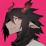
I then resketched it as a lineart only on a piece of paper the size of my final painting paper. I modified the pose a little, and made the character a little less masculine looking, with a slender body, less muscle and more wiry, as it usually is the archetype I like to use, especially for my mental illness related work, which I consider this piece to be.
As always, I didn't add any gender markers however, as I don't generally think of my characters as gendered, more as blank slates that I (and others) can project whatever I want/need on.
Once I was happy with the sketch, I transferred it to the watercolour paper using carbon paper (check out my previous Process PDFs if you are unfamiliar with the process, I explain it in more depth, and with pictures, in those).

I knew I wanted the light source to come from the right, at a slight angle, so I put in my main shadows early. I layered a mix of raw umber, walnut stain, and crimson red, and did wash after wash to get the dark I wanted. I made sure the shadows were never as dark as the inside of the crack on the wall however. That still needed to stand out.
But since acrylics don't seem to lighten as much as gouache does, it wasn't difficult to gauge.
I knew that whatever strokes of acrylics I put down, would stay there once dry, and would not reactivate, which was ideal to create a texture wall as a background. I simply used my brush with a minimal amount of water on it, and brush it randomly over the wall area. That dry brush effect would layer nicely once I applied more and more colours.
For the skin tone, I wanted to try something out.
I was intrigued to see if I could layer colours on the skin, and go quite dark, and then knock it all back and soften it by applying a wash of light gouache over the top.
I was hoping it would add some relief to the skin, making it look less flat than when I paint it just with gouache or watercolour.
Basically, I wanted to play with translucency, and the fact that acrylic doesn't reactivate.
So I started with putting some red down, using the Naphtol Crimson, and adding slight accents of blue (the Phtalo Blue is CRAZY intense, so I used it extremely sparingly). I also added some accents of yellow ochre, which is often what I do when painting skin in watercolour.

I continued layering the colours, and started adding some darker walnut stain and blue shadows, to accentuate muscle mass and relief.
If I was painting with watercolour, I might have stopped at the image on the left, but since I was experimenting, and was planning to add light gouache on top, I needed to go darker with my shadows, so they would have a chance to show up once covered.
I also started adding some slight outline with ink and pencil, in areas I felt needed an extra kick of dark value.
After a while, I started painting the brick wall.
That part of the painting is the one I wall least sure about. I had no idea what colour I wanted it.
I have been thinking of my colour schemes lately, and how I feel like I am being too literal a lot of the time. I would like to experiment more with alternative colours compositions, using less realistic colours.
So I decided I wanted to try painting it only with red. Not a brick red, but an unrealistic, bright red, and no other colour.

However, I quickly realised that I didn't like what I was doing. It simply looked too much like I was trying to paint a red brick wall, but had gotten the colour all wrong.
Plus, my whole painting was becoming increasingly redder, and, as I was scanning as I went along, and my scanner is dying and putting a red tint on everything, it looked even worse to me when scanned.
The scans in this posts aren't quite the right colour, or the right values, since my scanner is seriously playing up, but I tweaked them to be a close as I could get to the original.
I'd say the original is a little less brown, a little softer, and has a bigger variety in colour on the body.
The image on the right is after I decided to tone down the wall.
I realised that I wanted the value emphasis to be on the character, and the bright wall was detracting from that. So I added some rough brush strokes of colours, again using the dry brush technique quite a bit to add some slight highlights and scuff marks.
I think the texture of the cold pressed paper actually worked in my favour in making the wall look textured, especially in the areas where you can still see a little bit of the paper, which is making the wall look like paint has slightly flaked off (eg : under the top crack).
I also started adding some brown to the brisk wall, as accentuate texture and shadow.
I gave in to the part of me that felt uncomfortable with the unrealistic red, and decided to go more realistic in the end.
Lastly, in the picture on the right, I started adding that gouache wash I was talking about, to the character's skin. I mixed some white and some ochre, and a little pink and applied that diluted mix over the whole body.
I really liked the effect it gave! It really softened the shadows and gave the skin a sort of glowy, translucent look, which I really like.
Gouache always looks a lot more intense when first applied, and fades very quickly when drying, so I had to add a few layers, maybe 3 or four, to achieve the result I wanted.
Another thing I needed to keep an eye on, and part of the reason why I wanted to tone down the skin tone, was because the rest of my image was already quite textured, between the background wall, and the brick wall, so I wanted, and needed, the character to be softer, more organic looking, less sharp than the rest.
The piece is ultimately playing on this dichotomy between the harshness, hardness, almost brutal nature of the rock, and the soft, eery, organic body.

As much as I liked the effect achieved by adding the gouache wash, I did want to add a little more relief to the muscles and the anatomy, to make the character's skin a little less flat.
So I went in with my tuscan red Colerase pencil, and shaded some areas where the shadows would be darkest, softening the texture of the pencil lines with my blending stump.
The tuscan red pencil has a beautiful deep red, almost "bruise" like, which I felt fitted the image well.
I really, really enjoyed that technique, and will probably try it again in a future piece.
Pencil is generally very enjoyable to apply on top of gouache, and blending it a little took away the harshness of the pencil strokes very easily.
Finally, I added some eyes drawn all over the upper body.
That was a last minute addition, and I kind of wish I had added elements implying the character was drawing the eyes himself, but that was hindsight I didn't have.
I don't know if I was imagine them to be the character innate desire to tear down the wall, or if the eyes had been drawn by people outside of him that he couldn't see, but I am into the imagery of tattoos at the moment, and the eyes felt right to me.
My last touch was to further tone down the red of the brick wall, but adding some touches of gouache here and there, varying the texture and colouring of each brick.
Some of the keys to organic and realistic texture are randomness and variety.
Both the bricks themselves, and the cracks between them, needed to look less flat and uniform, so I very quickly (to help with the randomness, and overthinking things) applied a variety of different colours to them. I kept the darker values, even adding some blue in there, to the shadows and cracks, and added light touches of light ochre and white to the bricks more in the light.
A mistake I see myself make a lot when I paint, is think of each elements as as important as each other. And, although the brick wall is a focus point in itself, the main protagonist of this picture is the character, so he needed to stand out first and foremost. Which, in value language, meant that he needed to be the lightest.
The brick wall, not being as directly a focus point as the body, and also being made of a different material, would reflect light differently and less intensely, and also needed to be more muted, so as not to distract all the attention towards it.
The narrative of the viewing of the piece should be : looking at the person, then realising its head looks weird, then looking at the eyes.
Values are a tricky thing, and this piece was no exception for me!
✦MY THOUGHTS✦
Overall, although I don't really know how to feel about the painting itself, and I think I could have down quite a few things differently to make the whole composition work better, this whole piece felt like a good experiment.
The process was arduous, partly because I was using a new medium, partly because I don't know enough about values and colours, and partly because my head is messing with me these days. But in the end, the simple fact tat I tried something new, and took a few risks, felt like a good move, and even without getting the ideal results I was looking for, I still feel like I learned, both technically, and mentally.
The main enjoyment of this piece though, was trying the acrylics out though.
So here's a break down of my feelings about the medium :
WHAT I LOVED
✩ My favourite thing about the inks was how dark they stayed, even after I applied them, and they had dried. I still needed to work in layers, but nowhere near as much as I do with gouache, or watercolour, and with a much lower risk of muddying the colours, or dulling them down.
✩ My second favourite aspect, was the fact that the pigments didn't reactivate once dry.
The fact that I was able to work in washes, like with watercolours, was familiar, and made the experience that much more enjoyable, but the effect that no reactivation had on layers, and how colours played with each other without mixing, was the best part.
It was somewhat tricky to get used to, since, after so many years using watercolours, I have gotten innately used to that happening, and now play with it when I paint, almost unconsciously, so it was sometimes odd to not have that happen with these inks, but overall, it was something that was easy to use to one's advantage.
And given the coverage power of acrylics, making mistakes with them is a lot more forgiving than with gouache or watercolour.
✩ Because you get a lot more paint for a lot cheaper than with watercolours or gouache, I would feel more comfortable covering big surfaces with ink washes. I am thinking of using that in the future more, working on background with inks, and perhaps using my regular mediums for detail and characters and creatures.
WHAT I LIKED LESS
✩ How quickly the paint dried was jarring. Again, I suppose that is connected to how used to watercolours I am, and with that medium, I can quickly add colours and have them blend with each other in all sorts of effects. But acrylics forced me to reassess my time management with my painting, and find other ways to blend colours, as they wouldn't do so once they dried, which they did very quickly.
✩ The wastage of paint bothers me, I'll be honest. It's a pretty minor problem to have for this, since I didn't use a lot of paints in the first place, but the fact that my palette got increasingly dirty with no way of washing it off to see the paints I was mixing better was very annoying. I'm sure I can work around that, but that was an issue I encountered for this first time.
All in all though, it was all very interesting and you can be sure I will be using those inks again very soon!
I hope this post, although long, was vaguely interesting,
And I hope you are all well, lovely people!
Take care,
M