

I've always been terrible at making "art".
I've been teaching myself how to make stuff look good since I started on YouTube. It really helps to have a significant other that has an eye for what looks good & bad 😂.
A very small part of me enjoys making art. The first "thing" I ever made for my channel was this abomination:

It's dreadfully cringy 2000's era banner with those overused Tuxes. This was the banner for my old channel when I did mostly motorcycle stuff. I was only starting to get into Linux at this point.
When I created the Egee channel, I wanted a brand that I could use to separate the IRL me from the online me. The first "brand" image I settled on was this:

Inspired by the periodic table of elements and the new (at the time) Gallium Nine. It didn't live long though because shortly after making it, the channel format switched from Linux gaming to more technical topics like coding & benchmarking.
The next notable channel banner was this dreadful thing:

My least favorite banner by far. I had been working around a lot of Material Design stuff at work and I wanted to try my hand at making something very basic & flat. The results were underwhelming, to say the least.
The Egee & Egee.io "brand" use the Lato typeface (for that curly lowercase g!) and I made this godawful banner before I settled on that typeface.
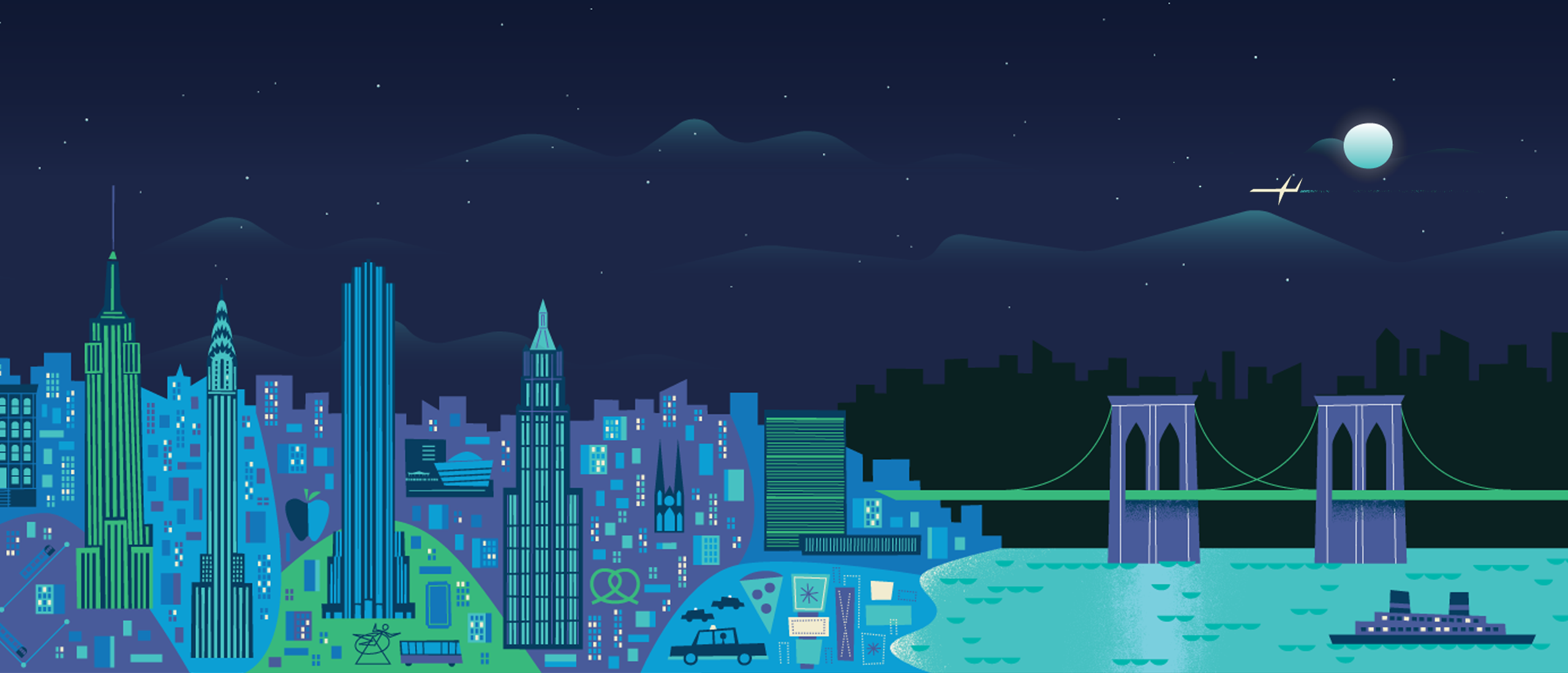
The first piece of channel art I made that I was actually proud of was this beast:

It is heavily inspired by the many Google Now wallpapers and I crafted each building & each square window by hand. This was before I knew much of anything about Gimp/Glimpse so this whole thing was done on a single layer. Yikes!
I used this for lots of different things including the channel art. It was an exercise for learning image editing and I'm still very proud of it.
The next & most recent channel banner I made was the image at the top of this post.
I'll save the explanation for the colors & avatar for another post but this banner is basically just reusing what I already have.
Rather than trying to do something fancy with effects, I used the rule of 8th's and put a pane on the left side, and Egee on the right side. It looks sophisticated and polished yet it's so simple!
I quite enjoy writing these "behind the scenes" articles for you guys. I'm still trying to figure out the best way to use and reward folks on Patron so, while I figure all that out, I'm going to write blog posts like this!
I hope you enjoy them as much as I do! Feel free to ask me any questions you like!
ihazdarkness
2020-02-23 21:52:45 +0000 UTC


