Commentary: Pages 30-31
Added 2024-12-02 20:18:30 +0000 UTCPage 030 - Lost and Alone

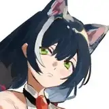
BELLTOWER SPOTTED.
Peri points: BELLTOWER!!
Where’d that come from? It certainly wasn’t there in chapter one…

It’s true! The belltower was a late addition. But up-to-date readers might notice that it never actually gets rung at any point, so like, why add it at all? To answer that, let’s jump ahead for a moment to the start of chapter four.

See, a belltower has a couple useful visual features that are well-suited to our purposes. It’s a good landmark, easy to draw in silhouette while still relatively memorable. And secondly, it’s tall and skinny, which means it’s pretty easy to show it gradating through states of disrepair. You can see here it’s already starting to bow over. Hollidae will be beset with adversity in the not-too-distant future, and we wanted to have an easy visual marker for that adversity to be reflected in the landscape. Introducing the belltower nice and early in chapter 2 gives us runway to get it all nice and established in the audience's minds before we start taking the sledgehammer to it.
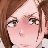
First half of this page here mostly covers ground I’ve already discussed earlier. Yuno’s perception of Jiro has come pre-pedestalised thanks to the Goddess.

I think this bit here is an especially important slice of minimisation. Polyta outright speaks for Jiro here. Pretty common fare for an RPG with a quiet protagonist, takes on a sinister edge in the new context. You know the drill by now.

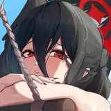
Let’s talk ghosts.
Peri says: OI! We talking GHOST COLORS up in here?!? Oh boy. Ohhhhhh boy! I have THINGS to say about this.
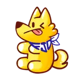
The original plan for the comic was for all the Ghosts to have the same colour. See Rodney’s nameplate?

All of the ghost characters (besides Rex, who got a different shade of green) would have gotten the same colour nameplate. Sam here would have been no different.
Peri gripes: Heeeeere we go.
There aren’t a huge number of ghosts in this comic, as it turns out. The dearth of ghosts was a reason why I felt comfortable giving them such a specific indicator of their ghostiness; it’s not like the cast would by majority green by volume if I did that. (Peri again: Not technically a majority but definitely HEAVILY SKEWED.) But I did want some kind of unified colour, because with so few ghosts in the cast, I think it helps to have something particular and specific to indicate that they really are a ghost, so the audience can get caught up to speed instantly.
(And if you’re gonna pick a colour to be the “ghost colour”, I do think green is the pick. It’s not just my favouritism showing! Green’s got that evil sickly glow! I swear this is an established trope I’m working off.)
RECORD SCRATCH
Yup, that’s me (Peri). You’re probably wondering how I got here.
“Here” as in being the editor of a webcomic with six existing green characters and staring down the barrel of adding untold numbers more. I know. It's horrifying to think about.
Okay, joking aside, this actually was a major moment of stylistic decision! Sam was going to be our second ghost extra (I’m not counting Rex, since major characters often follow their own style rules), so whatever we did here was going to establish a pattern. I remember at this point of the comic I was still flying relatively blind when it came to character designs. What I mean by that is, Lum and Rhys already had a lot of preliminary designs for upcoming characters (they developed a lot of them long before the comic started!) but I hadn’t seen most of them. Often, the first time I saw how a character looked was when Lum started drawing the panels for that week. (This actually led to a really funny misunderstanding about Proteus that I’ll bring up in one of the next couple pages.)
So imagine being me, at the start of Chapter 2. We introduce Sitara, who is green, and it makes a lot of sense because peahens are green in real life and also it contrasts nicely with the main three Homebound teens. Then we meet Yuno, who is also green, but it still makes sense because herbalist → plants → green. Okay, still checks out. And then we introduce the lost ghost and… Lum? Hey, Lum? Isn’t this kind of a lot of new green characters? Like, a LOT of new green characters?
…okay, I did lose that battle in the long run 😅
What can I say? Lum REALLY likes green, and who am I to deny such a passionate creative vision! But at least I got them to see reason about introducing some variety for the ghosts!
(Also uhh Lum you sure you’re not thinking of Slimer from Ghostbusters? For the whole “green is a ghost color” thing? I think you’re thinking of Slimer from Ghostbusters.)
Lum counternotes: look, if there’s a ghostier colour out there, I’d love to hear it. And no, we can’t do white! We already use white for everything!

Giving every ghost the same nameplate wasn’t really a great idea in the long term. It threatened to make what ghosts were in the cast harder to remember and differentiate from each other, and it was starting to look like there might be a chance there might be more ghost characters on the horizon. So, in recognition of that, I switched to all the ghosts having a green background in their textboxes, much like how the Aveans have a blue background. That meant the question of how to colour the ghosts remained. I tried a couple options for Sam:
Option 1 -- Green outlines with coloured accent.
This was what I initially wanted to go with. It keeps one unifying element across all the ghosts, but still allows for colour variation between them. Here, the ghost has a yellow "inner soul" .

Option 2 -- Outline colour changes completely
This allows for more colour variation between ghosts on a fundamental level, but I was concerned it'd also make them feel disjointed from each other, as if they aren’t even the same class of entity.

Option 3 -- Outline colour changes, but stays in the same general ballpark
This helps the ghosts feel "ghostier" as a unit, even if it limits how much the ghosts vary from each other. It would also make groups of ghosts feel unified if they were ever depicted together. Here I went with a teal, cause that still has that eerie otherworldly vibe to it.

The final design ended up going with an inverse of option one: coloured outline, with a green accent. We decided this would be the pattern for all future ghosts.

Peri preaches:
There was actually a fourth option Lum tried out, which was to vary both the outline colors AND the “soul” colors. I suspect they left it off here because they were never seriously considering an option that didn’t have some unifying green element, but for the record it was my favorite option.
Lum counternotes: Oh yeah, I was basically considering that as a subset of Option 2. Didn’t use it for the same reason as that one. Here’s how that looked:
Alas. Of the versions presented above, I still have a strong fondness for Option 1, with the different colors of “inner soul”. I think it is more versatile (not all outline colors look good with the bright green inner coloring) and makes the color associated with each character clearer. It seems like not all readers key into the outline colors readily–I remember when Headless Ed showed up for the first time at the end of this chapter, we had some readers confused as to why his nameplate was blue and whether that was an indication that he was still fundamentally linked to dog!Rhys in some way. But there is one major benefit of the green-soul approach, which is that it mirrors the green textbox background we use for all ghost characters (and also for Rhys when he’s possessed.)
Ghost-griping aside, the preponderance of green characters in Chapter 2 actually turned out to be a blessing in disguise. Because we did end up adding several more new green characters after this–and I’ll talk about why on the next page.

Page 031 - Bottom of the Sea
This is one of my favourite page titles. It’s evocative without being literal, it hits upon the visual themes of the page without spoiling anything. And it’s got such a music to it! Veritably iambic. Probably in my top ten, top twenty at least.
Peri prods: Well… technically it’d be trochaic. Agreed that it’s a great title though.
We’ve already talked about Sam’s design, now let’s talk about their writing.
The character of Sam emerged from a much older character that was cut well before the comic was launched: Usagi.

Back before Home Bound had furries and Love Bomb had elves, Jiro would have encountered a bunnygirl ninja named Usagi around this point in the story. She would have served a similar role to Sam, being someone Jiro would befriend who he connected with more than anyone else on the island. Later, however, he would discover the awful truth that Usagi wasn’t what she seemed: she was actually a trickster spirit from Home Bound and one of Headless Ed’s minions, a Pooka, who had taken the guise of an anime girl and infiltrated the isle of Hollidae to, uh…
That’s just the thing. The reason why Usagi was eventually cut was not just that her entire faction of spirits got excised from the story, it was that we could never actually figure out what her motivation here was. Why did she come to the island under false pretenses? Rhys has this gut feeling like we knew at some point and just forgot, but the fact that we were never able to think up anything satisfying even after the fact wasn’t a great sign. Usagi’s role in the story just never came together, and even though she was central to one of my favourite gags in the comic (a story for another time), she couldn’t stick around.
But that base core idea, of a new friend that Jiro makes in chapter 2 who gets snatched away from him, was still something I wanted to keep. I especially wanted to start hinting at the game crossovers here, and if that could be tied in with an important character moment, all the better, right?
Peri interposes: That concept of Jiro making a friend only to lose them–hold onto that thought. It ties into the whole “green characters” thing I promised to discuss before.

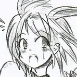
As a spiritual (lol) successor to Usagi, Sam was initially conceived of as a ghost girl, but after consideration I decided to go more ambiguous, leaning masc for the character. I knew that Jiro would later befriend Sunny. She too will be someone who Jiro unexpectedly connects with in a way he can’t with the anime girls. But I figured that even though this was a character who fulfilled a similar role to the one she does later in the story, I still should still draw contrasts between the two. So while Sunny is very much a girl, Sam is less of one. And while Sunny is an overflowing well of confidence, Sam is… well.
Despite knowing they’d be a sadsack pretty quickly, my first thought for their personality was something more… demure, I guess? Wilting. That first line “I think I’m lost” was along those lines, a very uwu I’m so sad kinda mode of character. But that didn’t really feel like enough of a departure from Jiro’s day-to-day to come off as a breath of fresh air for him. I retooled the character to have more rough edges, inspiring less of the protective kind of pity and more, uh… guy who spends too much time online vibes.

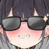
Sunny will connect with Jiro by appealing to his frustration and inviting him to express it constructively, while Sam does something similar for Jiro’s misery. They’re sad! Jiro’s sad! They have so much to talk about! And despite how uncharismatic their sadness is, the audience can still tell that this is exactly the kind of friend Jiro could use right now. Even the above reference to whacking off isn’t just crassness for its own sake, it’s an element that’s clearly incongruous with the sexless horniness of Love Bomb. It’s a vulgarity that would normally not be permitted in this world. Sam’s presence in this narrative is an intrusion. It’s the first of many.
When making this part I had wanted to try and disguise Sam’s presence as an interloper in this world. You can see that disguise already in the design: their appearance is amorphous enough that the only hint of their furry nature is the hint of what looks like cat ears in their green interior “soul”.

Peri pipes up: Ooh that’s clever! I actually never noticed that before…
I wanted to start hinting at games crossing over here, but I didn’t want it to be totally obvious right off the bat. I liked that being a realisation that gradually builds up through the chapter as the pieces slide into place. The idea was these world intrusions would get more and more blatant as the chapter progressed until it became too jarring for even the characters within the story to ignore. The perfect crime, so it seems, but the text boxes kind of throw a wrench in it:

Each world has its own style of textbox, you might notice, and Sam’s clearly marks them as a denizen of Home Bound. Uh oh! I had considered messing around with the formatting to make it less obvious, but that felt like too much of a cheat. In the end it seemed my ambitions to disguise Sam’s nature would be dashed by my own formatting choices.
Based on reader reactions, though... it didn’t turn out like this. Most readers just straight up did not notice the out-of-place formatting because, like, you’ve only had one chapter’s worth of time to notice these things and frankly the reader has more on their mind at this point. Some readers in the discord did recognise the mismatched dialogue box, but… they did not necessarily have any idea what the implications there were. Did a ghost possess the game console? Was Sam conjured up by Coral’s psychodrama? Turns out a lot of the information that would be necessary to “spoil” this mystery was not available to the audience at the time.
Peri ponders: It was fun to see how this played out when it got posted! We definitely had a few sharp eyed readers who noticed it, but I think a lot of people had just gotten so used to the textbox formatting that they didn’t really register the change. I suspect it’s even less noticeable when someone is catching up on the comic now–when you’re reading this page in an archive binge and not waiting a week for the next page, it’s even easier to skim over details like that.
I’ll also just add–I think Sam is the first time we’ve played with the nameplates before! Having the lost ghost be “???” and then become “Sam” after they introduced themselves is a nice way to establish that as another aspect of the comic format that we can play with.
An audience is a funny thing. I like to treat the readers like they’re Sherlock Holmes with this sort of thing and they’ll pick up on every itty bitty detail, and to an extent that’s true. But in reality… many of your readers will need a fair amount of clarification to follow what’s happening, for one, you don’t want to write your comic only for people who have reread it three times (well okay, maybe you do and that’s chill, but I don’t). And also, even those ultrageniuses in your audience can’t put together a perfect prediction of your story when they don’t have all of the information the way you, the writer, has in your head, so they’re still well liable to be surprised. And honestly… when you really really need to, it’s entirely possible to trick those ultrageniuses into ignoring evidence that’s dangling right in front of their face. We’ll get to that later.

This page is also the debut of White Text Jiro. No dialogue options here, no consideration, Jiro gets to speak this once from the heart. I have to be careful not to reuse this trick too often, much as I often tire of writing all of Jiro’s unspoken dialogue lines. One of the most interesting things about Jiro is that we get to see his internal monologue, and I recall writing this page reassuring Peri that wasn’t a feature I was looking to drop. Even when Jiro might become more willing to express his negativity, these no-options moments are still saved for moments when something really jumps out of him.
Peri palavers: White Text Jiro is one of my favorite tricks we use in the comic. Actually, Jiro Dialogue is one of my favorite format elements of the entire comic. It’s such a rich device. We can use it to both reveal and conceal things about Jiro’s thoughts, and we can break the pattern to make impactful moments like White Text Jiro. And it's a device that is only possible in this weird intersection of game mechanic conventions (rpg style dialogue boxes with multiple choices) and webcomics (a static medium where we can freeze that choice in place for the purpose of storytelling!) I absolutely love coming up with new ways to take advantage of this funky tool we have–stuff like the animated arrows on the comic page that got posted this week (pg 102), and hopefully even more twists on the concept in the future!
It’s funny to think of this as a heartwarming line considering the actual content of what he’s saying but it speaks well to the utility of negativity, right? Sometimes there is something inside that demands to be expressed. Sometimes you need to kick back with a friend and commiserate about just how bad shit sucks.
Peri pontificates: Alright, let’s talk about those green characters! Because, as mentioned, Sam is the third we’ve seen, and there are two(ish) more still in the queue for this chapter. But they all follow a pattern–the green character is a newcomer, and someone who shakes up the protagonist’s status quo and gives them something they long for, but before the end of the chapter they are unceremoniously snatched away. Sitara is Japser’s first reprieve from ghosthunting and the demands of their dad… but they have to leave before they can hang out properly. Sam is the first person on Hollidae that Jiro can open up to… but they finish their unfinished business and move on. Nix’s rocket launcher lets her skip past most of Hellfuck… but it gets knocked away by the Bastard. And baby Allen gives Cliff something to go full dad-mode on…
But there’s a break in the pattern, right? Two actually–Yuno and Allen. Yuno fits the “newcomer who shakes up the status quo”, but she has a negative impact on Jiro’s life as another obligation for him to avoid and resent. And baby Allen fits all the archetypes, but doesn’t get snatched away at the end.
I’m actually very fond of imperfect patterns in storytelling like this. It gives you more to chew on when doing analysis, and invites you to examine the differences between seemingly similar situations. We get a lot of readers doing what Lum and I like to call “Foreach Color Theory”, where they look for patterns in the colors of characters in different game worlds and what they might mean. And we’ve seen people come up with some brilliant stuff! But outside of the protagonist-demiurge color correspondences, pretty much nothing matches one-to-one around the entire loop. That doesn’t stop people though–it actually makes them get even more creative! Sometimes people pick out thematic correspondences that Lum and I hadn’t even consciously been aware of at the time of writing! It’s fantastic stuff, I’m always so impressed by how analytical our readers get!
I’ll end this write up on a dirty little secret–the Chapter 2 Green Character Loop was… let’s say serendipitous. It started with Yuno and Sitara both being green, and us realizing that readers might conflate them due to their similar personalities (Lum actually tweaked Yuno’s color more lime-y in order to distinguish them better.) But then we realized that we could lean into it. Milk it for themes and symbolism!
…and yes, that is me suggesting more green characters. But if you bring it up in court I will deny it! Strenuously!