Commentary: Page 5-8
Added 2024-06-10 22:13:56 +0000 UTCPage 005 - Infixes
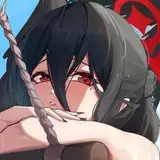
Moon-Soo calls Sunny “kind of a bitch” on this page. This was meant to be an uncomfortable line, one that hits you by surprise. Like, whoa Moon-Soo, you can’t just say that. It’s a very gendered kind of insult isn’t it? A very ugly word. Lingers on your teeth. Of course, as Peri pointed out, Sunny says the word “cunt” like six lines earlier here, which I think of as a punchy little chirp you use to refer to your friends and acquaintances. Turns out most people around the world find that one to be the worse word! Dialects! 🇦🇺!
Peri’s Thoughts:
Aaahh… dialects. I remember when we talked about this, my helping out on ForEach was still in a very unofficial capacity and so I was sitting there like, “How do I explain to Lum that where I grew up, saying ‘bitch’ would get you in trouble but using the c-word would actually get you thrown out of school?” Like, even growing up around extremely curse word-using parents, we still called that one the “c-word”--I’m still doing it right now! It was particularly surprising to me when Lum casually mentioned that they saw “cunt” as less gendered than “bitch”, particularly since it is literally a word for female genitalia. Dialects! Funny how different things can be across the ocean!
At the end of the day, this was the right choice for the page. Not just to reinforce the setting (Homebound is set in furry Australia, after all), but the difference in how the characters react to Moon-soo calling Sunny a bitch clearly conveys the different weight each of these things carry for the characters. And not just because “bitch” is a more cutting insult to them, but also because it’s Moon-soo who’s saying it. This is an escalation that is unexpected from him in a way that it wouldn’t be from Sunny, and it informs us about the dynamic of the main three–that’s a lot of characterization to pack into a small interaction!
This page was an early crack I took at doing more with my backgrounds. I was still broadly committed to keeping things simple, but I decided to move toward spicing things up.

There’s tendencies here that I retained for later pages in the comic, and there’s tendencies I abandoned… I guess that’s the point of experimentation. Stuff like that hatching at the bottom of this panel I pretty much never did again, while the sweeping cloud-like gradations at the top rapidly became a staple of how I handle colour transitions. You can see as well I was still consciously trying to keep it in that mostly-white palette, in the future I became a lot lot more comfortable with having a full colour wash over the whole background. I would eventually figure out that having a few panels that have a totally different colour than the rest helps break up the page, keeps a kind of dynamism in there.

Meanwhile, stuff like this Animal Crossing style frustration squiggle I didn’t keep doing so much, at least not on its own. I still work some odd patterns into the background every now and then, but usually in tandem with a bunch of other colour washes to get a more complex end result.
Peri’s Thoughts:
This page is also the one that really starts to drive home Jasper’s core conflict. We’ve seen before that Jasper and friends are having a hard time finding time to hang out, but here we see just how caught in the middle Jasper feels. Jasper’s whole job is to resolve conflicts with ghosts through talking. Now his friends are fighting, and it’s like he’s become the ghost in the conversation–invisible and unable to fix things or make himself heard.
Page 006 - Dadly Wisdom

Everyone told me this sky looked like MORIOH from the acclaimed mange JOJO’S BIZARRE ADVENTURE PART FOUR: DIAMOND IS UNBREAKABLE. I can kinda see it.
Peri’s Thoughts: OKAY BUT IT TOTALLY DOES THO.
You can see here how I was trying to figure out a good way of doing backgrounds without overworking myself. I’d determined a coloured sky was necessary, to communicate the passage of time, and that I needed to show that Jasper’d left the factory and was walking home. Hence the white silhouettes of houses against the sky.
I was a lot more worried about the labour intensiveness of backgrounds at this point. The background of the old factory from the 2 pages ago had taken a whole lot out of me, and I was cautious about repeating that. It’s fun to think of in hindsight, because I sketch out backgrounds at least as complicated as that now just for fun, but I guess I was still finding my rhythm back then.

Alma!!! What can we say about Jasper’s mum. Alma is a cat. And a mum, for that matter. She resembles Jasper a little more than Rex does, with her thinner frame, glasses and fluffy fur which also happens to be how their personalities line up. Her glasses are flatter than Jasper’s but just as round, suggesting a bit more maturity on her end in her older age. Her flowy, loose-fitting clothes give her a sage and easygoing vibe, while also reflecting the fashion sense of a woman whose body is maybe starting to sag a little more than she'd like.
Her whole entire bottom half doesn’t appear here. Actually it takes nearly three entire chapters for us to get a fullbody shot of her. For posterity:

Anyway.
My first pass at this design didn’t have the fluffy fur:

I could tell right away that this was missing something, even if I couldn’t quite tell what. My dear friend Mini was on call with me, her immediate suggestion was to make her fluffye. Thanks Mini! Your wisdom is all-surpassing.
Peri’s Thoughts: I really hate to say this and put a cursed image in your head. But alpha-Alma without the fluffy fur… she reminded me more than a little bit of Burger Pants from Undertale. Yeah. ^^;
Anyway, we stan a fluffy mum queen.
So, this title screen panel:

It originally looked different:

The reason it was changed was to better communicate the transition: I wanted to make it clearer that the games that the characters play at the end of each sequence are the games being depicted in the sequences that follow. I’d had 2 readers (a friend and my dad) not be certain about that when reading, and it's a pretty vital part of the narrative, so I want to make it absolutely crystal clear for any future readers.
So, I matched the background of the title screen with the pink background of the Love Bomb sequence, to create an association between the two in the readers’ head. As far as I can tell this worked perfectly, I’ve heard no confusion from any future readers.
Of course, at the time when I was first making this page, I wasn’t yet sure that that background was going to be pink at all. The cloud pattern in the background was locked in from the start, but when I first started Foreach I wanted the background of each world to match the colour of the character playing the game. Jasper is cyan, so I’d wanted Love Bomb to have a cyan background. Thematic reasons, you understand.

This didn’t pan out. Cyan with clouds indicates a bright and sunny sky. Nothing wrong with that in the abstract, but it meant that every scene in Love Bomb felt like it was taking place in the middle of the day with perfect weather, and that was going to be a problem in future when I wanted to have night scenes or storm scenes. I considered making multiple backgrounds for different times of day and whatnot:

But… it felt off for Love Bomb to have multiple backgrounds depending on time of day and for the other worlds to not.
To try and get around this, I tried a few other, non cloudy patterns, but in the end I yielded and just gave up on the background/player resonance thing, and went with an abstract-looking pink cloudy background.

The abstraction helps the audience instinctively swallow this background as something symbolic, rather than a literal depiction of the sky, in much the same way they’re able to read the green checker background of the first setting as not literally indicative of the wallpaper there or something.
Peri’s Thoughts:
Another thing from this page: I absolutely adore the panel of Jasper slowly opening the laptop. The way the light spills out feels like the magical glow of a chest full of gold–it’s like the suitcase from Pulp Fiction, or the moment in the adventure movie when they finally break into the vault full of gold and relics. Before we even see what’s on the screen or have any context for what Love Bomb is, we already can get the feeling that this thing is something that Jasper treasures–and maybe also something that feels a little secret to them.
Page 007 - Lovely Planet
This page was named after the videogame Lovely Planet, which I had seen on a GDQ run and had embedded itself in my mind. I actually bought it and played it just before this page went up so I wouldn’t be referencing a game I had never played there. It’s a pretty good game! Although kind of bullshit hard. Those fuckin’ apples, man…

These simplified sprites were a technique used to both set the tone of what kind of RPG this might be, but also… to just save on workload when drawing large numbers of anime girls. I based the look off of early Final Fantasy sprites, although I realised while researching those that they kinda looked like shit. The vibe I ended up with more closely resembled how I remembered those old sprites than the real deal.
Before we continue, let’s get a good look at these designs:

From the top:
Polyta is the “main” girl. You know, the default, the one who appears in all the mandatory cutscenes who the devs consider to be the “canon” option. Her hair is based on Saber from Fate, an idea that Rhys suggested in part as a little in-joke, and in part to emphasise her role as the normal one. While the other girls’ haircuts tend to resemble their Element somewhat, Polyta’s is not particularly windy… although I eventually realised I could make her little bun resemble a rose to tie in with the rose petals that appear with all her wind attacks. Let’s just quietly pretend that was my intent all along, shall we?
Her armour is based on a Greek hoplite. It took me awhile to land on that for her design because I wanted her to look like a warrior (but with a feminine side uguu~) without just drawing Artoria from Fate. I didn’t want Love Bomb to come off as completely creatively bankrupt, so taking cues from eras besides generic european middle ages type fantasy was the way to go. The “Greek hero” look worked on a number of levels, it highlights her independence, makes her look fierce, but still shows a lot of skin. And who can say no to a big billowy cape?
Helen is a standard issue Tsundere, the kind you can order online in bulk. Her design is something of a joke; she’s the blacksmith, all geared up in her weird apron hanging from her belt and her big heavy-duty gloves, and yet she’s got her titties just fully out. Her design is self-contradictory, logic being compromised for fanservice. What her in-universe logic is there I’ll leave for you to consider. In any case, having her show up on the first page of Love Bomb like this is a good way of setting the tone either way.
Her hair is like a fire, obviously, because of her FIERY PERSONALITY (and fire Element), but she still has a fringe and a headband because SHE’S STILL A GIRL DEEP DOWN. This was inspired by an essay I read about how girls in Fate: Grand Order will never be designed with completely pulled back hair because it implies the girls are fully independent with nothing to hide, and part of the value proposition of the girls in that game is that they are in some way insecure enough to be reliant on the player character for validation.
Rilly is a peppy genki girl, barrel of sunshine and laughs, and her role on the island is the attendant to the obligatory hot springs. She’s got a Roman look to her – those motherfuckers loved their public baths, so it was a good analogy for a very japanese sort of archetype – but still a little sexed up with her chiton cut off at the upper thighs. It’s a light and loose outfit, just like its wearer, and she’s the kind of free spirit who clearly isn’t afraid to flaunt a little. And her hair is wavy, like her Element of rippling water.
Naturally she doesn’t wear shoes, along with Polyta and, later, Eladea. Bare feet are both a symbol of delicate femininity and a very popular fetish, so of course this kind of game would be all over that shit. I consider these traits to be part of the commitment to the bit, to me it’s funny to design these anime girls exactly as a kinda trashy dating sim rpg would. This does lead to that situation where the work is totally indistinguishable from the thing it’s parodying, but in my eyes thats a small price to pay for a joke that’s only funny to me.
Last but not least, Jiro. Jiro’s the protagonist of this whole affair, he’s the generic Harem Lead guy that the presumed male teenager audience can project themselves onto. His design is more distinctly Japanese-coded than the rest of the cast with his black hair and eyes and monklike clothing, this marks him as an outsider to the island, but also as “more relatable” to the Japanese audience that one expects that this game was originally made for. He’s also got that stupid Kirito haircut that a good 85% of these dudes come prepackaged with where they got hair that just goes straight down with a little bit in between the eyes, although Jiro’s is longer than the stock standard, to emphasise the second important layer to Jiro’s design: he is fucking miserable.
He looks like you poured a bucket of water over his head and he just stood there and took it. His hair and his clothes drape over him like hanging ivy, and he has very prominent bags under his eyes at all times. He didn’t even have the scarf at first, but without it he looked like a hospital patient which I felt was maybe a little too much. Even before we realise the depths of his misery, you can still get a sense of how he feels and who he is by just the way he looks and emotes. I think that’s a goal that any good character design should aspire to.
This first page introduces a couple of bits of information, but the one I’ll focus on here is how it’s essentially a tutorial for interpreting Jiro’s dialogue.

The first time he says anything, it's in a situation that makes the mechanics of his dialog clear: he is asked a very unambiguous question that has two options, he says one option but leaves the other option unsaid, and then a character responds very clearly to the highlighted option and not the greyed out one.

The second dialogue he has ups the difficulty ever so slightly: he is not prompted as explicitly, and the responses he gets are not as directly referencing what he just said. This reinforces the mechanism of Jiro’s dialogue in the reader’s mind a little better, and introduces them to more ways in which this technique will be used.
It’s an approach to exposition that’s very similar to a videogame, but it works fantastically– it makes sure that every reader is on the right foot with Jiro’s dialogue before we start using it for more advanced characterisation.
Page 008 - All’s Fair
…in love and war.
Let’s talk about the Manticore!

He was introduced last page, but this one is where he really shines. And by “shines” I of course mean he dies ignobly.
Proteus’ forces in Love Bomb are all meant to follow a theme of being grotesque exaggerations of masculinity. For Thematic reasons, of course. You understand. This provided a unique challenge in trying to integrate this design language into the world of Love Bomb. Modern anime has converged on a very specific idiom for how people are drawn which I was able to take wholesale when designing Love Bomb characters to make them feel like they’re part of that tradition, big eyes with ovoid pupils and small noses. But that’s an idiom that can’t be smoothly applied to the category of “grotesquely masculine beasts” so I had to come up with a new design language for these guys that felt like it fit in smoothly there. At Peri’s suggestion, I decided to take inspiration from the way old Japanese woodcuts depicted Oni and other beasts, with the round wide noses and expressive fanged mouths. I think it worked really well!
On another note, the dripping venom was white at first. I will leave why I changed it as an exercise for the reader.
This page is also the first appearance of Jiro’s Love Power:

You’ll notice his love energy or whatever is depicted as gold. The reason for this is surprisingly direct: it had to be clear the energy wasn’t coming from any of the three girls (so blue/green, red and pink were all out) and it couldn’t be Jiro’s colour of black because that wouldn’t look very lovely. So, gold. This did mean that the look of Jiro lending his Love Powers to others throughout the entire rest of the comic was then permanently defined by the needs of this one panel here, on page eight. Kinda funny, right?
But… I don’t regret that at all. Ensuring the reader knows what’s happening at all times is essential to telling a story effectively, and the best time to clear up any misconceptions of how something works is the very first time it happens. Even if it means making decisions that will affect my comic years down the line, if I can clear up exactly how this love power donation works here, I can save myself a lot of trouble later. On some level, this page is the most important panel that the effect will ever appear on. (Well, maybe the second most important. But I haven’t drawn the most important yet… :3)

Iolium is an in-joke between me and Rhys, for the record.
We had some disagreement between Peri, Rhys and I as to exactly what the different XP values signify, I won’t explain where we came to about that because it’s more fun to leave it up to the reader. Uhhh what else. I guess the Master Sheath having a bag icon implies it’s part of a very broad category of item that encompasses a lot of wildly different shapes? There’s some deep lore for you lmao.