Hi Everyone!
I hope you're having a good week 🥰 I'm sprinting to finish all my tasks for this month. Including the Patreon content 😁
One of the most frequently asked questions about portraits is "How do I get the likeness?". Here are some tips based on my experience:
1. FOCUS ON THE CHARACTERISTIC FEATURES
Instead of focusing on everything, try to find the most important elements specific to a given face. These can be large eyes, oblong face or specific mouth shape. If you're not sure, try to take notes. The more, the better:

2. FEEL THE VIBE AND DECIDE WHAT YOU WANNA SHOW
Some faces won't have very obvious and characteristic features but they'll have a specific vibe. Try to focus on this general feeling of the face and try to show it in similar vibe of your art. For example, if we want to show a romantic facial expression and delicacy of the face - we will use delicate, soft lines. If you wanna show masculinity, try to use stronger, more geometric lines. Such features are often difficult to capture, but if you succeed, your portrait will be much more authentic.
Here are few examples...
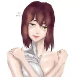
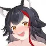
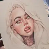
In this portrait I focused on the softness of the face but also on the very strong gaze. That's why the portraits focal point is her eyes and the rest is more symbolic (e.g. hair):

Here I wanted to focus on masculine, strong, geometric features so I used such lines:

This photo is seemingly strong (colors and contrasts) but the facial expression is delicate and carefree so I focused on it by drawing soft lines and shading:

3. SEE MORE THAN ONE REFERENCE OR EVEN BETTER - A VIDEO 🎞
Recently, I was commissioning a portrait of the author of the book I was illustrating. I was given a specific reference photo. I did two approaches and got the respond that the likeness could be better. Then I started looking at the author's other photos and videos available on the Internet. It turned out that my perspective was too narrow. When I saw the facial expressions of the portrayed person, it turned out that her features are much softer than in the photo I received before. On the third attempt I hit the jackpot :)
I had the same problem when drawing Aurora for the first time. I only saw her in photos, so I only focused on the easily noticeable features. When I watched her on the video, it turned out that her facial expressions significantly influenced her perception.
Sometimes people are not similar to themselves on the photos so if you can - watch them on videos before drawing their portraits.
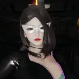
Look, if I had drawn Aurora from this screenshot of her video (top right) - she wouldn't look like her at all. Some photos reflect someone's nature better, some less, others not at all. Therefore, it is best to draw from nature. But if you can't - remember, watch a video or at least photos from different angles and with different expressions.

4. EMPHASIZE CORRECT FEATURES
If you want to capture the similarity but also play with the styling of a portrait, focus on the characteristics and try to exaggerate them. Character has a small nose? Draw it even smaller. Has big ears? Make them bigger.
In these photos you can see that by exaggerating the features typical of a face, you will maintain its character. However, if you change only one of the features to insuitable (e.g. change shapes of the features and enlarge the tiny nose), you will lose the resemblance.

5. FOCUS ON SHAPES OF THE FEATURES
It is often said that when looking for a similarity in a portrait, you have to think about proportions. This is true, but in my opinion, the specific shapes and angles are just as important (or even more). Repeating them will keep the similarity even if the drawing will be stylized. Notice how I repeat the shapes (nose, mouth, ears) even if I change their proportions in the stylized drawing (1):

6. KEY COLOURS
If you create in color, also focus on the tones typical for the characters you're drawing. Are they spooky? Use cold shades. Are they joyful and kind? Use warm tones. It all depends on what effect you want to get.
In this drawing, I wanted to highlight the cool shade of Billie's hair. So I made them even more silvery than they really were. I think it emphasized her bold character and balanced the sweet face on my stylized drawing.

7. WHAT IF YOU CAN’T SEE WHATS WRONG?
That's all for now! Hope my answer is a bit broader than "search for the proportions" and the tips will be helpful for you 😎
Hugs 🤗 Gaby
Yve - GraphiteDebris
2021-10-28 09:09:23 +0000 UTC