It's so difficult to pick a favourite! I really like that the T and R stay very clear while merged, but the more subtle one (the one that's shaped like a triangle), is also very neat.
Anechka
2022-11-20 16:17:28 +0000 UTC
I just added the second batch. Anechka, I think he made the one you were imagining.
Ryan Feeley
2022-11-19 20:42:58 +0000 UTC
I think I'm going with the first one. The majority of folks I have shown it to liked that one. The second batch he sent were not great.
Ryan Feeley
2022-11-19 20:38:45 +0000 UTC
I think I prefer the text of the first one and the logo of the second one.
Anechka
2022-11-19 20:36:33 +0000 UTC
Original is good. If you are going to change however I suggest the second one.
GratefulAmerican
2022-11-19 01:08:49 +0000 UTC
I would own the new logo. I've got my graphic designer working on a couple more
Ryan Feeley
2022-11-19 01:04:22 +0000 UTC
I don't own the current logo.
Ryan Feeley
2022-11-19 00:55:52 +0000 UTC
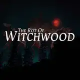
I need to give this some thought, because I really like the logo as it is now.
Anechka
2022-11-18 23:05:39 +0000 UTC
to be honest, I like your current logo more..but if you really want to change I'd choose the 1st one