XaiJu
New Age Ninja Corps
New Age Ninja Corps

patreon


Antarctic Covers

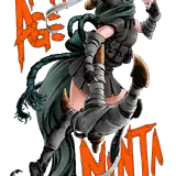
Alright folks, since ya'll are part of this creative process, tell me in the comments what you think of Antarctic's rendition of our cover? Love it? Hate it? Black Bars are where the creative teams names are going to go. Myself, Trent, Luigi and Liz. White space is pretty much the bar code. 

Antarctic Covers

Comments

Then I have some searching to do

Hazard Grin

I believe that was one of our earlier posts.

RAGS

Would love to see a diagram of all her tattoos laid out at some point

Hazard Grin

I like the new font, the Unicorn R is great. Not a fan of the straight white, I liked the orangey red. If we could get this font with that orangey red I think I'd be happy with it. Even if it stays white I don't think I'll be THAT upset about it. Overall, looks pretty solid.

Vulpine Machine

I like it! It's clean and dynamic, easy to read in thumbnail. Simple, but that's good from a advertising perspective, I think.

S.C. Jensen

I like the other logo

Luis Alsina Martin

I like the old logo but looks great

Giob83

I agree. This is just a mockup from them and its not set in stone. Logo being in color is a must for me. Thanks for the feedback!

RAGS

I preferred the old logo quite a bit more, to be honest. I understand that the white is likely going to be perceived as much more striking overall, more eye-catching, but the old logo felt more appropriate.

J. Bozlinski


More Creators