![[Download] CSP brushes I use + Color Palette + Lineart color guide](https://img5.xaiju.com/storage/3/yq/tc/d38796-019e8734-acf4-7aab-8f0c-509018707971.png)
![[Download] CSP brushes I use + Color Palette + Lineart color guide](https://img5.xaiju.com/storage/11/zb/jo/d38796-019e8734-acfa-7e5a-a158-c5e617837f42.png)
![[Download] CSP brushes I use + Color Palette + Lineart color guide](https://img5.xaiju.com/storage/8/ip/bx/d38796-019e8734-ad05-7ae4-bb8a-51c84a6f7cb8.png)
![[Download] CSP brushes I use + Color Palette + Lineart color guide](https://img5.xaiju.com/storage/9/iv/nh/d38796-019e8734-ad08-7abd-916c-9b4d4693a58a.jpg)

Thanks again for the support! Here is a .zip file with the ClipStudio Paint brushes that I use for all my normal illustrations. They are few, most of them are the same with different brush size, and the brush I use for the lineart is complicated and I don't recommend using it for lineart (I just keep using it out of pure habit, it feels weird for me to use anything else even though I know there are way better options out there).
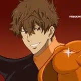
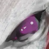
It also has a color palette with all of the basic colors I use. Here is a pixelated screenshot of it to use as reference (I couldn't get a good screenshot sadly)
Here you can see the base color on the left, a slightly darker color in the middle and an even darker color on the right side. The dark brown color is the color I use for the lineart by default. The 3 purple colors lazily put in the top-right corner are the colors I use to lazily add "darkness" to drawings by coloring the entire canvas with one of those purples, set the layer (that is on top of all other layers) to Multiply and the opacity to around 25%.
For this lineart color information the most useful colors will be the darker colors and the base red color.
Once the lineart and coloring of a drawing is completed, I create 3 new layers on top of the lineart layer (lineart folder, in my case 99%), turn them into clip layers and set their opacity to 75%
(Inside the red circle is the button to turn a layer into a clip layer)
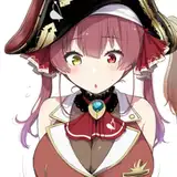
In the "linecoloring1" layer I do most of the line coloring using any default hard brush. I simply use the darker color corresponding to each color where the lineart is. For example I use the darker white skin color on lines that are touching the skin, and so on:
Note that I don't color every single skin-related line (or any other line). I make sure that the lines I color are not the outlines (the lines that define the shapes), so the colored lines are always inside an object/body part and never touch a different color or make the shape harder to see. For example in the image above, the reason I didn't color the line of the boy's hair that is touching the girl's hair is because that line is the outline of the boy's hair and it would make harder for the shape of his hair to see. (The outside of the boy's ear might seem colored, but it's not really. I'll explain that shortly.)
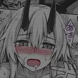
In this layer I also color the lines of the character's blush with the base red color (I draw the blush lines with the dedicated "casBlush" brush).
In the "linecoloring2" layer I do just one single thing: I grab the color pick tool, I select the point that looks the most red in the blushing area of the character's cheeks, and using this color I paint over the blush lines. That's it for this layer. It's important that this step is not done in the previous layer.
In the "linecoloring3" layer I grab the "casSpray" tool, select the basic red color, and do a soft, gentle coloring of the lines where redness makes sense. Mostly the face, around the eyes, knees, genitals, hands. It's imporant not to overdo it. This spray can ignore the rule I explained in "linecoloring1" to make the lines look more lively, which is why the ear of the boy looks slightly colored.
Some people have told me that I shouldn’t be so subtle in my drawings, in terms of line coloring or shading, as they might appear unrendered to viewers who only glance at them or see them as thumbnails. I apologize for not following this feedback, but I personally find beauty in subtle effort that may go unnoticed by most people. This has stayed with me ever since I played Metal Gear Solid 2 repeatedly when I was younger, discovering new subtle details, interactions, and bits of dialogue in every playthrough that I hadn’t noticed before.


