XaiJu
Apollos Thorne
Apollos Thorne

patreon


Underworld - Book 2 - Cover v1

Ladies and Gents! 

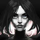
I present to you the first version of the cover for Underworld book 2. I'm interested in your initial thoughts. 

Note: It is not exactly accurate to book 2, but I always give the artist artistic freedom as long as they get the feel right. 

So, what you think?

Underworld - Book 2 - Cover v1

Comments

Everything but the ground and the doc Oct appendages. Sorry, former graphic designer so the liberties they took look alright,but like they rushed or got lazy with the design. But if your happy with it then they did their job.

John Findlay

I’d also suggest that for future books we get the sexy ladies on the covers. Clearly they will draw more attention ;). Only sort of kidding. It might help if you are having issues with artists getting the characters abilities properly displayed. creative endeavors with writers and artists are hard. I understand this from both sides...

Cameron C

the cat looks great. Is the I pictured the helmet/ back, etc looking more bone like

Robert Rosenthal

Thanks for all the feedback everyone! I gathered all your notes. No promises, but we'll see what can be done. I've mentioned it in some of my responses, but I have to work within the artist's abilities and we have a bit of a time crunch. Other than that, I'm also saving your feedback for future versions of new covers for the series. If things go well, in a year or so I'll probably go through and have them redone. The artist I work with does low to mid tier custom work for a great price. One day I'm hoping to go top of the line, but things need to stabilize as much as possible before I'm going to spend the money. That is one of the things the art fund is for. :D Cheers!

Apollos Thorne

Hah. I actually used the good Doc as an example to describe him. I know what you mean. I don't think we are going to get much more out of the armor I'm afraid. It's something I also was working on with them on the first cover. I don't think we are going to get a Skeleton Titan's Defense out of them. :(

Apollos Thorne

What might fix him (in my mind): He’s sort of weirdly floating, in a way that seems unnatural - from a body positioning standpoint - maybe fix that? The arms don’t quite work. If anything I was thinking the Spider-Man suit arms from infinity war versus what we have here. Maybe that might be the advice provided? More spider-like? That might upset people because it would be less true to the story, but probably look cooler. Maybe have Elorion shooting magic? Right now he’s sort of floating and waving weird arms at someone.

Cameron C

My opinion is that the issue is Elorion. The cat is neat. Magma is neat. Elorion? He sort of looks like discount doc ock

Cameron C

You're right. They were. The problem I've run into with each artist I've worked with is that if I give them too detailed of directions, then it just doesn't turned out as good. Depending on their experience, they may just be better with different kinds of bones than others. One day I'm going to spend a lot more money to redo these covers to the way I really want them, but that will probably cost about five times more. Heh. Thanks Zac!

Apollos Thorne

I agree, if they made elorion with more armor, it would make the cover look more crowded, but if they gave the angle were elorin is with more room, it might just work

I thought the bone arms were actually arms in the book less like a spine but overall pretty good

Zac James

Good deal. I'm not sure there is much they can do with the armor honestly, just knowing their past work, but I was thinking the same thing about the appendages. That is on the list! Thanks Bo!

Apollos Thorne

That should be good.

Vorquel

That's my fault. I told them the ceiling was about a mile high, so they put it at an angle where you can't see that high. Hrmmm. I'll ask them if there is something that might make it feel more confined.

Apollos Thorne

I like it, but i think it would look a little Better if elorion was covered in more bone armor, and if possible, make the appendages look sturdier and with at single Sharp point at the end

For something specific... The scene should at least be underground.

Vorquel

There's too much artistic liberty taken. It only barely looks like it could take place in the world.

Vorquel

I like the idea Tyler! I think they were trying something like that but they were having problems with making his appendages stand out when they did. It's a definite maybe!

Apollos Thorne

Hey Vorquel! Any idea what seems off? I can't have them redo the entire image, but small details can be tweaked. :D

Apollos Thorne

Man, you were right. The magma texture does make the cat look way better. Only thing I can think of to maybe, maybe improve it, is to add a couple lava exploions in the background. With at least one behind the MC. Not behind his hands, so it doesnt overlap the magic, but enough that it highlights the bone arm spikes.

Tyler Babcock

It doesn't feel right.

Vorquel


More Creators