XaiJu
ShimmeringSword
ShimmeringSword

patreon


Night Gyr Concept Sketch

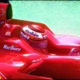
Here we have the Night Gyr.

On the left is Harri Kallio's sketch as I assigned him this one. On the right is my pass of trying to make it a little more interesting shapes wise. Most of it is just the more protruding and aggressive cockpit, with minor tweaks elsewhere.

What do you like more?

Night Gyr Concept Sketch

Comments

All the Jade Falcon Mechs have seemed odd to me. I've never been able to pin down what it is about them. maybe it's my general dislike of the Jade Falcons I don't know. either of these would be an improvement

Jeffery Smith

Left side one

Alex F

The right one seems a bit too beefy. I really thought that was an AC/20 in the right arm.

Mike

One on the right

Personally I prefer the more recessed cockpit. I do like that HUGE UAC/20 and the additional texture/details of the design on the right.

I like the first one's head assembly as more of a more detailed rehash of the old model and art. I like the second one more as a design. Thank you for sharing these with us! I'm really excited for BattleTech over the next year!

Raymond White

will you pack it in already, ive got to buy more mech packs now because of all this damn art! and the one on the right as its differant from the mwo one

it needs to look organic in order to facilitate the Laser Heat Sink Design

James Bixby

Personal thought the Night Gyr needs to have specific panels on it's body that look like they emit LOTS of light in order to reflect the use of Laser Heat Sinks. the Depressed Panel on the shins of the example on the left is ideal for what I am speaking of. another thought is to replace anything that looks vent like with such panels, since excess heat is converted to visible light by means of space magic. otherwise I prefer the autocannon on the elft side, but the PPCs on the right, I prefer the more rounded armor of the left mech but, to be honest I think the cockpits on both are not quite there. Both MWO and older artwork vie me the impression of a Ball Cockpit sitting ON TOP of the shoulders instead of being mounted in the front, and an armored cowl sitting on top and around the head module similar to a Cyclops. just my thoughts on the matter

James Bixby

Sorry Shimmy, I gotta go with the one on the left. Your version looks... too Organic

Paul Mabbott

I like the one of the right better. I like the arms and cockpit. It doesn’t look as “plump” as the one of the left. Now I don’t mean that as any kind of insult to the on the left. It is a very nice update to the design and I’d buy that miniature but I think the one the right just looks better

Dan Hegarty

The right one, definetely. It took some time to warm to the design, but now it's getting better. The right looks more beefy and dynamic...more aggressive and ready to storm ahead. Cool job!

Henning Boessler

Right looks so much better. The purpose of the re-design is to take the original designs and make them better without losing the 'spirit' of the original. And that's exactly what you've done with the version on the right. Lot's of people are going to always vote for the design closer to the originals, but what's the point in releasing the 13th version of the same design? Modernize and update.

Aaron Stevens

Gonna go with the left one. The weapons are kind of overly large on the right one and the head is just...not really a night gyr head. The elbows on the right one are also a little excessive.

I like these but, my problem is all the little holes and 'cut aways' in the armour, the vents etc, it seems a bit excessive.

Steven Cross

The right side looks better for me... except the cockpit. Actually, both cockpits look weird. Maybe a smaller cockpit?

The left one. I like the head on the right one, but it just doesn't look right on that mech. The minis for most of the 3058 mechs just have bad poses, can you give this a more active pose?

Of these two I like the one on the right more.

I like the aggressive right.

Honestly? I prefer the one on the left in almost every way. The one on the right is fine, but the protruding cockpit just looks a little awkward as it is presented there, and that's also the thing that deviates the most from the original design (which is, I'll admit, just "fine"). But even the beefier arm and shoulders aren't really doing it for me... the problem with the Night Gyr has always been that the miniature looks kinda dumpy and static (something that is unfortunately true for a lot of minis from TRO3058). Giving it a more dynamic pose and aggressive stance and higher detail is really enough to fix it, IMO. It's also one of the mechs whose MWO design I think is actually perfect instead of just "different", so I might be biased toward that—there are so few MWO designs I think are total improvements, so I hold onto them when I see them!

Robert Schuster

1 - In the original art, this is one of the stupidest looking mechs out there - so GREAT job with taking something ridiculous and making it look cool. Lots of things I like about your designs... but a couple that are... well, a little odd looking. Love the head/shoulders/torso on the left model - and really like the PPC arm - but the UAC-arm is a little... I don't want to say bland, because its definitely not bland, but it looks out of place, and same goes for the legs. It makes me think "Eh kind of generic sci fi robot" not - "ultra awesome 75-ton battlemech" - maybe take a quick pass with some massing-diagrams a little inspired by Alex Iglesias' Night Gyr?

I like the left legs and head, right shoulders and arms

Taylor Shead

I mean, to be fair to Anthony, the Night Gyr has always been a mech that my Jade Falcon self has wanted to love, and never really been able to get there. Something sort of always seems off to me about it. I guess I like the chonkiness of the MWO version?

Lexikon

Both look great...hard to choose, but if forced, I think I have a very slight preference for the version on the right...

Danny

Definitely the one on the left. The cockpit on the right looks too much like the bow of a Suffren-class destroyer.

Terence Harris

I really dig the right one. Gives the Night Gyr that extra bit of character and interesting shapes it needed to stop looking boring.

BFenix

I am particularly partial to the MWO version, so if I had to pick: left. Mainly the head on the right makes it look not like Night Gyr.

Ryan Voigt

I prefer the one on the right to the one on the left, but as some others have said I think the MWO version is my ideal. Even though the one on the right looks more aggressive, and I like the more narrow cockpit, I think it may poke out just a little too far.

I think maybe it needs a bit more weight in the feet and ankles to offset the top weight? The top to bottom proportions feel off.

David

Never understood why people liked the original baseballhead, so id choose the right design. One of those small changes that make a "yeah ok, at least it has a good bang" to a "as intimidating as it should be"

Swen Decker

The original art and description in the TRO says 2 PPC in the left arm and AC10 in the right arm.

For me the same goes as for BriansCache. I like the overall grade of Detail in the right, but the Cockpit is mit my kind. Too much forward pointed looks like a shark

Andreas Hoffmann

Kind of like a tempest and nova cat combined, Right? I Don't know how to feel about this one. really enjoying everyones opinions.

Jordan G Roberts

Aesthetically, I prefer the head on the right. However, that head makes it look less like a Night Gyr.

Yankee Air Pirate

First thing the arms are reversed in the original tro art so kudos for fixing that . But I agree with most commenters that the right head is better than the left. The reverse is true of which body is better.

MechaParade

If you add teeth rows in the canopy at right pic, it will be a Diamond Shark new totem mech. :) and trangle fin over the torso

The right looks meaner, I like the aggressiveness. But both have lost the Falcon essence, I like that the original had a break down the center. Maybe that’s not worth keeping, and if not, the one on the right is superior.

Andrew Bethards

I do agree with Lexikon, I am not thrilled with either. I can't really pinpoint it down, there is something odd about both heads/cockpits. The MWO design works much better here. Having said that, if I would be asked to make a choice, I would prefer the left one.

The right one looks very aggressive, by far the best

Tinman

Lov the mech and the sketch. I don't care for either head they look like an after thought. Left one is too small. Right looks like an egg rolling down a shoot.

Patrick D

I like the smooth curve of the left cockpit better than I like the shark-shaped cockpit on the right. Overall, I like the right one better than the left one- the right one looks chunkier, maybe butch-er, and the left one comes off looking smooth and delicate in comparison.

After thinking about it, i think the left one's cock pit is more true to the Night Gyr, but i like all the detail and beefier legs on the right.

Jordan G Roberts

I like the larger details on the right, but the cockpit is a little too forward pointed. Maybe dial it back a little. The left cockpit does need to look more aggressive.

Tough one, my opinion is I think the cockpit from MWO with more of a Terran marine from Starcraft shoulders would make it nice. I don't know, I am not sold on either. If I had to choose, I'd go with your pass over Harri's.

I guess the one on the right.

Vernacular Ham

This is the first mech in this campaign where I am just not thrilled with either. I guess the one on the right looks more aggressive.

Lexikon


More Creators