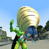
Crusader Concept Sketch
Added 2019-07-04 22:23:12 +0000 UTC
Story time. About two years ago we were wrapping up our mech selections for the Game of Armored Combat box, and decided to throw IWM a few more designs to release. They had the Shadowhawk and Ost Scout, were just releasing the Wasp, and had a Valkyrie on the way. The Crusader and Marauder II were going to be next, in time for Gencon.
Then the battle started, and all that was swept away.
I was mid design process for the Crusader, that you can see on the left, and dropped it there.
This last week I've picked it back up and refined everything with the skills I've improved on since. Everything got a pass, but the biggest changes were to the torso, head, and lower legs.
Any parts from the older sketch that you liked better than the new one?
We gundam now.
I like both sketches but the one on the right I find appealing. I personally think it would be pretty cool if the missile rings around the hands retracted to allow melee combat or club use etc. I did like the shoulder missiles but understand the need to move them.
Todd W
2019-08-26 23:55:24 +0000 UTC
Love the Crusader design. To be honest I have not been disappointed yet with one of the redesigns. you are doing incredible work.
2019-07-31 13:31:58 +0000 UTC
i had no choice but to throw more money at the screen to get this mech thats needed an update since forever and it does not dissapoint kickass!!!
2019-07-28 18:17:50 +0000 UTC
Man I totally love that Crusader on the right. How close will the final be to that Crusader?
2019-07-26 20:26:51 +0000 UTC
I feel like I agree; maybe having the missiles be slightly higher up the forearm? Right now, it looks like if it punched something, the launchers would be toast
2019-07-10 23:58:44 +0000 UTC
I love what you are doing with the head. I know it follows the design but man having the missiles come out around the hands so much makes the hands seem to be pretty useless for grabbing things.
2019-07-10 01:31:56 +0000 UTC
I really like the one on the right. I think the head looks fine
2019-07-08 20:40:14 +0000 UTC
Like it. Want it. Make it.
Damen DeLeenheer
2019-07-08 12:54:15 +0000 UTC
I definitely like where are you going with the sketch on the right.
2019-07-08 10:18:43 +0000 UTC
Both versions look good - at least where you were going with the first. I see the second captures more of the feel of the original source material: particularly the chest. I also like how the head matches more the cyclopean appearance from the TRO3025 illustration. The missiles in the vambraces work - when I was a kid I thought they were there anyway until I saw Macross. Only thought is to set then further back in the forearm so that the hand has more usable range of motion.
2019-07-07 16:59:04 +0000 UTC
I prefer the right. I’m glad to see the Jump Jets return. You know how I feel about the missile fists. Would prefer two antennae rather than what is clearly a unicorn horn. I agree with Bishop, the arms look too long and the thighs are currently too forward. Having said that, this is really quite nice and I look forward to adding a few to my collection. 😁
Richard Jensen
2019-07-06 15:41:26 +0000 UTC
Can we get a look at the hip launchers? Also I like the rear fins from the one on the left and the exhaust vents for LRMs need something but I am not sure what
Robert Moore
2019-07-06 15:34:58 +0000 UTC
Left shoulders, the rest from the right. Unicorn bits are just fine. I'll miss the shoulder missile racks, but I understand just how little say I have in these matters (Edit: Also, Kudos, current fore-arms are just right).
Mark
2019-07-05 20:41:36 +0000 UTC
Left head. Right torso and legs. I yearn for the LRMs to be in the shoulders.
2019-07-05 18:57:28 +0000 UTC
I see improvements on the new sketch all across the board, except maybe on the shoulders, but that's personal preference. Loving the cockpit, the lower legs and the way you handled the weapons on the forearms (almost looks like a jet turbine!). I never liked the aesthetics of the Crusader, always looked too super robot to me, like an action figure. Now it's getting that proper heavy metal machine-vibe!
BFenix
2019-07-05 16:04:14 +0000 UTC
Humbly I prefer the left head design, particularly the cockpit window. The right design I think is too rounded.
Jakob Fredensborg
2019-07-05 14:43:46 +0000 UTC
Right side is near perfect.
Thighs feel a little wonky (like to far forward compared to the pelvis)
and the arms look too long overall (as drawn looks like fists would hang next to the knees),
but aside from that, I think the details work real well, and I can't see a single feature from the Left Side one that I feel is better than the same features on the Right.
Benjamin Myers (Bishop Steiner)
2019-07-05 14:25:13 +0000 UTC
It's a Rhino Horn man. That's your problem... can't tell the difference between a unicorn and a rhino.... gosh!!!!
Benjamin Myers (Bishop Steiner)
2019-07-05 14:22:29 +0000 UTC
I love it. The Crusader goes from a mech I always honestly forgot existed to something I'd actually want to field!
Robert Schuster
2019-07-05 13:19:51 +0000 UTC
Also for tbe record, I love the unicorn horn.
Raymond White
2019-07-05 13:17:25 +0000 UTC
Left head for me) right one looks as if it continues down the back, like Alien creature head is. The horn is true or it had just an antenna?
2019-07-05 10:49:27 +0000 UTC
Right
2019-07-05 10:47:42 +0000 UTC
I prefer the right, but I'm not digging the unicorn horn. Everything else looks great.
Joshua Bressel
2019-07-05 09:24:56 +0000 UTC
Yes! YES!!! She's gorgeous!
Raymond White
2019-07-05 09:12:55 +0000 UTC
Looks absolutely amazing - glad you´re continuing with mechs which have the old flair, but are bulky as heavy mechs should be. Like the unicorn on the right. And to be honest...with no horn on the head it´s no true Crusader Mech. :D
Henning Boessler
2019-07-05 08:37:39 +0000 UTC
right's good, not totally on board with the head and the unicorn horn. The backpack seems big for a mech that can't jump, too...
David
2019-07-05 07:02:58 +0000 UTC
Booo missile fists! Can't fit? That's quitter talk. More like Anthony Scribbles am I right guys.
I like the one on the right.
2019-07-05 06:46:48 +0000 UTC
I prefer the right one personally, both are amazing but the right's arms look better :)
Steven Cross
2019-07-05 05:42:10 +0000 UTC
This. Is. Awesome! The one on the right is definitely more defined and the fins (back), recessed head, and protruding chest make it a mean looking mech. I also really like the slightly recessed hands!
2019-07-05 04:32:22 +0000 UTC
The right one is better in pretty much all ways. You've really done the design justice. :)
2019-07-05 03:10:13 +0000 UTC
left chest and head,right arms and legs, ditch the horn entirely, otherwise I will shave it off when I get the minis. I am agnostic on the Jump Jets.
I wish the medium lasers were more prominent, but that could be because of this perspective rather then the design itself. only other thingI could wish for is that the head was a little more square with cockpit panels or sensor panels that wrapped around the majority of the head. this beast was supposed to be the "Standard" Heavy for the SLDF (Such as anything exists) a wide visual would be needed for it.
James Bixby
2019-07-05 03:02:33 +0000 UTC
Meh, never cared for the Crusader.
Tyler Erickson
2019-07-05 02:08:53 +0000 UTC
Sweet. I can’t wait to see your take on the Urbanmech. I have faith that you can make the little trash can look amazing.
Damen DeLeenheer
2019-07-05 01:44:49 +0000 UTC
add me to the righhand body, lefthand head crowd
Matt
2019-07-05 01:31:51 +0000 UTC
I like the design better than expected, but the forward slanted blade on the head makes me think "unicorn"! Please change that!
2019-07-04 23:57:49 +0000 UTC
The one on the right, but add the cockpit on the left. Looks really, really, good.
2019-07-04 23:44:25 +0000 UTC
YESSSS! Totally fine with the one on the right. Crusader came out of the brutal Reunification War and this beast looks the part.
Mitchell Berthelson
2019-07-04 23:35:31 +0000 UTC
Right one looks better in every regard except maybe the cockpit glass as others have said. The left design evokes the old 3025 head design which had nostalgic appeal. But the right one seems more in keeping with the current aesthetic.
2019-07-04 23:27:52 +0000 UTC
I'd take that right one into battle. It looks like it means business.
James Doughty
2019-07-04 23:19:49 +0000 UTC
Hell, you may even have converted me to a wrist-pod guy...
Stewart Spencer
2019-07-04 23:09:26 +0000 UTC
I'll echo the thoughts above on the head, The left one looks more dome like, which I prefer, apart from that right pic for the win. EDIT: Changed my mind about the head - The right pic is better in it's entirety. :)
Stewart Spencer
2019-07-04 23:08:56 +0000 UTC
As a suggestion in general, consider the size/ recessing of the cockpit glass at tabletop scale, some of the new minis are near impossible to paint in the cockpit glass, or to even see it.on the table. (Thunderbolt). Just a thought, loving the look of the new models though!
Phil
2019-07-04 23:08:47 +0000 UTC
I really like it, except the squat head and tiny cockpit glass.
Phil
2019-07-04 23:06:52 +0000 UTC
I was prepared to hate the loss of the shoulder pods but... the updated one is a thing of beauty. I'll call it a Crusader and love it.
2019-07-04 23:06:26 +0000 UTC
I really like your more recent version, especially so the chest as it seems to give the pilot better visibility.
Danny
2019-07-04 22:54:35 +0000 UTC
Only thing I like more on the left is the head. Fantastic work! Zieg Zeon!
Jordan G Roberts
2019-07-04 22:47:36 +0000 UTC
The original was still supposed to be a round drum, but did have a flatter front. Mostly though it was just drawn badly.
I thought the whole forearm silhouette being a simple cylinder might be going too far on retro shapes.
Anthony Scroggins
2019-07-04 22:45:33 +0000 UTC
New one too sleek?
Anthony Scroggins
2019-07-04 22:38:49 +0000 UTC
Because I've almost fully modeled the Marauder II, it's not likely to change much.
Anthony Scroggins
2019-07-04 22:38:32 +0000 UTC
Don't like them angling/bulging out?
Anthony Scroggins
2019-07-04 22:37:53 +0000 UTC
My first thought was that I too liked the more "squarish" Missile launchers on the left. However, the more I compare the two, the more I'm heading the other way. Plenty of mechs have square launchers, and "round" makes a lot more sense given the location. I really prefer the chest on the right.
Dexion (Shawn)
2019-07-04 22:35:37 +0000 UTC
I like the head on the older sketch. But to add weight to James Lees post “YES”
Dan Hegarty
2019-07-04 22:27:25 +0000 UTC
Noice! I like the torso shape and back "wings" better now. Any chance the Marauder II may still get that facelift?
Paul Mabbott
2019-07-04 22:27:22 +0000 UTC
The only thing I like better on the older one are the forearm launchers, really. The new one looks fantastic either way!
2019-07-04 22:26:58 +0000 UTC
YES!
2019-07-04 22:23:45 +0000 UTC