Getting these first few pages right has been the hardest part of this process so far I think. I keep having to step away and come back to it with fresh eyes, and I'm still not that happy....
Please keep in mind that these aren't the final pages...

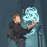
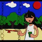
This is Page 0 and 1, with lighting on the characters, and some backgrounds. Next to it is one of my favorite pages from the previous chapters - a look I want to replicate.
Now my issue and dilemma right now are that these first two pages are way too busy. There's so much going on - and I think the comic is so much stronger when the characters pull all the attention. If you look at the example page next to them it sings, through its use of very simple splash backgrounds. Bright comic colors, and little to no background. I want to find that again, but instead got lost somewhere in murky-textures and distracting backgrounds.
There's something to be said to having a detailed panel early on - it sets the scene and location. Buuuut currently I think it looks at odds with the comic. The background that I've made so far isn't supporting the characters - but is instead fighting for attention. That's no good!
Originally page 0 was just going to be a chapter page - pretty darn basic, but it's expanded into something else and now feels at odds with the rest of the comic. I've not thought up a good fix for it yet...
I'm not looking for help or anything on this - I just thought you all might like to see these first steps. I'll revisit these pages a few more times I'm sure - maybe explore simple color gradient backgrounds. I'll also explore making my lights on the characters 'whiter' to help it feel a little cooler - there is such a thing as TOO much color!
It's all part of the process =)
I hope your all staying safe and well <3 I've got a regular work week coming up, but after that - a couple of half weeks, so I'll be able to work a bunch on the comic =D Hopefully finally finish up a couple of these pages =D
Edit!
After hearing some of your thoughts and dropping a few hours into it, I think things are shaping up! Still, brainstorming page 0 - I love the idea of reworking the page. But don't want to invest crazy time into it. I'm thinking about maybe using the coffeeshop poster I made as to the center point. And adding... a coffee machine or something next to it? so the page is more 'zootopian coffeeshop'? Anyway, it's all progress!

Amadose
2020-05-26 02:01:59 +0000 UTCTigerchris
2020-05-26 00:45:30 +0000 UTCAmadose
2020-05-24 21:25:31 +0000 UTCocaron
2020-05-24 21:15:33 +0000 UTCAmadose
2020-05-24 20:16:04 +0000 UTCKadath
2020-05-24 20:08:05 +0000 UTC