XaiJu
tryguys
tryguys

patreon


Merch Help!

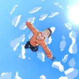
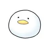
Hey friends! We are making some needed Eat The Menu merch and want to hear from YOU! What do you prefer from these two options? Is there something missing that you wish were a part of them or do you like them as is? Let me know in the comments! :) 

- Nick

Merch Help! Merch Help!

Comments

I like both, but the white text on navy stands out better, and I agree it needs some sort of logo somewhere… even if it’s small and on a sleeve or something. It would also be nice to offer the zip up hoodie option

Ditto other folks on logo needs, but did want to put in a vote for the tonel embroidery in general! Love that look

Allison DeVoe

DEFINITELY need a logo. I’ve been super unhappy with the Patreon merch that just has plain words with no logo or anything to indicate that it is try guys. Also bummed I received a Ned quote hoodie weeks after the scandal unfolded. Went right to the thrift store the day to donate it.

Lauren Camp

I like the navy/white ones, though they all look pretty good. I kinda wish the font was different though

like kaine said i like the simple "eat with keith" and maybe include basic tonal images of a taco, french fries, and a noodle dish to pay homage to the first season? -- I also second that their needs to be a kleith moment -- perhaps with some blue squares?

I second the not having people stare at my chest bit. Plus the lowest chance of face to face interaction with strangers at the grocery store is always a plus

For a shirt I would prefer just an “eat with keith” not the i wanna part, the eat the menu specifically looks like it could be a small decal like where a breast pocket would be? or on a dad hat? tbh more than just a quote would look dope :) <3

Kaine J Mozdzen

"I wanna eat with Keith" is much more specific to us, though I get that "Eat the menu" may lead to more Google searches and thus lead generation or whatever the business speak is. As others have said - we NEED a logo, otherwise is it even Merch? Navy all the way. Personally I prefer the image/text/whatever to be on the back so that people don't have to look at my boobs to see it, but that's just me.

Like the dark Blue, grey is too much. Zip up hoodies with the words on back and front are good

I agree about the branding. I like the "I wanna eat with Keith" but maybe throw a hot sauce bottle or a fried chicken on there to make it 'Keith' I also like the darker colors, I always get dark when it comes to hoodies and such things

Pixels

I do very much agree with this statement. Without the TryGuys branding, this could just as well be Cafepress by a fan.

tossingglitter

Indigo Tonal and Royal Tonal, in that order. That Indigo Tonal is wearable any day of the week with jeans, joggers, or yoga pants. That's my throw-on go-to I'd keep by the front door and wear until it was tattered.

tossingglitter

I like “I wanna eat with Keith” as a dad hat, but I don’t know if I’d wear a shirt or hoodie with either phrase. I think there needs to be some branding on the shirts to make them more clearly Try Guys. Maybe the triceratops or a sketch of a hot sauce bottle with Keith’s face on it.

I would prefer merch that has something of a design, nothing major, but even an almost transparent triceratops logo in the background or something would be great. I want people to know it’s try guys merch and if it’s always a (sometimes) niche joke of just text, makes me very unlikely to want to wear it.

CaitRose

I like I want to eat with Keith in the Indigo blue hoodie, wondering if y'all would offer it as a crew neck as well?

Crystal


More Creators