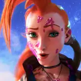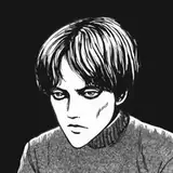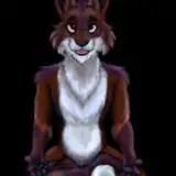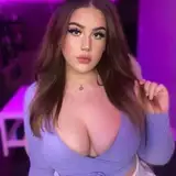
During my break in June, I’ll still be experimenting with a new visual style for upcoming works from time to time. I’ve more or less decided on the drawing technique and how to handle the white outlines, but I’m still unsure about the color palette. Since this is adult animation, stronger colors might deliver more impact. Here’s an early preview—feel free to share your thoughts. I’ll re-evaluate the final look once the illustration is complete.
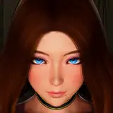
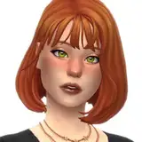
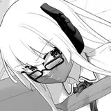
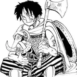
( C more or less follows the style of the original work. I'm considering whether to stick with that style or add more color. )


六月休息期間,我仍會不定期測試新作品的視覺風格。目前大致已經決定了繪製方式與白邊的處理方法,不過在配色方面還在猶豫。畢竟是成人動畫,感覺用強烈一點的色彩會比較有衝擊力。這裡先釋出一版,歡迎大家提出意見,等到圖完成後我會再做一次評估。
( C 的風格基本上沿襲了原作。我正在考慮是繼續沿用原作的風格,還是添加一些色彩。 )
T-50PAKFA
2025-06-13 06:39:24 +0000 UTCtedeus
2025-06-09 15:53:47 +0000 UTC