XaiJu
LoftyPursuits
LoftyPursuits

patreon


Patreon Pre-orders closed, and another draft of this shirt, more tweaks

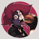
I've been working on new shirts for the store. Here is another draft of the record. Two drafts actually. I'd love some feedback. It's for the store front more than candy.

Also, we hit the first five batches of Tangerine Sours sold just through Patreon, thanks folks. As I warned I'm turning pre-orders off until we can actually make this candy and get some out. This is a big enough run to get the production bugs out. Still having issues grinding the acid, but we've solved the shrink wrap issues.

We will re-open pre-orders for you patreon folks when we get this under control, and that will be before the next group gets a chance at it.

-GReg


Patreon Pre-orders closed, and another draft of this shirt, more tweaks Patreon Pre-orders closed, and another draft of this shirt, more tweaks

Comments

I like the egg.. maybe make it larger so that you can increase the track font size?

Brian Marsh

"Thirded" on the point about the one that isn't a perfect circle! It looked more egg-like and it seemed like the text was clearer. However, I will say in both designs that the font shows up a bit blurry on my screen. This one is even blurrier. Even if it's not blurry, I personally would see if you can make the track list shorter to give you more room to make the text bigger. Also/or you could maybe use a font that's either more spaced out or less bold. Otherwise, I really do like it and think it's a great idea! Legibility just seems to be an issue.

Natalie Rose

Oh it will not be big enough to read from a distance, but the egg and the record will be. And if somebody comes closer they'll be a second layer of humor. Hopefully the overall design will be interesting in enough to bring somebody closer. Still not 100% sure of this design but I'm getting there

I agree with Ashleah. Also, I wonder if the song title font is big enough to be legible from a distance on the shirt?

Curtis Davis

I like the one better where the egg is not a perfect circle since I think it goes really well with the fork/record arm. Makes it read more like an egg.

Ashleah


More Creators