Like I explained in my previous Edited artwork compilation, I'm changing my web address in several old pictures, as well as improving certain visual aspects of them (If necessary).
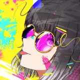
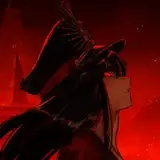
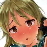
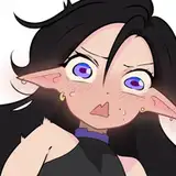
This time I edited My artwork of Haruko, originally shared in march of 2015. An interesting fact about this picture is that I originally intended to submit the final picture as a flat artwork, using only the outlines and a solid color.
While I was trying to do something different than usual, playing more with the colors and the contrast between them, maybe even using pure blacks like a manga page, But I eventually I scrapped the idea. I felt some might think the effect wasn't intentional and I just left the picture half done, so I added more details the way I use to work.
Most recently, I changed the web address of the picture and decided to add more light effects to the picture, I also come up with the idea of including the show logo and adding a texture, to make it look like it was a scanned page from an anime magazine.
I think the texture adds something you don't usually see in my artworks, but you'll tell me which version you like best :)
Hotaru Mayowasu
2015-11-27 19:23:16 +0000 UTCSoran
2015-11-27 13:54:13 +0000 UTC