Hi. Today I decided to try an experimental format of exclusive content. I usually show in detail the process of creating some of my recent art. Such a post will be closer to the end of the month.
And now I would just like to analyze what effects I usually add at the end of the work and why I do it (in the first part). And I'll also show you how to do the same (in the second part).
To begin with, I admit that I have always liked this combination of character stylistics and environment: cartoon characters and a more realistic background. And I intuitively tried to do the same. I learned the possibilities of creating various realistic backgrounds (if you want, I can write a separate post about it), but I left some cartoonishness with the characters themselves: contour lines, facial expressions, mouth shapes, big eyes.
Then I found out why the combination of cartoon characters and authentic surroundings is really good, but I'll probably tell you about it another time because it deserves a separate post.
In order for cartoon characters and realistic backgrounds to "be friends" in one picture, I apply 3 effects that we can see in real photos and in movies: these are Vignetting, Chromatic Aberrations and Film Noises.
Let's see what it is, where we could see it and what it is for.
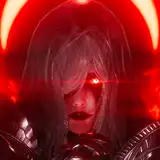
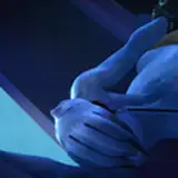
1. Vignetting. This is a decrease in brightness closer to the edges of the frame. When shooting with a physical camera, this effect occurs due to many technical reasons (details on wikipedia). This effect may seem undesirable, but in practice it can be used to increase attention to the center of the frame.
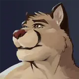
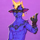
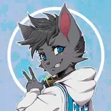
A good example is one of my old sketches:

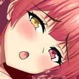
If you add to it a blur to the edge of the frame, you will get an effect that people like to use on Instagram. He is very well suited to portraits, emphasizing the focus on the face and "blurring" peripheral objects:

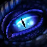
If you play with shading more subtly, you can create an interesting effect of focusing attention to a certain detail by directing light at it and darkening everything else:

2. Chromatic aberration. This effect is obtained due to the passage of light through the lenses: different light waves are refracted differently, and often we see a "divergence of colors" (we see the effect better at the edges of the frame)

Usually this is an undesirable effect and they try to remove it, but we still see it very often in photos and in movies. For example, in the movie "La La Land":

We are so used to the fact that this effect is visible in real pictures that the presence of this effect even in games or in drawings gives "physicality", "authenticity" to what we see.
Here's how this effect is used in the cartoon "The Amazing World of Gumball":

Here the authors decided to enhance this effect to give the photo inside the cartoon even more "photo effect":

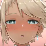
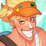
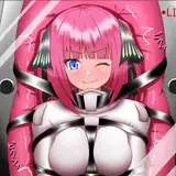
I discovered this effect relatively recently, here is an example of how I used it in one of the recent art. This gave the art an additional realism, adding "imperfection of optics".

3. Noise. Or rather, Film grain. This is something that famous directors adore and many viewers hate. Authors such as Spielberg, Fincher or Tarantino are very fond of the vintage grain of old films, and then the audience buys a noise-canceling TV at home))
Here are the shots from my favorite movie "Fight Club":

And even in modern cinema with an abundance of computer graphics, noise is added.

So why is it needed? For three reasons. 1). The noise gives the impression that there are more details than in reality, and the surfaces under the noise look "richer". 2). Noise "equalizes" a realistic background with more cartoon characters. 3). The noise creates a cinematic effect, as if it is something that was filmed on a real camera.
We can see noise not only in films, but also in cartoons, for example in "Luca":

And even in "The Amazing World of Gumball":

But in other cartoons, the noise is almost imperceptible. for example, in "Zootopia" it is very difficult to find it and in most frames it is practically absent:

In using this effect, it is important not to overdo it. I sometimes make such a mistake and I will work on it.
Here is an example of how well I added noise (on the left without noise, on the right - with noise):

Here you can see both chromatic aberrations and the addition of noise:

And here I think I overdid it))

All 3 effects add the feeling that real optics were used to shoot the frame, the difference between the background and the character becomes smaller, while the realism of the background and the caricature of the characters are not lost.
I'll show you how to do this in Photoshop version 23.1. In previous versions, it should be a similar process.
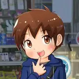
1. For example, I just added contours to a photo of a funny kitty and applied effects, so we have something similar to a drawing in front of us. And we want to make this drawing realistic with our three effects

2. Vignetting. Just in case, duplicate the background layer. Select the "Lens Correction" filter and there, on the "Custom" tab, move the vignetting slider to the left to darken the edges.


3. Chromatic aberration. Just in case, duplicate the current layer. Again, select the "Lens Correction" filter and there, on the "Custom" tab, shift the Aberration sliders in different directions, and also make the "Scale" 99%


In most cases, one application of the filter will not be enough, and you can repeat this filter by selecting the topmost line in the Filter menu several times in a row (usually two to 5 repetitions of this filter are enough for me)

And we will get a clearly visible effect:

4. Duplicate the current layer and apply a "Radial Blur" to it (from the center to the edges). You can choose the strength of the blur experimentally, in my case this value is 5. The blur method: "Zoom"


5. We got a blur.

But let's bring clarity back to the far eye. To do this, just take the "Eraser" and erase our last layer with a blur in the eye area, right under it - our previous layer before the blur.

6. Let's add noise. Let's create a new empty layer and fill it with an average gray color.


Then select the "Noise" filter and apply it to the gray layer (you can choose the amount of noise experimentally).

Please note that it will be better if the noise is colored (the absence of a check mark at the bottom of the filter window is responsible for this)

7. So that the noise is not so sharp, we will apply a blur to it.

The larger the blur value, the larger our noise.

8. Let's choose the overlay mode of our layer with noise as "Soft Light"

9. As a result, we got this picture, in which we added all 3 of our effects.

Let's compare how it was and how it became::

Those places that looked too "cartoon" have become more "photographic" (thanks to aberration and noise), and thanks to the darkening and blurring of the edges, our attention is now better directed to the center of this cute muzzle. Which is exactly what was required.
I hope this turned out to be useful to you! And towards the end of the month, I will share the PSD source and describe in detail the process of creating a recent art with a bunny walking in the park.
See you soon 😉
Kotyami
2022-02-23 09:02:46 +0000 UTCKiko
2022-02-23 06:17:34 +0000 UTCKotyami
2022-02-23 01:37:03 +0000 UTCBearfighter
2022-02-23 00:16:57 +0000 UTC