NOTE: This post was originally published on January 11, 2019 on Drip.
Hello, folks! Erik here.
Happy Friday! It's 2019, and I hope yours is off to a great start.
As the saying goes, "New year, new you!" and so I thought that now would be a perfect time to go back in time a little bit, to talk about how we updated our logo a few years ago. Like most things around these parts, it was a team effort!
Rewind to 2014. At the time, we were still using the first true logo of ours, that I'm sure many of you are familiar with: the Filmstrip. It was designed by our original graphics guru, Justin Panlasigui.

One of the things I was interested in was completely revamping the logo, while maintaining a fun look-and-feel. I also wanted to make sure that any new logo would be slightly more compact (instead of being so much of a horizontal orientation) so that it could be transformed, scaled and cropped, and more easily used on everything from shirts and mugs to TV apps.
We also didn't want to lose the identity of the company; we'd need to make sure that the new logo would still echo the one that had already existed for 5 years, so as not to confuse anyone who had grown accustomed to it.
I began to play around with some general concepts, keeping in mind that RiffTrax is about comedy; we don't make the movies you're watching, we make them funny! So why not have a logo that takes its inspiration in a similar way?
Thus began a collaborative process between myself, a bunch of the RiffTrax staff, and some trusted colleagues to begin shaping a new visual representation of what we do.
After thinking it through a bit, and taking into consideration the history between our company, MST3K, the SyFy Channel days, etc., I thought that harkening to those would be a fun and sensible way to go. I wanted the logo to represent movies, and making fun of them, while also creating a relationship to the shared history of Mike, Kevin and Bill. Therefore, perhaps the new logo should be a planet, but without copying what had been done before. I got to work, and came up with a very rough draft concept, using a planet that was a film reel canister:

Not great, but I thought the idea was worth pursuing, so I kept iterating on it:

I loved the idea of the film reel canister, but also realized that it would be super hard to translate just what it was - especially at smaller sizes. Plus, the age-old question of, "How do we explain what it is RiffTrax does in a single image?" Then it occurred to me: jokes. Voices. Maybe even a microphone — as long as that wasn't too "on the nose," of course.
The first thought I had was that the microphone itself should be realistic.

We went through a couple options of what type of microphone we should use. Originally, I thought that a vintage, retro-looking mic, like a Shure 55, would be the best fit to emphasize the age of many of the movies we riff on.

Those squiggles you see are inspired by "radio broadcast lines" as seen in places like the old RKO Radio Pictures logo. Kevin was a big fan of those.
As mentioned earlier, I enlisted the help of a bunch of folks, such as our long-time graphic designer Jason Martin, as well as Kevin Murphy and our technical director David D. Martin. I also started a private Facebook group, wherein I would poll a group of RiffTrax super-fans to get their feedback throughout the process.
One of the first bits of input from this committee was that the microphone should really be cartoonish, to aid in separation — that is, distinguishing it from other elements in the accompanying layout, especially when used in the context of larger formats like theatrical posters. Jason began working on some sketches, and other variants, to give us a good selection of options to choose from.

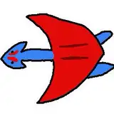
We tested out some alternatives with regard to the planet aspect, too:

We all agreed that a spherical mic worked best, especially for a "planet." And as such, the microphone planet should be a planet, and not a microphone. (For instance, any ideas of attaching a mic stand or handle were out.)
With everyone signed onto the general look, and with the clock running out for this project, I reached out to our friend and artist extraordinaire, Adam Koford, to see if he'd be willing to help. Luckily for us, he was eager and excited to help us create something awesome.
I sent him some references of different microphone models to get started, and within a few days, he sent us his first draft:

Adam drew the microphone and film reel separately, so that we could arrange them how we wanted. We continued to play around with things like proportion, angles, and even colors of the filmstrip.

I even tried flattening the reel to make the whole thing look like Saturn, but it ended up more like one of those Pogo Balls we all had in the 90s:

While we all kind of loved the vintage microphone look, it became apparent that some aspects of the design would lose their definition when scaled down to smaller sizes. "Is it an electric shaver?" was one question I got from our feedback committee; that further informed our move in the direction of making the microphone more of a classic, well-known shape.

By now everything was coming together. However, our focus group made us aware that this particular microphone shape still didn't quite "read" as a microphone. After thinking on this a bit, we had Adam craft a new version of the planet with a visible band around it. It would peek out just enough to make it recognizable.

"I like the band, but it may just be because I work with microphones every day." - Kevin Murphy
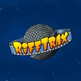
Adding that little detail actually made the entire thing come together. Voila!

One of the benefits I had aimed for since the beginning was the ability to transform the logo into other things, for whatever dynamic concepts we could think of. Having the flexibility helped a lot, especially for live shows and other promotions:

But my favorite part of the entire process - as much as I enjoyed the actual creation aspect of it - was walking into the Belcourt Theatre the first time we used it in a live show. I mean, how cool is this?

And there you have it! From concept to creation, it was certainly a challenge. But being able to collaborate with so many smart people — inside the company, and out — was great fun.
Any time there's "reinvention" of any sort, it's always a balance to make sure you're honoring what's come before, but making sure the work will still hold up in the future. So, while those requirements were a bit scary at first, I think the path we ended up taking, and the final logo itself, was well worth it.
Thanks for joining me on this inside look at the logo redesign process. I hope you enjoyed it as much as I did!
Your pal,
Erik
Christopher Cummings
2024-01-23 19:06:48 +0000 UTCEd Henry Flynn
2020-02-21 11:34:13 +0000 UTCKell Brigan
2019-10-13 03:04:43 +0000 UTCRiffTrax
2019-10-10 00:22:45 +0000 UTCKerry S.
2019-10-08 22:00:12 +0000 UTC