Hey folks! I wish I had more interesting things to show you, but all I've been up to recently is scripting and drawing comic thumbnails. It's been the most fun I've ever had working on a comic, and every day spent on it has been so rewarding, and the only reason this is possible at all is because of your pledges, so thank you!
I can tell you I'm 47 pages in and nearly done with the first act of the entire story, which I personally find very exciting! There's likely going to be 5 acts in all.

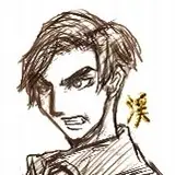
A friend asked when I'm going to start pencils on this comic, and my answer was, basically, "Uh... I have no idea!" Truthfully, I wasn't expecting to start pencils until I was nearly done thumbnailing, because I wanted to make sure I've got a clear roadmap going before I start driving.
...but then the other day, I got absolutely stuck on writing/thumbnailing a certain scene, so I decided to switch gears and pick away at pencils. I'll probably continue like this - going where my attention span and ADHD wants to go, rather than fighting it!

Two things I wanna mention about these rough draft pencils -
1. THE FONT. I've been planning on lettering and typesetting this comic myself, because comic lettering has always been something I've been interested in! I've been toying with different free Blambot fonts, but my heart wasn't set on anything.
As I've been scripting, I've had pages and pages of the manga, Paradise Kiss, open for panel and pacing inspiration, and it hit me. What if... what if I could find the font from Paradise Kiss? Specifically, the 2002 TokyoPop version, because that's the edition I grew up with and hold in my heart.

(I saw Vertical holds the Paradise Kiss license now, so it's been re-translated and re-lettered and I was aghast. Did they un-British Arashi? I don't want to know!!! Don't tell me! He'll always be British in my heart!!!!)
So, to hunt for the Paradise Kiss font, I hit up my peer, agency buddy, and most importantly Actual Cousin (this is a long story), the incredible cartoonist and letterer, Kyla Aiko.
Kyla's the letterer behind Gokurakugai, Dandadan, Komi Can't Communicate and is super passionate about lettering. She runs the Manga Font Directory, which is exactly that - a directory of tons of fonts, what manga they were used in, and where to buy them!

I asked Kyla if she could figure out what font was used in the 2002 Paradise Kiss. About an hour later, she came back and had an answer for me...
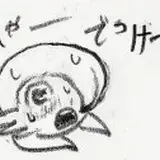
Harold's Fonts: Markerman.

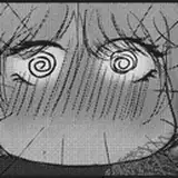
The instant I saw this next image, my heart nearly stopped:

Seeing that font writing "Markerman", my heart instantly recognized it. I knew it was the font from TP's 2002 Paradise Kiss. I can only describe the huge amount of warmth and joy I felt to running into an old, dear friend I haven't seen in years.
I managed to find an instance of Paradise Kiss using a glyph (the asterisk, on the first page of Stage 2) to confirm it was indeed, Markerman.
The license to Markerman cost twenty bucks, and... I did it. I bought it. It's officially. Markerman is going to be the font of Project Kintsugi.
I can think of no greater homage to my love of Paradise Kiss, Ai Yazawa, and the incredible amount of influence those stories had on me during my most impressionable years than to use the same font as it. This is such a small, trivial thing that no one is going to care about as much as me, but it's made me so disproportionately happy and I wish these pages were all drawn just so I could letter them already, haha!
Okay, wait. I said there was a second thing I wanted to mention about that penciled page, right? OH.
2. The backgrounds!
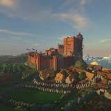
The keen eye-havers might spot some screenshots of 3D buildings in my thumbnails, and that's because, as I've mentioned before... I build all my sets in Blender. (Literally. All of them. You name a place that's going to appear in this comic, and I have a 3D set of it).
Just so you folks haven't come this far just to read about a font, I thought I'd share the set I've got for Daniel's apartment!
Daniel lives in River North of Chicago, and comes from an upper-middle class family, and is an incredibly lonely guy, so I've tried to make his apartment reflect all of that.

I wanted his apartment to feel "too big for one person", and to reflect Daniel's modern and minimalist aesthetic.

Any door in any of my sets, I've also rigged so that it can open and close, should I ever need to have that happen in a background. (Now you all know my secret to how I was able to draw the door in the colored test page in perspective. I just... literally opened it to the angle I wanted!)
Daniel's a "shoes off" guy, because that's how he was raised as a third-generation Japanese American, so we've got the shoe rack right by the door.

He's also got an upright piano, the Fender electric guitar he plays in the band, and an acoustic guitar he plays for fun in his living room.

His bedroom is pretty sparse, but it does have a queen-sized bed because... reasons. Reasons everyone at the NSFW tier, Espresso Shot, are here for.
--
Okay, I think that's it for now! Thank you all for being here. Your financial support makes all the difference in the world. I'm so excited to keep working at this!
Amélie
2023-07-27 18:58:07 +0000 UTCKody Okamoto
2023-07-27 17:34:46 +0000 UTCKody Okamoto
2023-07-27 17:34:11 +0000 UTCAmélie
2023-07-23 21:00:20 +0000 UTCotasatic
2023-07-22 21:16:08 +0000 UTCKody Okamoto
2023-07-22 02:57:48 +0000 UTCJenna
2023-07-22 02:28:20 +0000 UTC