
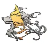
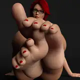
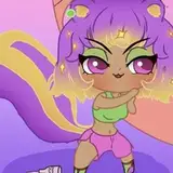
I wanted to ask you, wich kind of lines you preffer for the webcomic, option 1, more think and solid or 2 more thick and a bit softer
both have hteir pros and cons really
for larger view: https://s3-us-west-1.amazonaws.com/patreon.posts/6606427531270873123.png
The Black Pharaoh
2016-07-28 21:54:06 +0000 UTCDaichi Lu Azure
2016-07-28 15:16:32 +0000 UTCProfe MacKnight
2016-07-28 05:43:02 +0000 UTCIfrit9
2016-07-27 22:42:37 +0000 UTCAv4LoN
2016-07-27 22:01:55 +0000 UTCJay Mireles
2016-07-27 21:14:04 +0000 UTCIncarnadine
2016-07-27 21:02:48 +0000 UTCAutoreloader
2016-07-27 20:41:13 +0000 UTCfoducool
2016-07-27 20:35:10 +0000 UTCCristopherOS
2016-07-27 20:29:40 +0000 UTC


