Q: You've mentioned your evolving art style, how, specifically, would you define the evolution of your inking style over the past few years? Do you now favor thicker line art and simpler character designs? Or do you try to cram more detail into each panel, now that you do a "page a week" format instead of a "gag a day" format?
A.: I always tell younger artists that one's drawing style isn't something they can drive towards. Rather, it's typically something they can only see in their rear-view mirror. So, let's take a look. Here's some very early work — political cartoons from The Huron Daily Tribune (when I was in high school), The Almanian (college) and The Repository (my first job, in Canton, Ohio).


I was pretty heavily influenced by political cartoonists that I admired — like Pat Oliphant and Tom Toles. There's a lot of solid blacks that make an attempt at scene composition, a ton of crosshatching, and — as you see in the Santa cartoon — a tendency to confuse a jagged line for texture. Of particular interest (to me) is the line quality. The lines go from thick to thin with absolutely no rhyme or reason. They're just... blobby.
When I started my daily strip, Greystone Inn, in February 2000, I started to refine the look. Borrowing heavily from Berke Breathed's Bloom County, I simplified the look significantly.


In an attempt to force an original style, I was making all sorts of bad decisions. The eyes were stylized to the point of being confusing. The hair had similar problems. And the anatomy? Woof. Most importantly, the lines still vary with no purpose — just thick-and-thin for the purpose of avoiding being flat. I mean... I was going in the right direction, but I was still a long ways off.
However, there's something else I always tell younger cartoonists: It's hard to get worse at something you do every day. And after four-and-a-half years, I had made a decent improvement. The shapes got simpler and the anatomy got a little more consistent.


When I launched Evil Inc, I continued to along the same path.

Then something important happened...

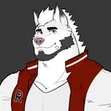
I signed my first colorist — Ed Ryzowski — and my art took a major turn. Since I wasn't worried as much about composing the image through crosshatching and solid blacks, I could concentrate on lines and anatomy. The faces, in particular, became very simplified, and the lines started to settle down a little! The image above is from 2008. The one below is from 2011.

By concentrating on lines, I'm finally getting better at indicating weight and shadow with the variance of the line. It gets heavier in the shadows and lighter in the highlights. There's finally a purpose to the line, and the art takes a step in the right direction. The faces, meanwhile take a turn from the minimal toward something resembling actual facial features.

Remember that old line about two steps forward and one step back? By the time we get to 2015, I'm back to using solid black shapes as compositional elements — with mixed results.

But the faces have taken a big step forward and the lines are improving as well. Also, it's important to note that I've made the switch to digital art at this point, so the backgrounds have become much more detailed. The background above would have simply taken too long to draw in multiple panels.
Likewise, I started getting much more braver in my use of perspective — like the first panel here.

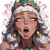
Then came 2016. I had decided to incorporate a NSFW spin-off into Evil Inc. It's impossible to understate the impact. I knew that the art had to really deliver. And I challenged myself to do exactly that.

Yeah. I know. Growing pains. But I got better. Pretty soon I was doing some stuff I was downright proud of. Like this nearly identical take on the same composition...

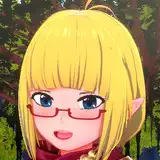
By 2017, I'm starting to produce images that make sense. The lines are consistently showing the weight of the image, the bodies are (fairly) consistent, the faces have the right amount of detail. Heck, I've even learned how to draw noses! And I've developed a very nice habit of drawing detail lines with a very light touch — which keeps them from becoming conspicuous.
Today, I'm doing images I really like.

When I decided to start doing single-panel cartoons on Mondays, I decided to dust off that old political-cartoon approach that I'd started with in the late 80s. But, after spending over a decade trying to make my lines look right, it looked much different.

So... y'know... mission accomplished, right? Heh. I wish. I'm still finding areas in my art that I'm trying to improve. It's like nailing Jell-o to the wall. As soon as I improve my anatomy skills, I want to improve my approach to gesture. Once I figured out noses, I had to re-examine facial expressions. On top of all that, I'm trying to make the final product, well... beautiful. And I'm not even sure what that means half the time!
But here's the thing. You know how I said I was producing images that I'm really proud of these days? Well, I was pretty darned proud in 2001, too. It wasn't until I improved that I could see the warts. And it's been that way for the past 22 years. Have I reached my "ultimate style"? The truth is, I won't know for another five years or so.
But I will tell you this — it sure has been a fun journey.
Brad Guigar
2022-12-19 13:45:06 +0000 UTCBrad Guigar
2022-12-19 13:44:44 +0000 UTCHarry Bleckby
2022-12-18 15:57:16 +0000 UTCMichael
2022-12-18 02:49:00 +0000 UTC