Hello everyone! Today I'd like to talk about color selection.
Recently, I've been experimenting with different techniques for creating anime-style textures for 3D models, but I often find myself spending too much time choosing colors. Since I tend to select colors based on intuition, it can be quite time-consuming...
That's when I thought, "Why not create my own color selection rules?"
By establishing some rules, I figured I could create guidelines that would make the process more efficient!
Since it's difficult to solve everything at once, I decided to focus first on "luminance" and think about how to determine contrast.

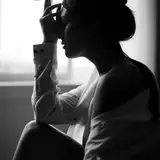
This is a texture I created previously. I put some thought into it at the time, but I hadn't fine-tuned all the details. First, I want to convert it to black and white to check the luminance.
The 3D model is Peke, sold by QuQu on Booth → https://booth.pm/ja/items/3686641
After converting to black and white, several issues became apparent.

The difference in luminance between the light and dark areas is quite large, making the overall contrast feel too strong. To explain in more detail, the clothing areas are a bit too dark, and the hair and skin appear too bright compared to the white parts of the outfit, creating slight inconsistencies.
I'll adjust the light and dark values with these points in mind.


I adjusted the overall light and dark balance while trying to reduce the contrast. I think it looks more cohesive than before the adjustment.
When coloring, it's important to remember that luminance changes with different colors, so you need to be careful to maintain consistent luminance impression while applying colors.
When considering brightness on a scale of 0-100, I selected colors mostly within the 30-95 range. The key point is to avoid using pure white (RGB: 255,255,255) or pure black (RGB: 0,0,0).

↑ This is the range I use to determine brightness values.
For darker colors, it's better to keep them slightly brighter than you might think, as making them too dark can create problems when adding shades later.
Next, let's adjust the shade colors. It's helpful to create a color specification chart when deciding on colors.

In the square frames, the upper frame shows the Base color, and the lower frame shows the shade color.
When thinking about shade colors, if we assume the same light is hitting everything, theoretically the luminance difference between Base colors and shade colors should be consistent.

↑ This is what I mean. If the difference is 20 between light and dark areas, all Base colors and their corresponding shade colors should have a difference of 20.
In reality, luminance perception varies depending on the color, so rather than making them exactly the same, I adjusted within a range of 10-20.
I made the difference larger for brighter colors and smaller for darker colors.


Using these rules, I determined the luminance for each shade color.
When creating shade colors, you need to adjust not only the brightness but also the hue and saturation, but I'll talk about that another time.
After establishing these rules, I found that I had fewer uncertainties and my workflow became faster! While there's no absolute right answer for color selection since it depends on the style of your work, having some guidelines really helps reduce decision-making time.
If you're struggling with color selection, I recommend trying to establish your own rules like this. Please give it a try!