Hello everyone!
Today, I'll explain about "Color Correction" and "Color Grading" - terms frequently encountered in video and image editing.
These terms are often confused because they are both used for color processing work, but they serve different roles.
Color correction is the process of "restoring colors to their correct state." The main objective is to unify the overall color balance.

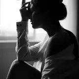
For example, when a photo appears to have a slight greenish tint overall, we first adjust using white balance. White balance can be simply explained as an adjustment to make white appear "white."

In this photo, we adjust using clothing as a reference point to make it appear white. This is how we adjust to make white recognizable as "white."

The overall colors should now appear more distinct. We'll also finish by balancing brightness and saturation. This restores the overall colors to their original state.
On the other hand, color grading is about "creating the mood" of the work. It's a color adjustment process that adds specific atmosphere and impressions to scenes that have already been color corrected.

It can significantly change the overall impression of the work. Color grading doesn't have specific procedures as it's about creating atmosphere for each work. It's an artistic process where you might add colors only to dark areas or make skin tones more vibrant to stand out.
The crucial point is the order of these processes. Make sure to follow this sequence:
1. Color Correction
2. Color Grading
What about 2D art like anime and illustrations? Unlike live-action footage, anime and illustrations have their colors determined during the coloring phase, so color correction is essentially done at that stage. Color grading might be considered part of the anime shooting.
In Shoost v0.14.0, we've implemented various features to perform these color adjustments. In fact, all the color correction and color grading work you saw in the previous examples was done using Shoost.
Features for Color Correction:
- White Balance: Adjust colors based on white as a reference
- Color Correction: Overall color adjustment
- Levels: Brightness and contrast balance adjustment
Features for Color Grading:
- Screen Filter: Easy-to-use preset filters
- Color Grading: Customizable detailed color adjustment
For this demonstration, we'll work with separately prepared character and background elements, as typically done in streaming setups. This means we're assuming a scenario where "the character and background colors don't match."
While Shoost has a "Blend AutoColor" feature that automatically matches background colors, this alone isn't always sufficient. For example, in dark scenes, characters might become too dark, or the contrast between characters and backgrounds might be inappropriate.

So, let's perform color correction. Using the character as our reference, we'll adjust the background colors. First, let's adjust the brightness. We'll set the Blend AutoColor value to 0 and lower the saturation to create a black and white state.

we'll add a levels adjustment effect to check the brightness.
As we increase the Input Black value, the entire screen becomes darker. This allows us to compare the brightness between the character and background.

When increasing the Input Black value, while the bright areas of the character's skin and clothes remain visible, the bright areas in the background disappear. This indicates that the background is darker than the character. In the same space, brightness should change consistently.

Conversely, when we increase the Input White value, everything becomes whiter. At higher values, while the character turns white, the background doesn't brighten as much. This confirms that the background's brightness is low.
Using level adjustment this way allows us to compare and verify brightness levels. After confirmation, we'll add a color correction effect to the "background layer" and adjust its brightness.

We'll increase the Brightness until it matches the character.

The darkness in some areas concerned me, so I made fine adjustments using level correction.
Using color correction and level adjustment, we've matched the background's brightness to the character's. Let's check the colors by returning the saturation to its original value.

The sofa had a bluish tint, so I adjusted it using white balance to appear white. The saturation and contrast didn't need adjustment, so I left them as is.

The background is now brighter and matches the character's brightness. Let's compare.

After adjustment, the ceiling and monitor brightness are maintained, and the brightness harmony between character and background is achieved. This completes our color correction work.
For color grading, you can use Screen Filter and Color Grading features just like with live action footage.


Comparing this with using only the Blend Auto Color feature, combining color correction and color grading makes the character more visible, increases overall screen unity, and creates a more appealing result.
No amount of adjustment will improve the overall atmosphere if colors don't match initially. First perform color correction (color unification), then color grading (creating the mood). Following this order will significantly improve your screen's atmosphere.
Give these techniques a try!
Lorem Ipsum
2025-01-27 03:42:59 +0000 UTC