Homework time again! Here are some attempts during this month. It will take too long to explain each process so I want to cut to the conclusion first. My biggest problem is that I find it almost impossible to finalize an illustration if the painting methods have poor compatibility for 'loosely painting'. By loosely painting--pardon my lack of vocabularies--what I mean is 'not perfectly rendering everything', by freely using strokes, textures, limited values, etc.. If a painting process requires 95% of the time to correct small errors and copy from references, it will end up being a rigid and lifeless rendering image because the painting process itself is as boring and exhausting.
本月做的一些練習和WIP,其實還有分心跑去練線稿但沒得到什麼像樣的成果。總結目前最大的難題,是無法進一步完稿,原因可能是過度要求正確的光影與灰度,導致畫面的「容錯度」太低,於是不論怎麼添加細節看起來都與畫面整體格格不入。叭子的腦畢竟不是3D引擎做成的,但要是整個作畫過程中95%都只是在修正錯誤或抄參考資料,不僅畫起來很無聊,最後的結果看起來也會很無聊。
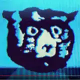
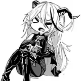
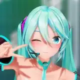
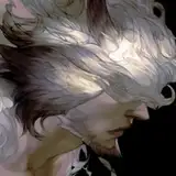
Months ago I did bump into a method which granted me the ability to go further, to add more smaller forms. It's this one (only the face part is closed to be finished):
數月前我一度嘗試到某個畫法,能自然而然地進一步處理細節,這些細節與整體畫面也沒有不相容的問題。如下圖(只有頭部接近完成):
My guess is that the method itself has better compatibility for loosely painting, you can see every detail does follow the strokes, and all those traces of strokes make it easier to add more, because the focus on this work is shifting to the relation of strokes and forms, therefore, free from the need of being precise of value or shading control.
個人猜想是因為其畫法本身提升了整體畫面的容錯度。這張圖整體有明顯的筆觸痕跡,且每一筆都與其刻畫的型體緊密黏結在一起,讓觀賞者的注意力從正確性移轉到筆觸與型體的關係,於是提升了灰度和光影等方面的容錯度。
But there is an obstacle, that I can only leave strokes by using flat-shaped brushes which are not very ideal for drawing and edge control, and on a monitor with high dense pixels(in this case, it's a 4k 24" monitor). If using a round brush it often ends up eliminating all strokes and textures. If on a lower dense monitor (I have a 24" 1080p monitor) the strokes will be very hard to observe.
但目前我只能透過扁型筆刷留下這些筆觸,且作業螢幕的解析度要有4K以上,如果用其他類型筆刷或較低解析度的螢幕,畫面很快就會糊成一塊(汗)
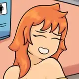
Somehow I am still puzzled by the difficulty of going further to finish his torso, arms and wings, maybe I was just not familiar enough with the process and failed to give it a better start, or the concept and design are too vague and chaotic, or the composition is kind of boring, etc.. I'll practice more till the day I can finish an illustration properly.
但是咧我仍然碰到其他問題,身體、手臂和翅膀部份怎麼畫都不合意。目前還不確定原因為何,可能是初步構想太草率,構圖太無聊,或者我基本上就是手笨不會用手寫板完稿(為了看清楚筆觸所以只能用普通螢幕+手寫板畫圖)。總之我會不斷練習直到能完成一張滿意的作品。
Some additional thoughts about A-E practices:
額外補充一些練習A~E的感想;
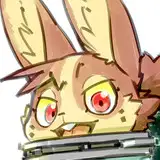
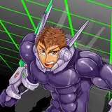
A - Kars/
Probably the best looking one among those WIP/practices. You can find its sketch in this Tumblr post. The anatomy and proportion are exaggerative but still possible to be rendered. I'm using limited values for faster sculpting but it might end up giving me trouble for finalization because of poor compatibility for adding strokes.
這張卡茲基本是拿舊圖來實驗,草稿可以在tumblr上挖到。大概是練習作中最能看的一張,然而還是碰上了最後難以完稿的問題,因為看不太到筆觸,灰度層次也不夠。
B - Dante and Angelo Credo/
The problem is similar to A. Super hard to adding details or correct everything. It seems starting with defined linework is not ideal for painting over with values.
蛋丁和朵天使這張碰到的問題和A類似。從完整的線稿開始畫往往會碰上型體與線稿不搭的問題,整個過程都變成在修正錯誤。
C&D/
Experiments of trying to paint loosely.
C和D基本上只是在嘗試一些容錯度較高的畫法。
E - 4 practices on the same sketch/
I used different combinations of brushes on each of them with different lighting sources. The one on the bottom-right is the fastest, most intuitive and requires very little light sources for figuring out geometry. Sadly it looks very murky and flat. The bottom-left one is another attempt to paint loosely, similar to C.
四張基於同一個線稿的練習。每張都使用不同的筆刷組合與光線來源。右下角畫起來最快、最直覺、也最省腦,因為僅使用漫射光與補光,可以快速抓出型體,但是灰度表現最差。左下那張使用的畫法則和C練習差不多。
Night Excision
2019-11-08 04:37:26 +0000 UTCK T
2019-10-30 13:20:26 +0000 UTC