An earlier public version in my twitter:

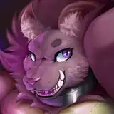
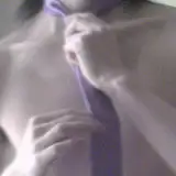
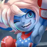
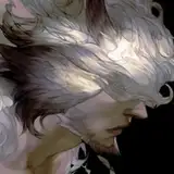
It's close to the end of October! Yeah, it's late for this month and the top image is a WIP preview of the HD2+ monthly reward. It will be soon finished and ready to be sent. Sorry for the waiting! And I sure owe you guys an explanation. (Long post! Feel free to avoid it if you're not interested to know)
# Where is the finished version of the Leather Devil illustration in one of my previous post?
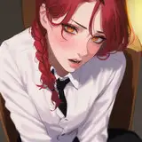
Weeks ago I was stuck in the inking process. Here are some of my attempts to ink the sketch:

I'm not too happy with both the results and process, and it's a bit hard to explain:
# The inking process is stupidly long.
I spent 5-6 hrs on a sketch which only contains one character, no complex ideas nor the composition. And the inking process is not faster than that. If I rush it, the inking result will look no better than the sketch. In short, it's like the inking process is just me very slowly destroying my sketch.
# The composition is a bit boring.
I personally think it may be okay if it's for a 'painting'. Because the values, lighting, colors will add a lot more to the work. But when making a 'drawing', it just lacks some sort of focus. And I didn't notice this problem early enough to fix it. It's the high-contrast and clean linework make me notice this problem. Which means I can easily make poor choices and never notice them while sketching.
# My sketch doesn't tell enough information.
The hand gesture and cloth are not defined enough and I basically need to re-design them while inking. Also, some of the design didn't go well when I try to ink. But doing a sketch in lighter colors will easily cause me to ignore such problems. If I'm making a painting, it's fixable, but if I'm inking, it breaks the workflow and results in a sloppy line art.
# Lack of confidence while inking.
I try too hard to keep it clean, and every line is just to for one sole purpose-- finishing the work. I don't design anything and add any information while inking. When I do sketches, my drawing always looks more lively and constructive. Because I can construct everything without worrying too much.
It may be easy to think " Because I just lack practices", and while it could be true, I have also done fanbooks for 10+ years. It's not very practical to leave all these problems to only one solution that may take me another 10+ years to get any better. So, is there any other way to improve my inking skill? And this is the task I have been through for recent weeks.
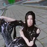
Anyway, the top image is the result I finally came up with. In my earlier drawings, I tend to use lighter colors, like light green or blue, for sketching or even inking. The reason is that pure black, the high-contrast lines are very easy to make a messy drawing. Here's an example I did in April, using pure black brushes:

The lines are messy and hard to clear. At first, I believe I need to use a lighter color and bigger brushes for drawing, so it's less distracting and I can focus more on the anatomy/composition/etc. rather than small details. But then...well, you know what happened.
After tons of trying, I was quite frustrated and thinking maybe I just need to brainlessly practice and refine every line forever. But then I open my old self-published books which were drawn in real papers 10+ years ago. You can see an example here:

They just look better than my digital works. Why? I then took some real paper and real pens and doodled. Weird. I don't mess up with pure black lines when it's on real paper. The significant difference was that the lines always land on where I need them to land, so I didn't need to draw 2-3 times to make them right. While in digital, they are always slightly misplaced.
Then I assumed it's the resolution problem. In real media, the resolution is always denser than digital. Normally ppl will think 300 dpi is enough for every digital work. I've also worked in 300-350 dpi for a long time. But what if it's not enough for me? So I raised the resolution and made some tests. When the resolution was higher than 600 dpi, it works a lot better. I no longer feel the lines being misplaced and it's very intuitive to draw and preview the result in pure black lines. Here's one of the test (work in 600dpi):

I also get another better result in one of the shameless tests (work in 800dpi), but I'm not going to post it haha. You can download it from the attachment though.
One drawback for working in high resolution is that my PC lags and my zooming level is always about 20-30% which gives me a lossy preview while working. But nothing beats the feeling of ease and control for drawing. :D
( After all my 10+ year old works still look better. *sobbing* )
______________________________________
較早放在推特上的公開版:
十月都快結束了,啊那個HD2+獎勵到底哪去柳?嗯呃首圖是我終於畫得出線稿的途中預覽,這張就快畫完啦,是真的快畫完啦,我終於不用再送出舊稿插畫包了呃咳。上一PO也說接下來要解釋我這幾週到底在幹啥,原因如下,內容很長不夠閒不用看:
# 那張翹臀BDSM老蛋的完稿死哪裡去了?
兩週前我把草稿影片上傳時,其實就隱約意識到...我還是很不會上墨線,而且這個問題很快就會讓我付出代價。以下是幾個上墨線的嘗試結果:
總之咧我對結果很不滿意,不單純是不喜歡線稿,而是非常不喜歡製作線稿的過程。
# 上墨線的速度還是慢得可以
之前提到,光是草稿就花掉我5-6小時。我上墨線的速度絕不會比畫草稿快。現在看看這草稿的構圖不複雜,還只有一個角色。完成一個簡單的線稿怎麼會需要這麼久?假如想縮短上墨線的時間,結果就是會得到一個比草稿還醜的線稿,啊這樣上墨線就變成了某種「緩慢地毀滅草稿」的過程。感覺一點意義都妹油。
# 整體構圖原來還蠻無聊的
假如這草稿拿來畫成彩稿,應該還可以接受。但如果是黑白稿,總覺得就是缺了什麼。我在畫草稿的階段並不會意識到這種問題,是直到線稿描了下去,才發現哎呀這構圖對於純線稿來說有點太平淡喇,也就是草稿製作過程也存在著問題。
# 草稿本身沒有提供足以完稿的資訊
在上線稿時才注意到,手的姿勢和衣服得重新設計過。另外某些設計被畫成墨線稿的效果並不好。假如是畫彩稿,這些問題都能被修正,但若是畫線稿,這些問題則會破壞線條的流暢度。
# 欠缺自信的墨線
我花太多精力在試著畫出乾淨的線稿,而且每條線都只是為了完稿而照描上去,整張線稿看起來就是欠缺了某種活力。相較於草稿,線稿看起來十分死板,也失去了焦點。
總地來說,一般人可能都會認為問題出在「平時欠缺練習」,這麼說基本上也沒錯,但另一方面來看,我已經畫超過十年的同人誌啦。都十年了還算缺練習,那麼我到底需要多少年的練習才能端出比草稿能看的線稿?有沒有什麼其他的方式能改進我的線稿?這成了我最近幾週一直在苦惱的問題。(不如說已經苦惱好幾年了)
本PO的首圖是我這幾週嘗試後的成果。如果在座有看過我前幾個月的線稿作品,可能會注意到我會利用比較淺的顏色(綠色或藍色)打草稿、甚至是畫線稿。原因是純黑色的線稿不知怎地就是很容易打亂整個畫面,以下貼一張我四月時用純黑色筆刷畫的塗鴉:
可以看到我每個輪廓都撇了複數的線條,導致最後很難清理出乾淨易讀的畫面。那時我假設,改成用比較淡的綠色或藍色打稿,可以讓我先專注在先處理比較大的結構:人體解剖、構圖、透視等等,而不會太快就分心去處理細節。但直到本月,我才注意到,其實這種作法也大有問題,至於問題都已經條列在上面了。
接著我一試再試,換筆刷,換軟體,換螢幕的角度,換桌子的高度,什麼想到的招都試下去,但多半都沒有得到明顯的改善。就在萬念俱灰地想著「好吧我就只能傻傻地再給他苦練十年」當下,我拿起了自己十多年前出版的同人誌回顧,當時都還是畫在漫畫稿紙上,然後掃進PS做後製。以下隨便選一張當sample貼上來:
幹我十年前畫的東西比現在畫的還能看,甚至畫得比較快(抱頭)。到底是那A安捏?接著我隨手拿起筆計本和幾隻自來水筆亂撇了幾撇,發現在紙上作業時,即使用純黑的筆尖,我也能一筆就畫出想要的輪廓,不需要一描再描。但在數位作業時,我往往得重覆畫好幾條線才能得到想要的成果,也就是筆刷的落點和我想要的位置有些微的落差。
接著我做了個假設:真實媒材的「解析度」永遠都比數位媒材還高。但多數人都認為在數位創作時,300dpi足矣,過去幾個月我也多半用300-350dpi作業。但對我來說,300dpi會不會根本不夠?於是我打開Paintstorm Studio,然後逐步調高作業解析度做測試,以下是其中一張測試塗鴉(600dpi作業):
當解析度調到600dpi以上,下筆的落差感幾乎就消失了。基本上若能調到800dpi以上效果更好,但問題是現階段的軟硬體設備都還跟不上這個作業解析度,不僅會導致電腦lag,我作業時的視圖尺寸多半只有20-30%,也就是影像會明顯失真。(我隨便撇了個破廉恥的800dpi塗鴉,藏在附件裡,這邊就不貼了啊哈哈哈咳)
簡單來講,現在我終於可以用純黑色打稿了...!(一個人人皆會卻只有我不會的普通技能)而且光是打稿就能做到接近完稿的效果。雖然說我十年前在紙上畫的東西還是比較好看...我到底是為了啥學畫CG(無可奈何的失焦感)
K T
2018-10-28 08:55:07 +0000 UTC